Diagnosis · Strategy · Identity · Editorial · Communication
HIDRA
Modernizing an industrial engineering brand without compromising solidity.
The starting point
A specialized technical firm delivering turnkey hydraulic infrastructure.
HIDRA provides end-to-end water engineering and wastewater infrastructure: structural metal fabrication, water control gates, electrical switchgear, SCADA telemetry, pumping stations, and fire suppression systems. Yet their previous identity looked like a basic commodity supplier.
The strategy directly addressed a crucial requirement for civil engineers and infrastructure directors: finding a single, highly qualified engineering partner capable of resolving the entire hydraulic ecosystem from initial blueprint to handover.
Specialists in hydraulic infrastructure.
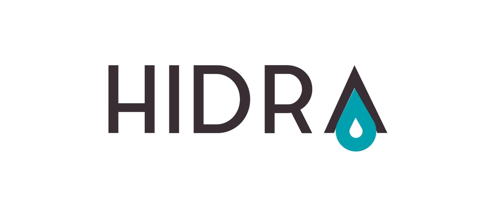
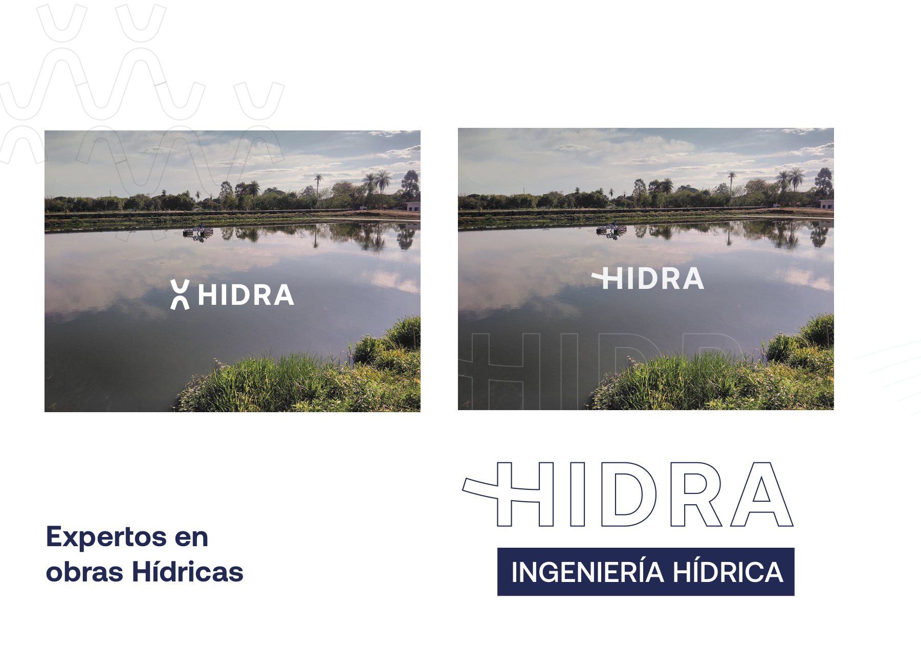
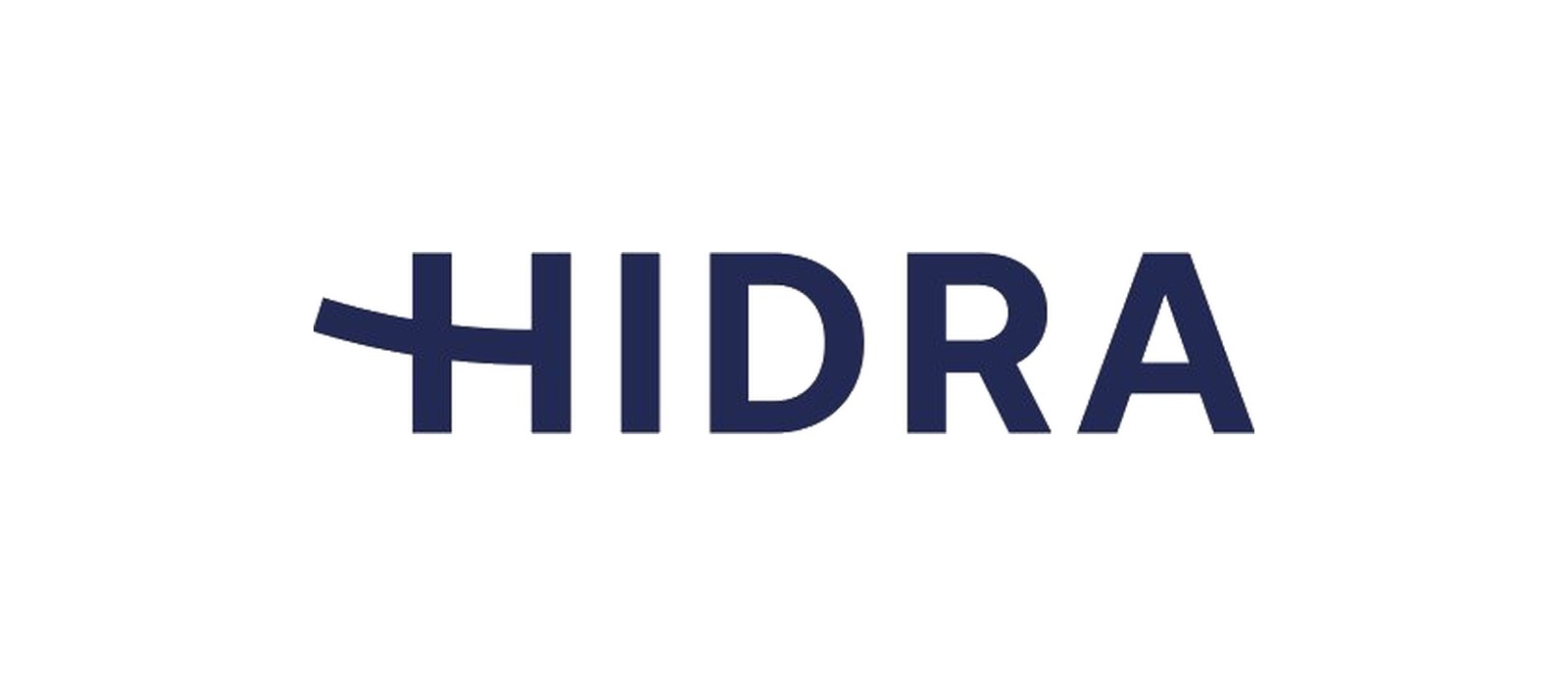 BeforeAfter
Identity
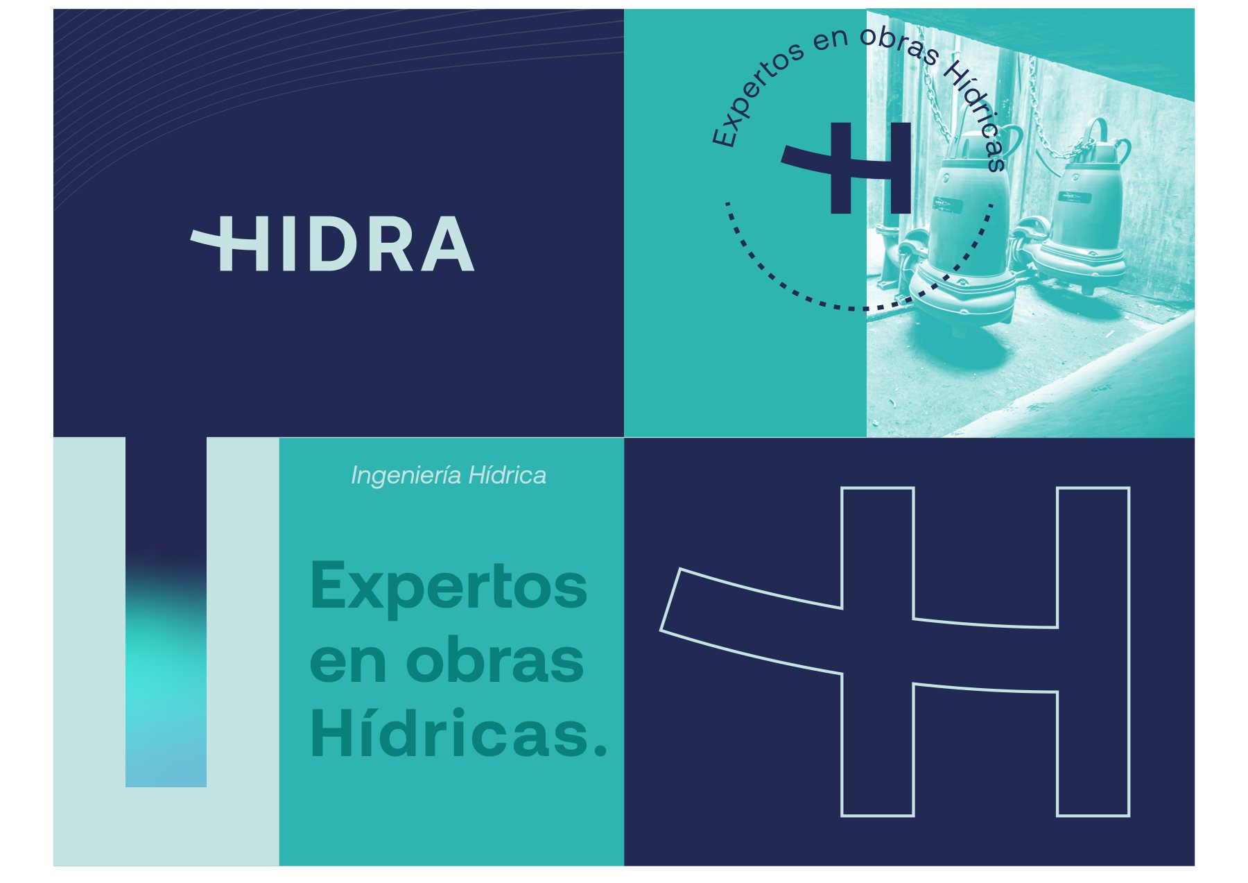
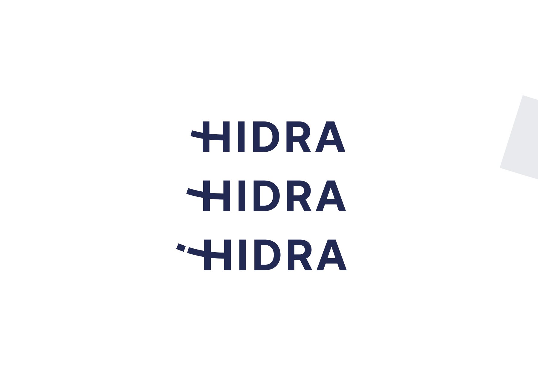
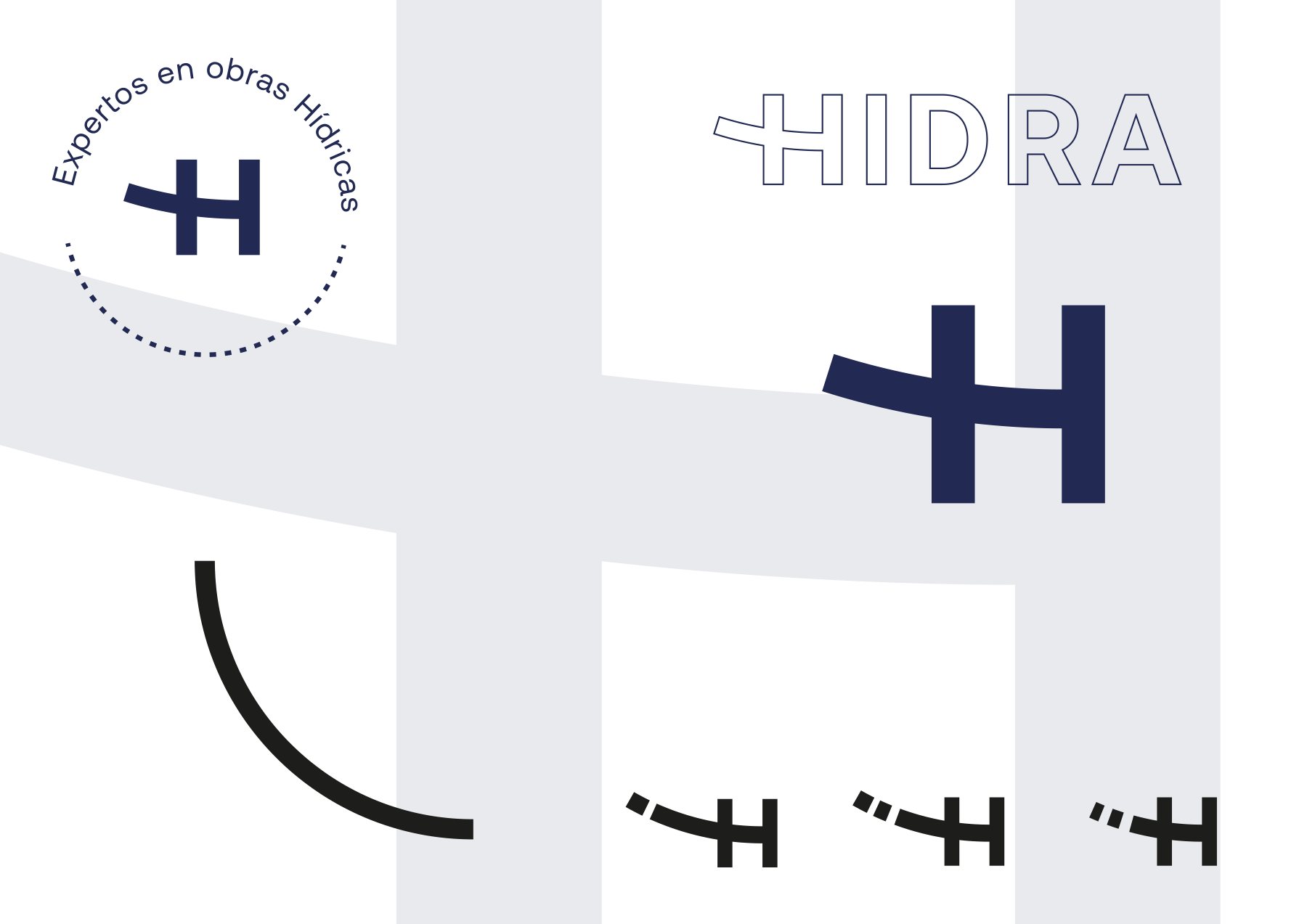
The H as an engineering valve.
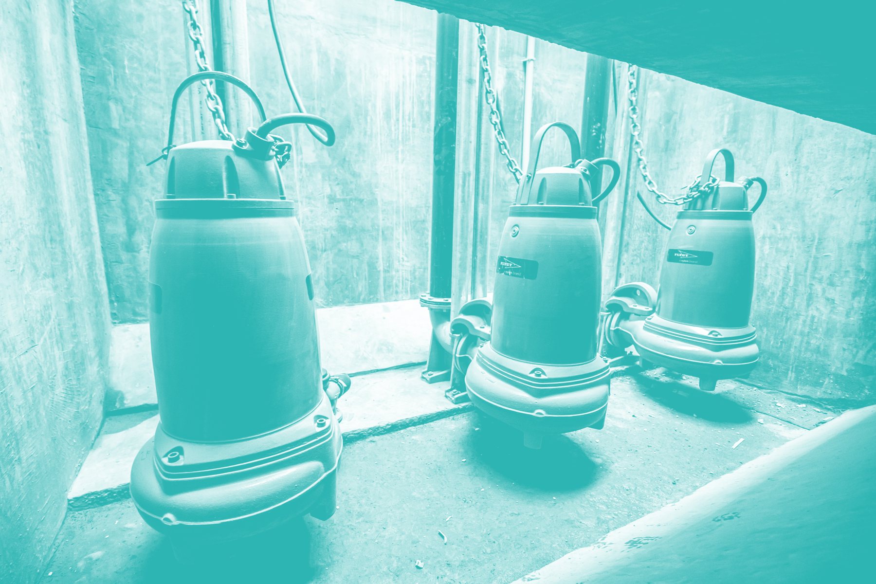
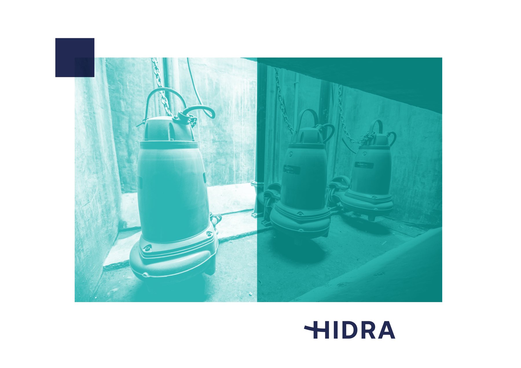
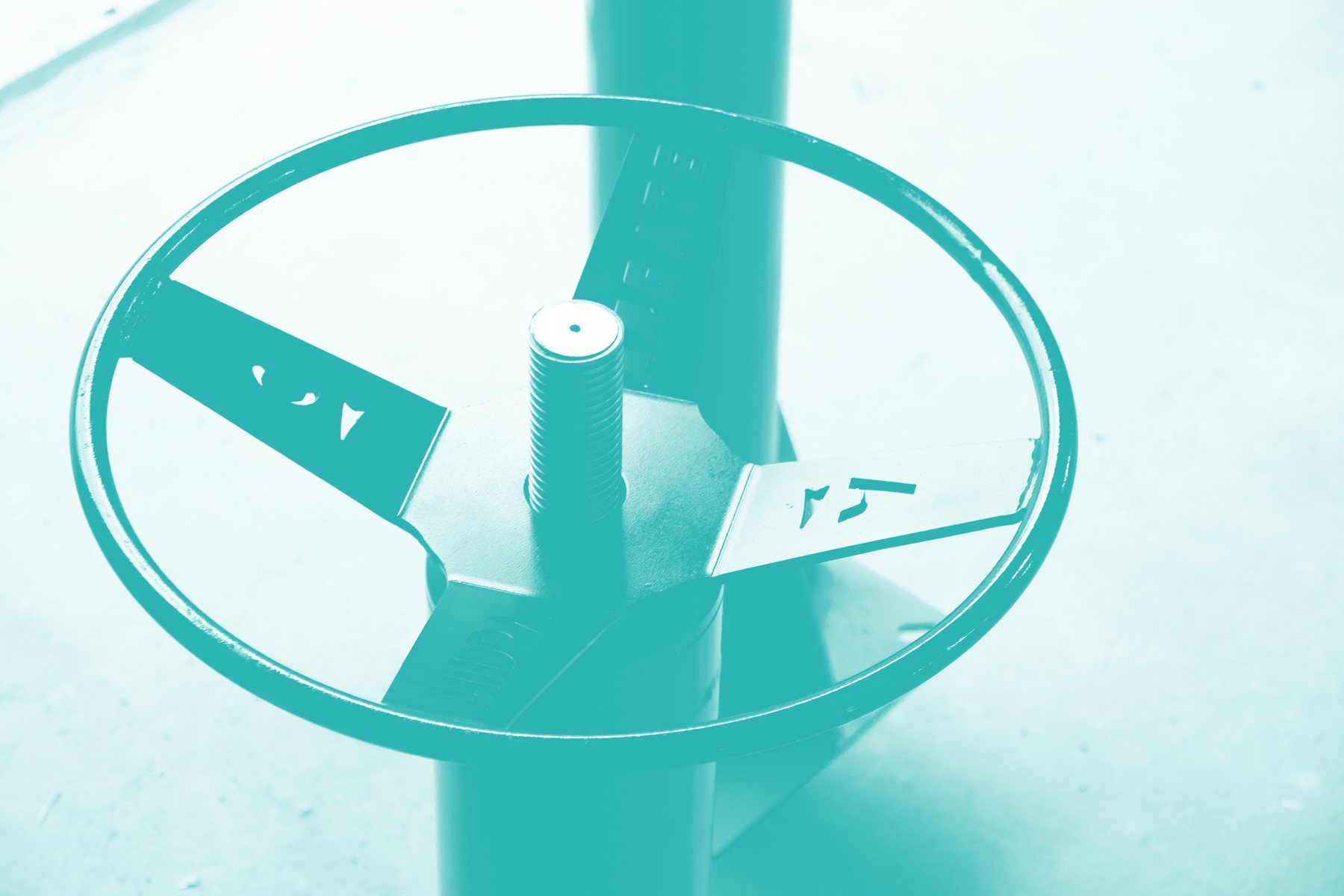
A robust technical logotype featuring an H mark designed as a hydraulic symbol — a flow valve, a pipe coupling, a continuous conduit. Deep industrial navy communicates stability, bright turquoise represents water, and engineering site photography is graded in the brand's signature palette.
#1A2B5CTurquesa
#1BB1B0Agua
#7FD8D2Gris
#E9EEF2Acento
#F28C28

Editorial
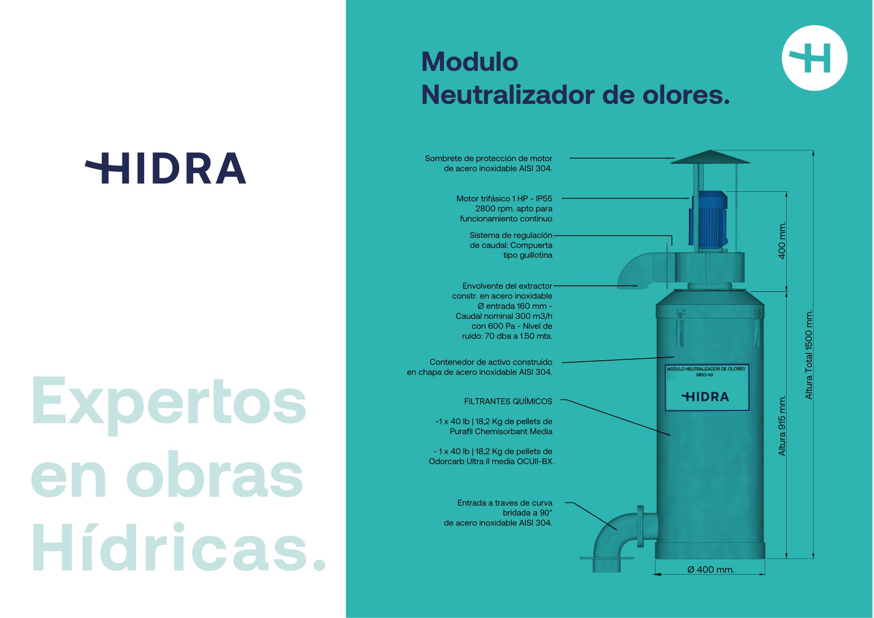
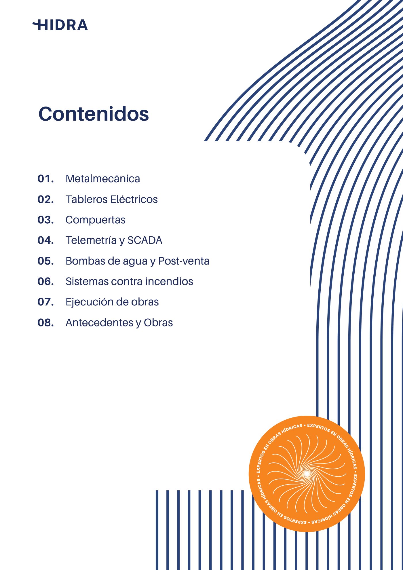
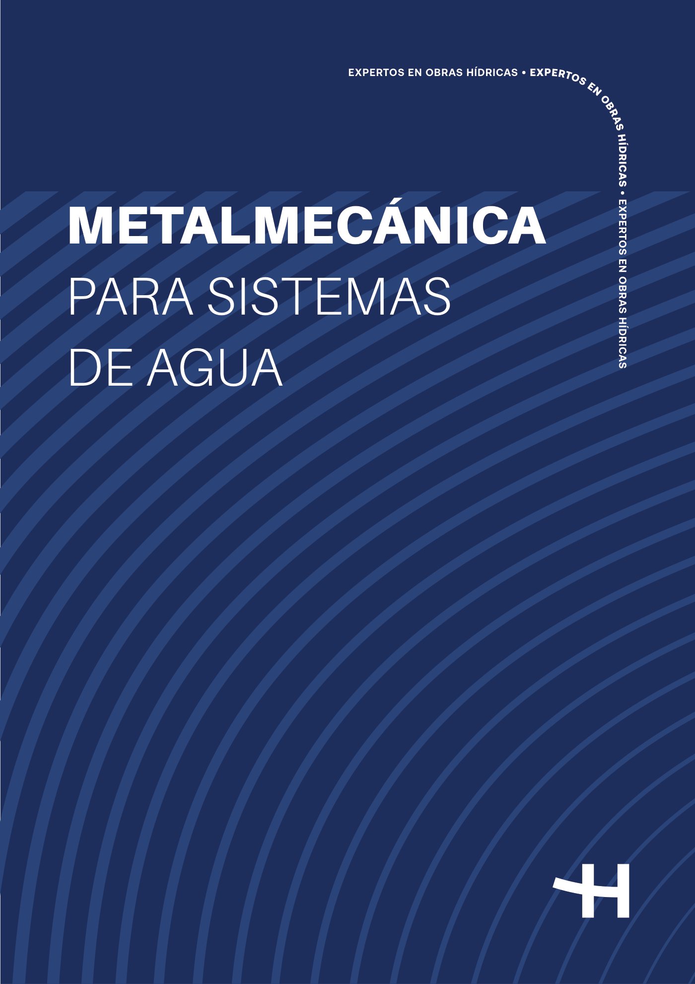
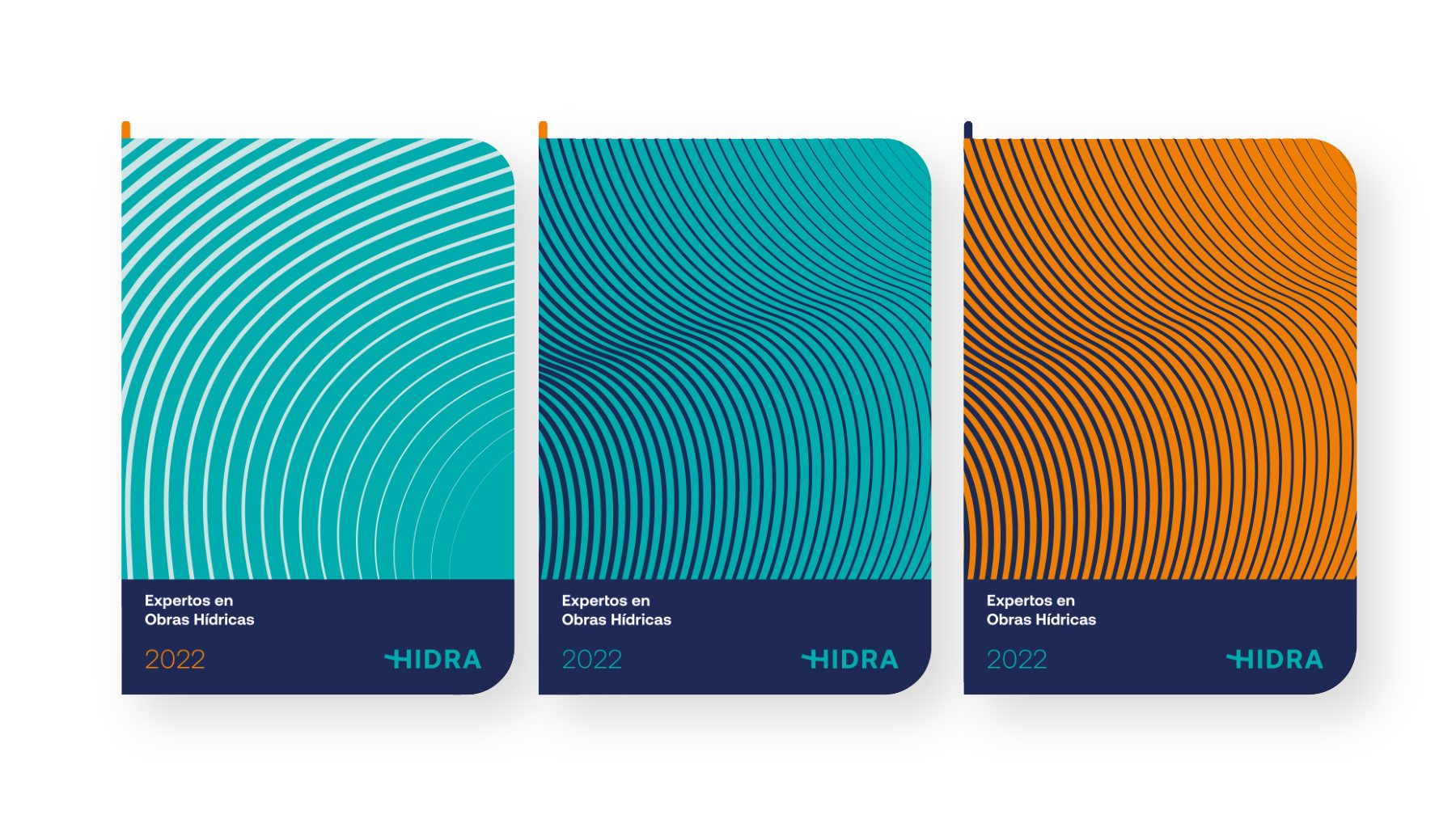
A technical catalog explaining the engineering.
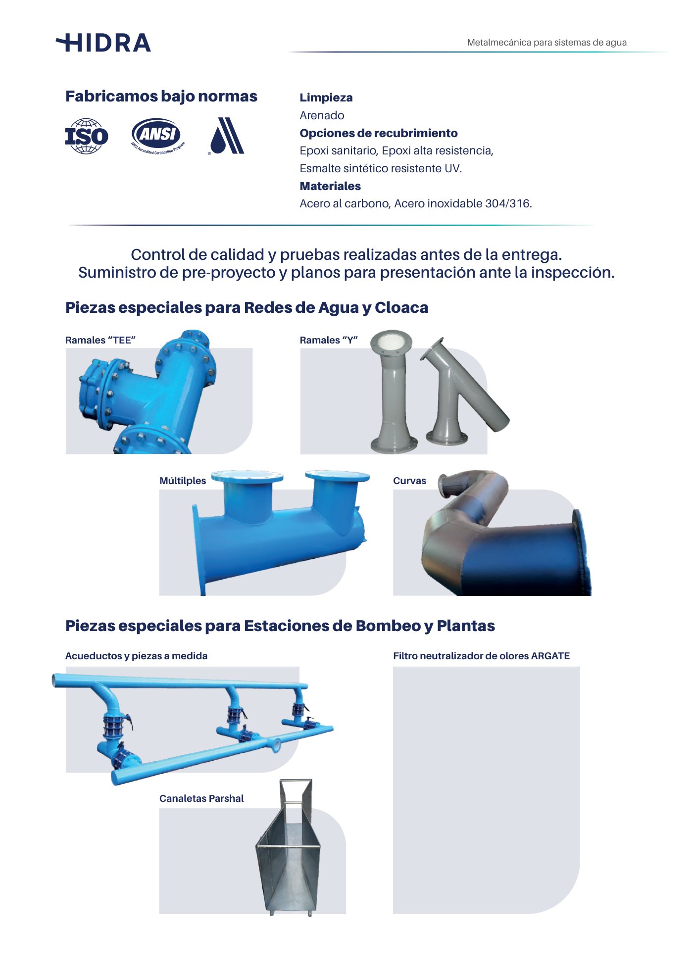
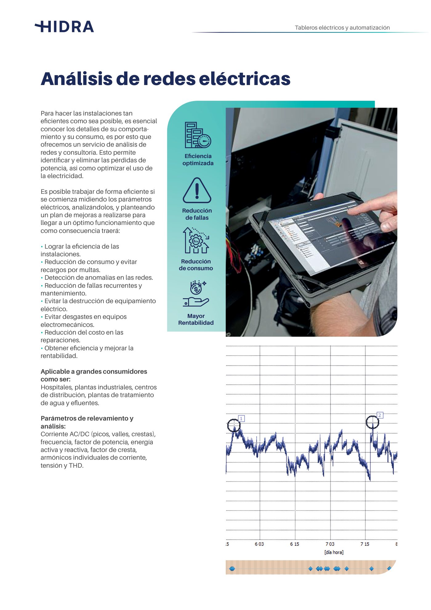
Corporate overview and technical specifications catalog organized across core capabilities: metalworks, electrical automation, sluice gates, pumping systems, fire prevention, and landmark civil works.



Applications
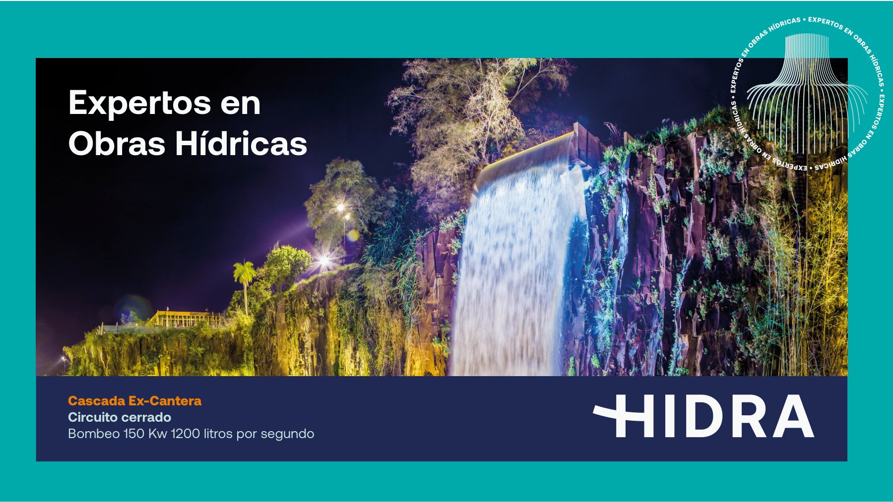
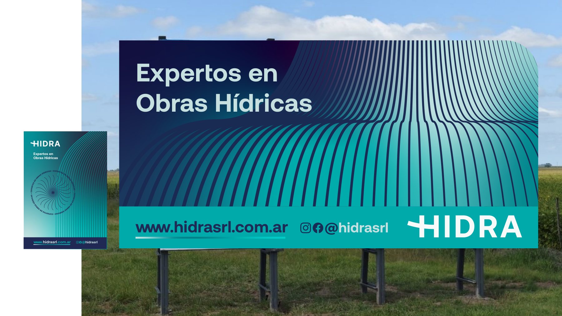
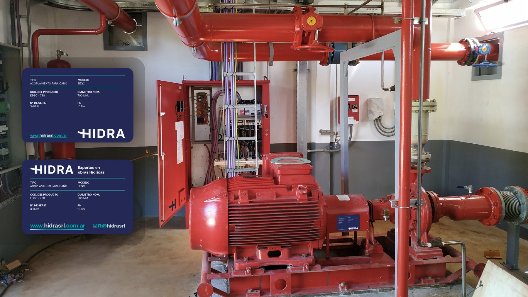
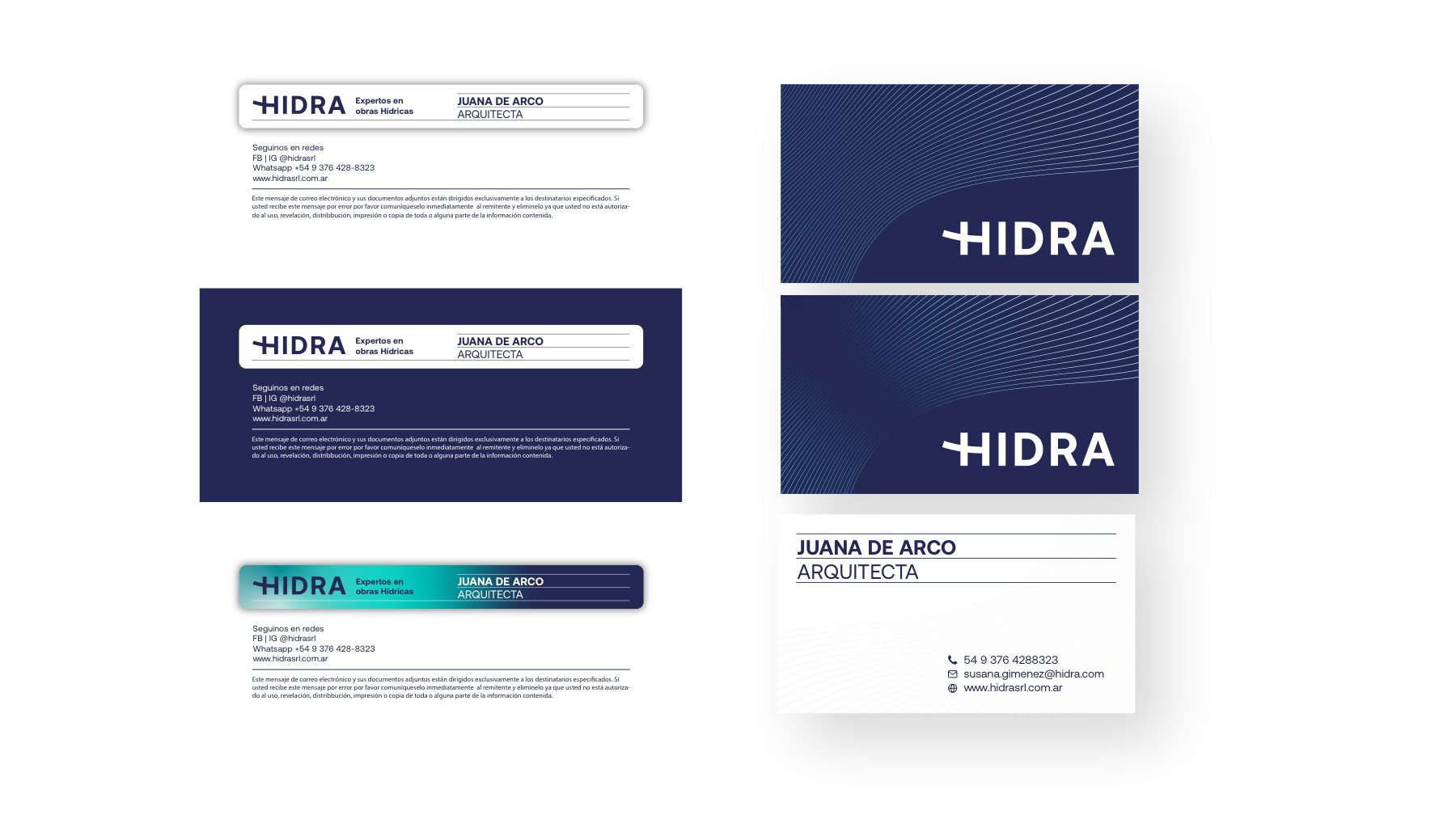
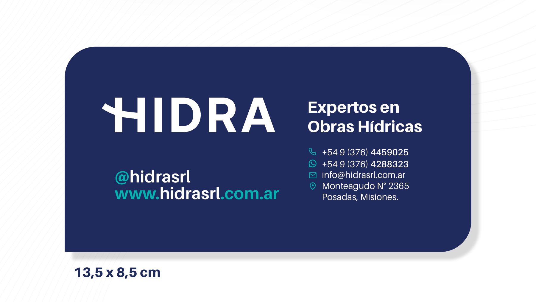
On the highway, at the site, and on the control board.


My role
From strategic positioning to the jobsite.
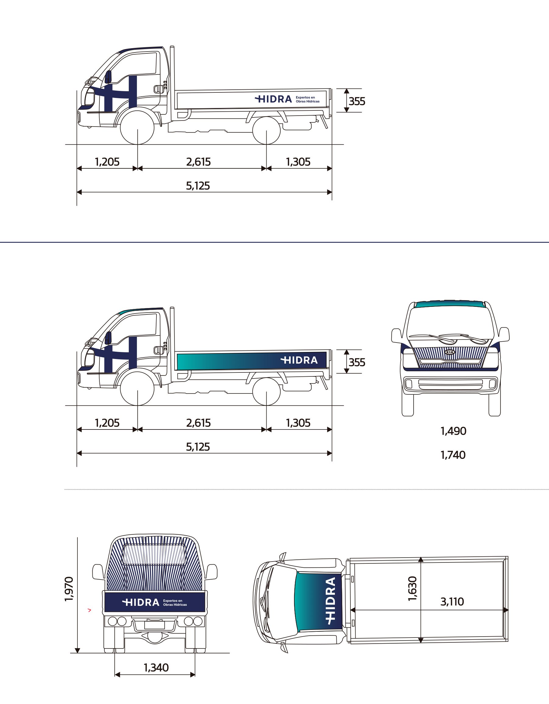
Brand diagnostic, strategic platform, tagline, visual identity, technical catalog, construction site signage, corporate stationery, and fleet branding.
- Diagnosis
- Strategy
- Tagline
- Identity
- Editorial
- Signage