Strategy · Identity · Environmental Design · Signage · Communication
Petri Market
The trust of an artisan bakery, brought to daily groceries.
The starting point
A recognized family name and a fresh format.
Petri was already an established bakery renowned for quality, warm service, and prime locations. The new strategic challenge was persuading those same customers to buy their daily essentials — fresh produce, meats, pasta, and pantry staples — in an agile convenience store format.
The strategy was founded on benchmarking regional and international urban markets: speed, ready-to-eat products, neighborhood proximity, and the reassurance of an established brand.
- Ready meals
- Prime location
- Time-saving
- Quick shop
- Petri heritage
Identity
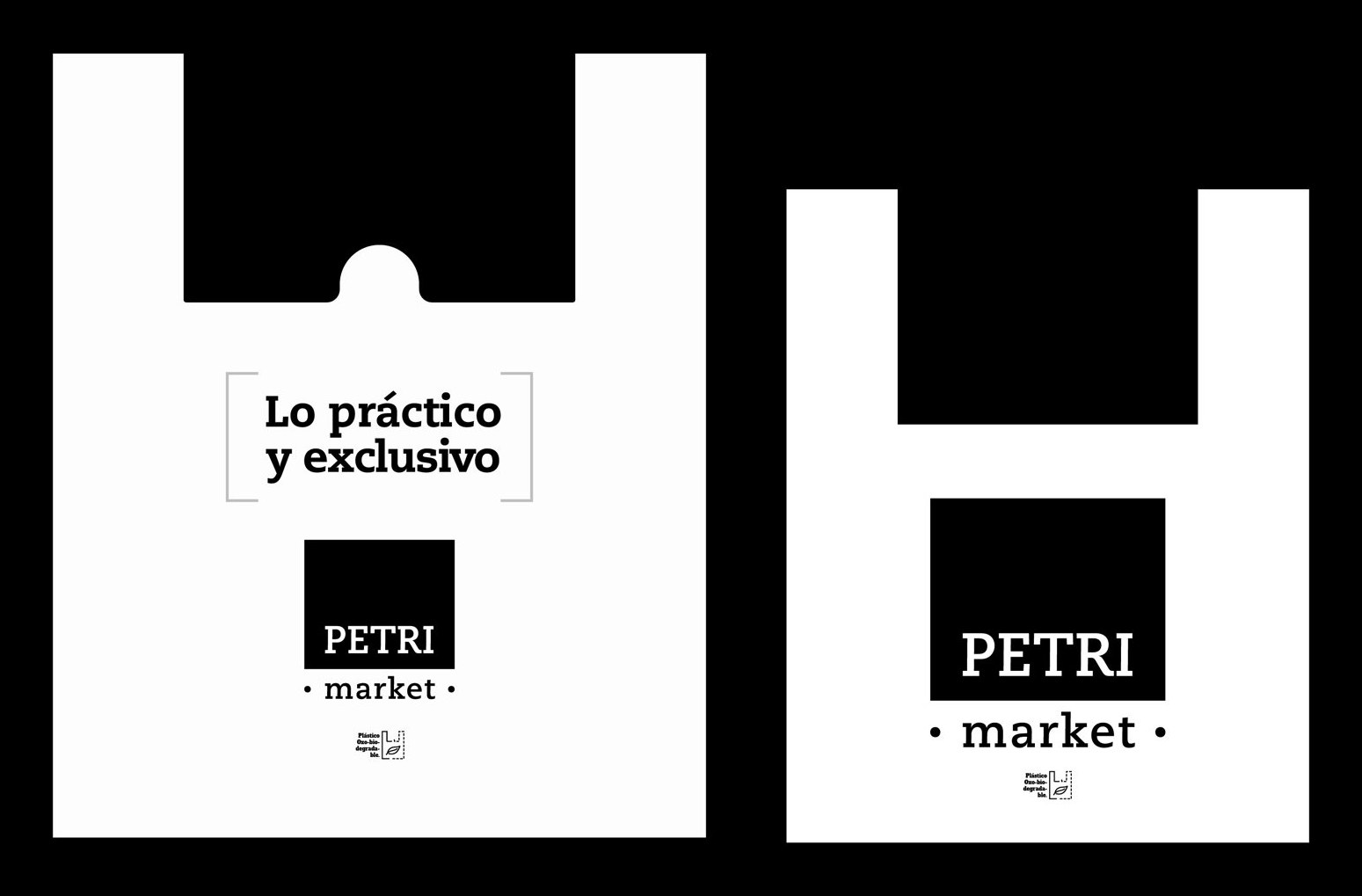
Practical and exclusive.
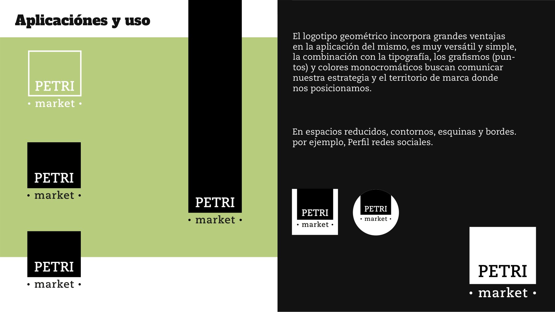
A monochrome palette enriched with warm wood tones and a refined serif typography distinguishing the market from the bakery while preserving the family lineage. The brandmark works as a modular block: stacking, cropping, and reducing to a bold P. for compact formats.
#000000Carbón
#1C1C1CBlanco
#FFFFFFMadera
#B98B5AVerde
#9DBF6ANaranja
#F28C28Vino
#8E1B2F

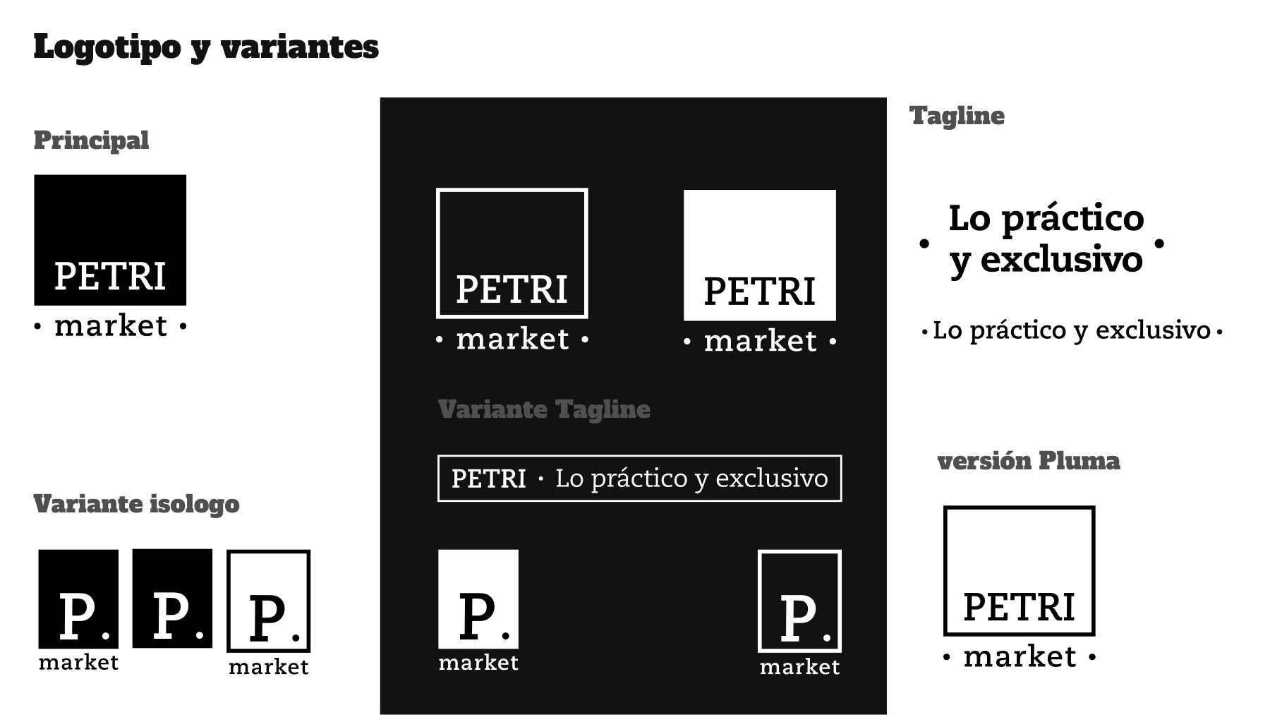
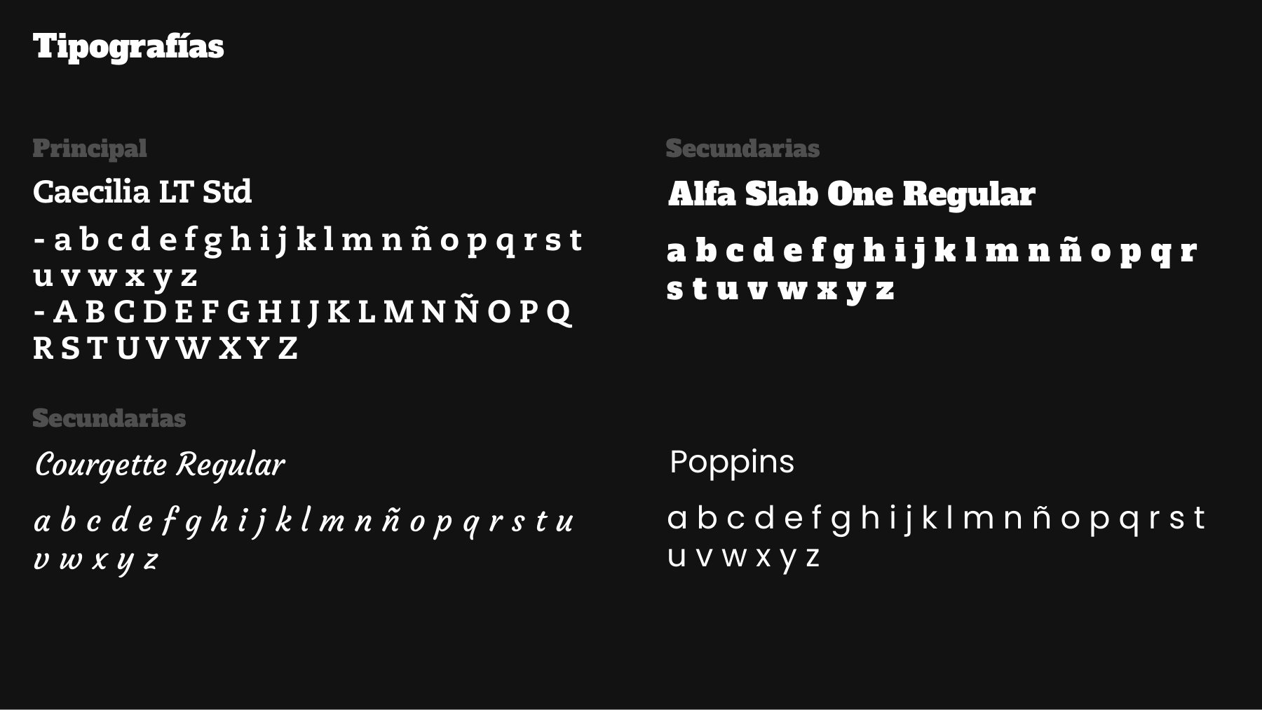
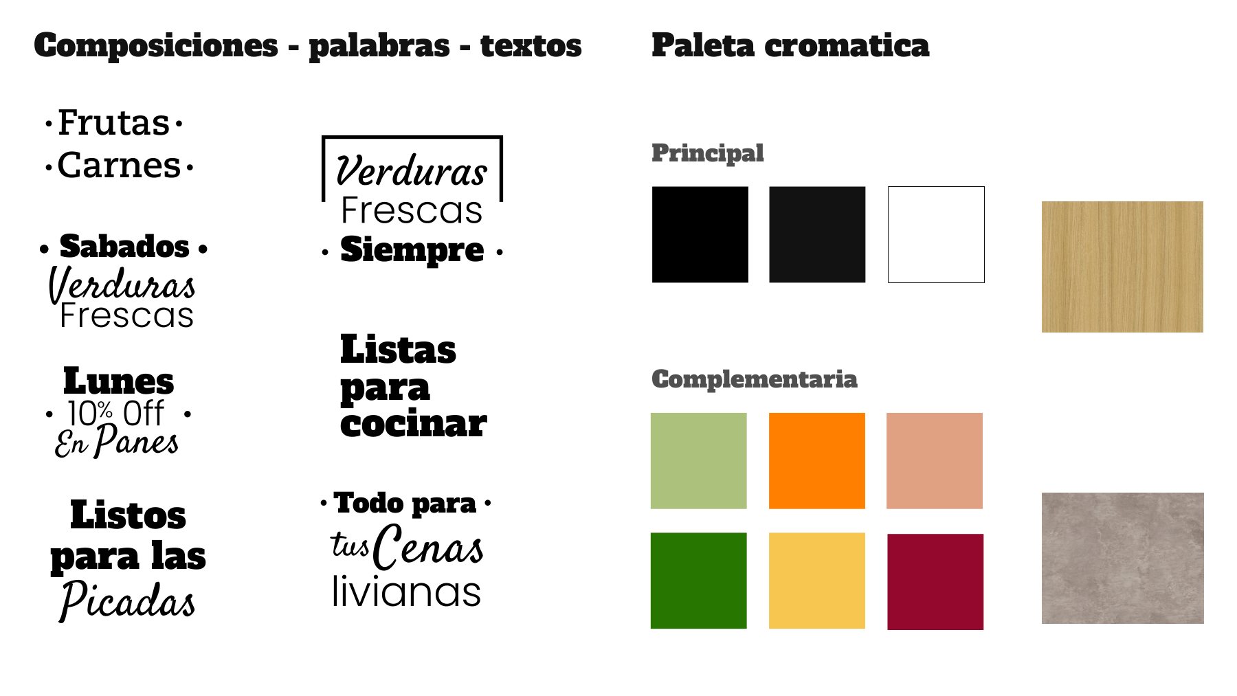
Illustration system
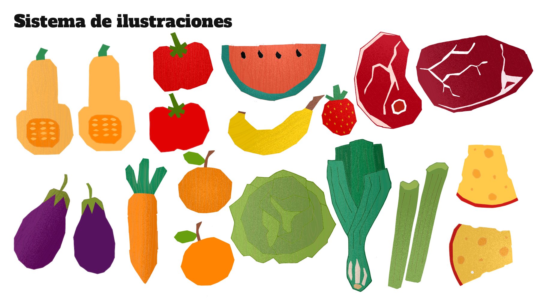
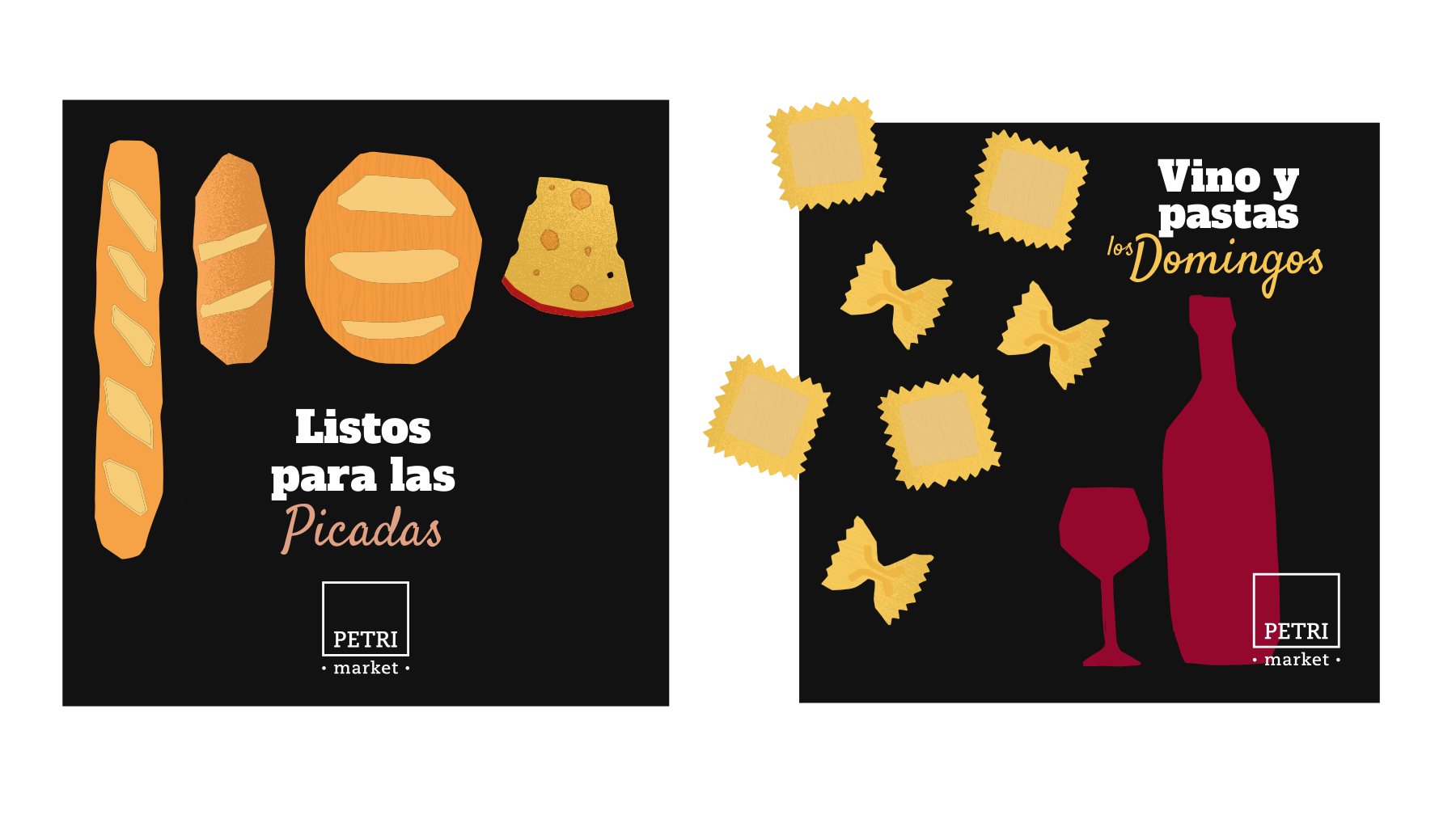
Fruit, artisan breads, and wine to celebrate the table.
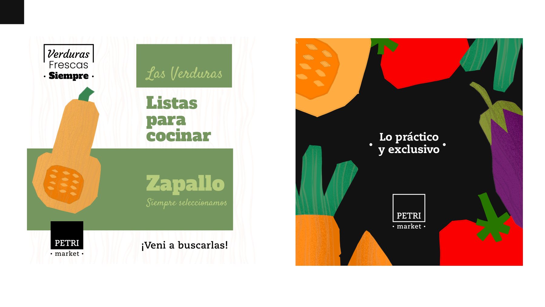
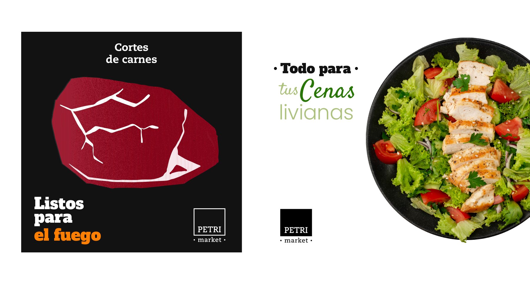
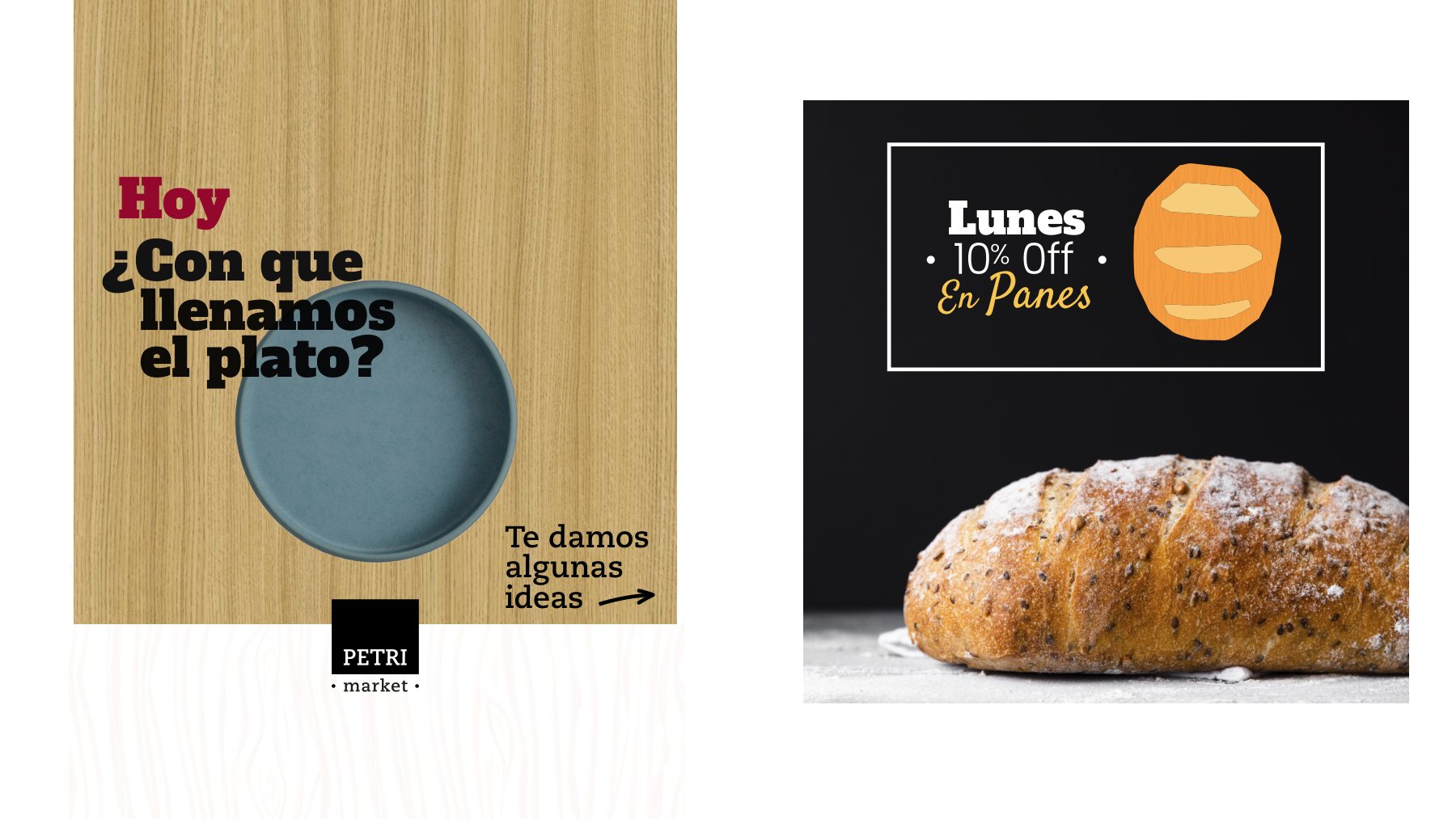
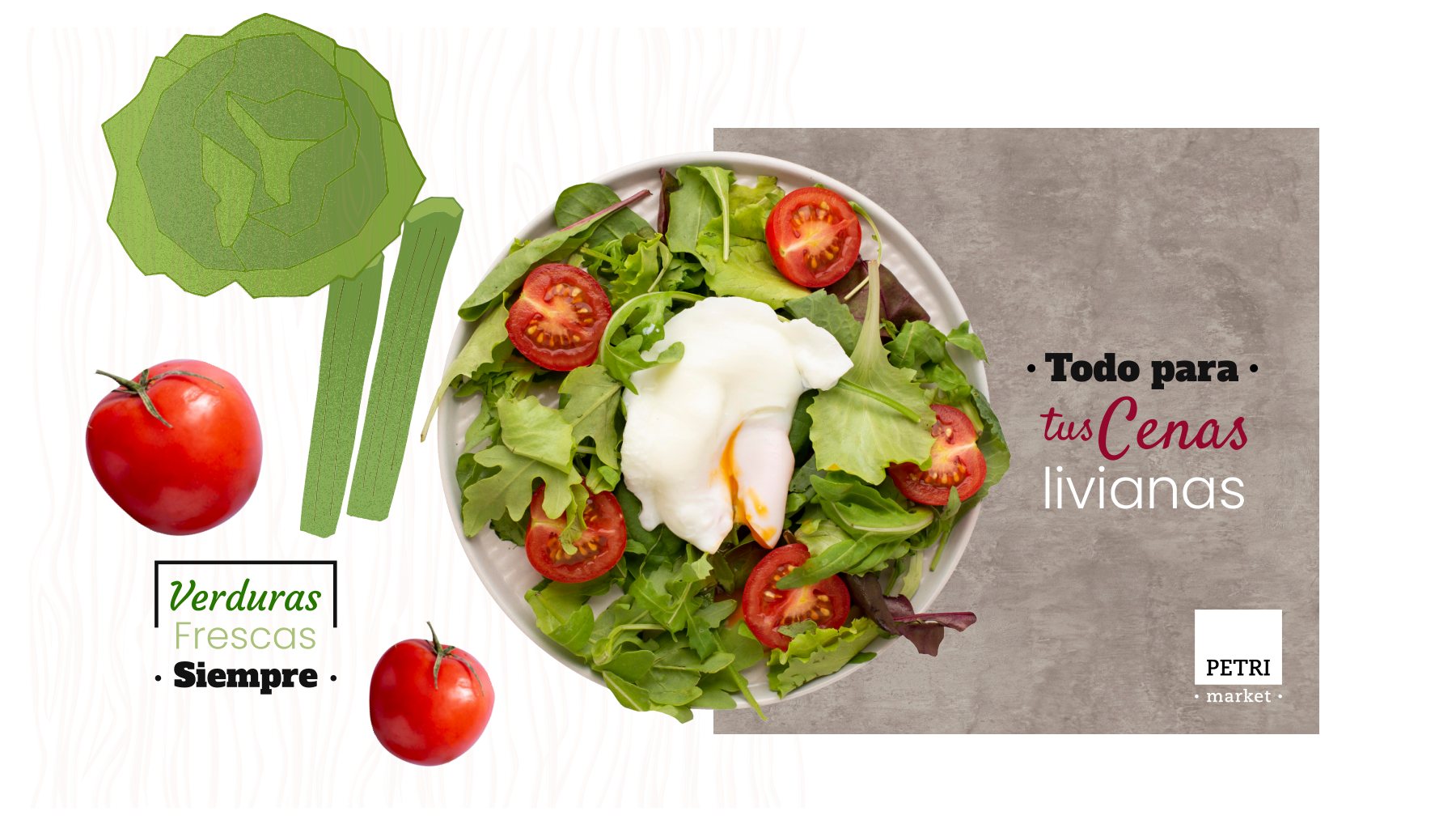
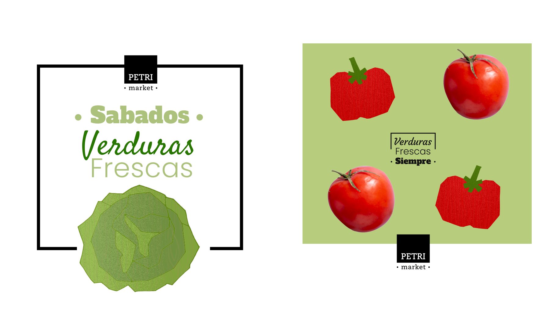
A collection of line illustrations and tactile wood textures that brings warmth to everyday retail communications: promotions, seasonal recipes, and weeknight meal ideas.
Storefront & Environmental Design
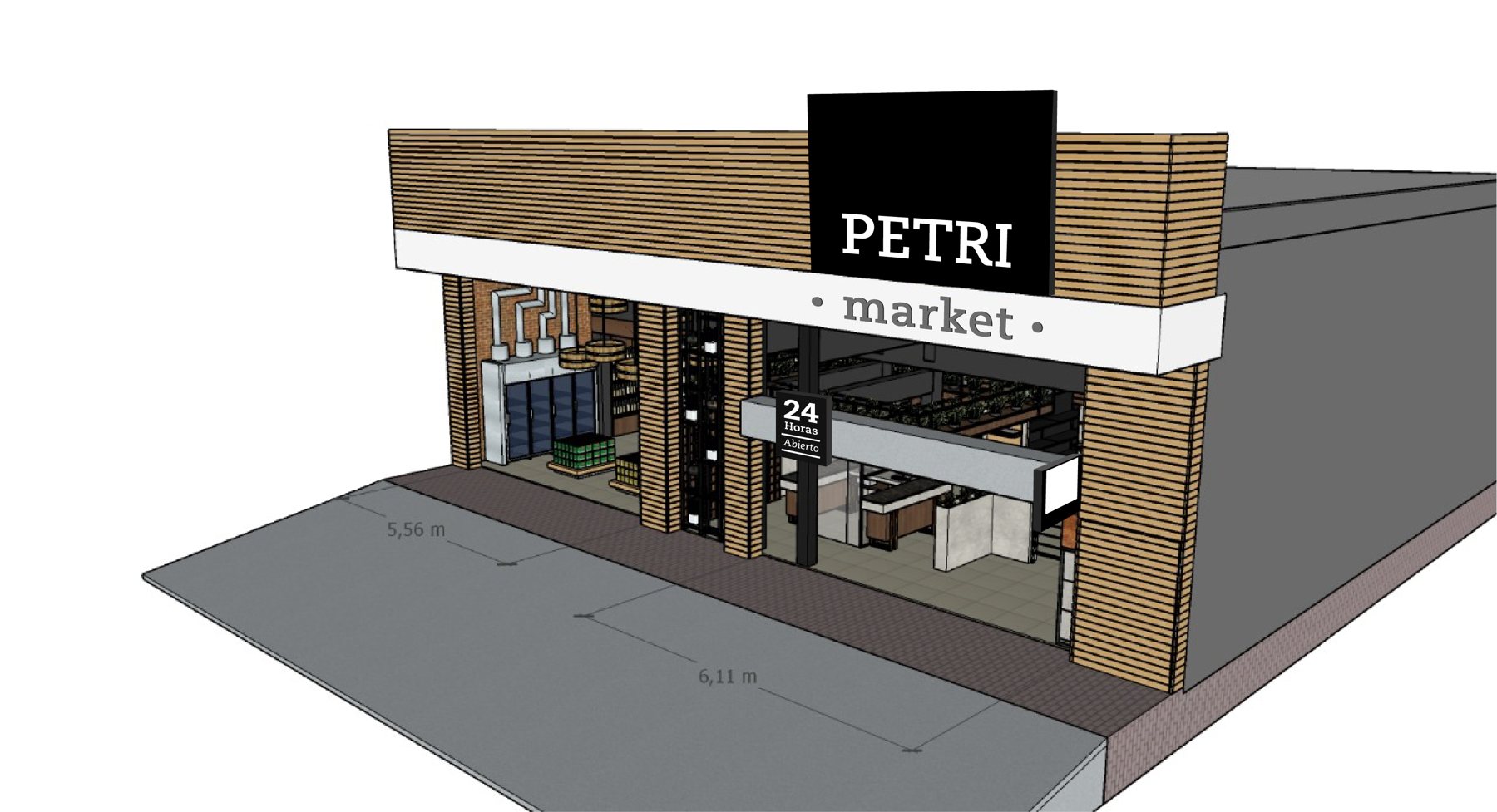
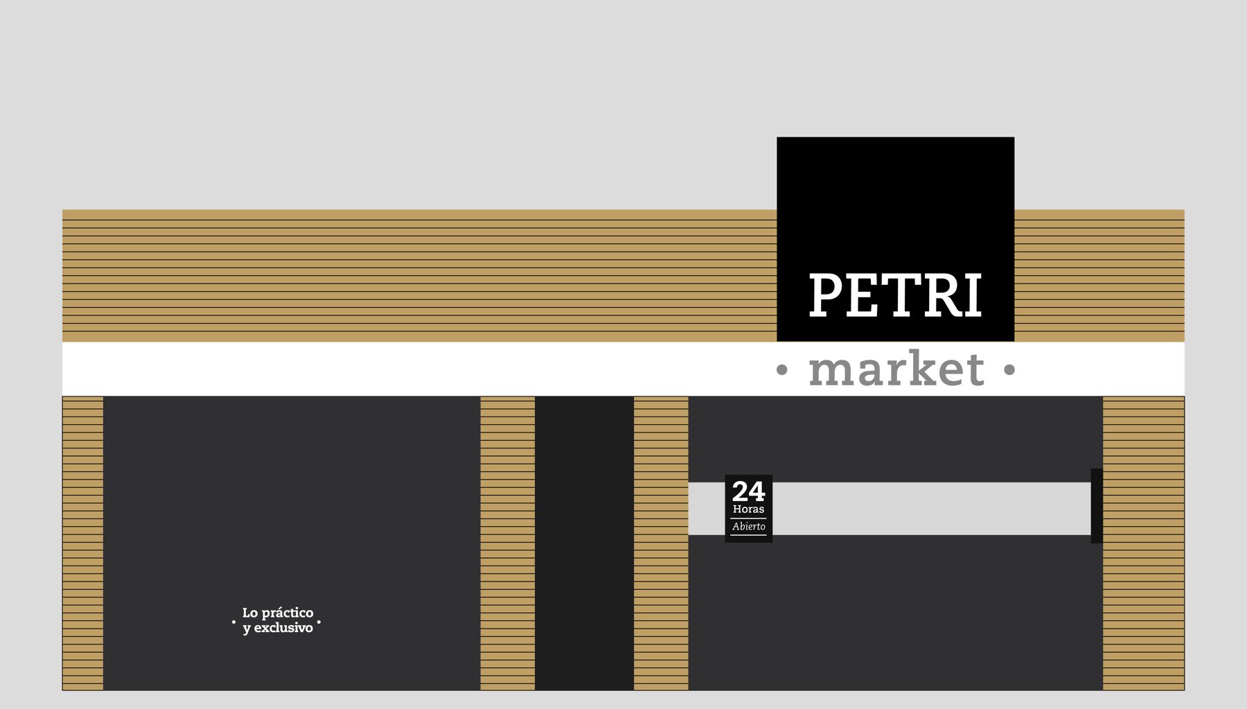
From 3D render to brick and mortar.
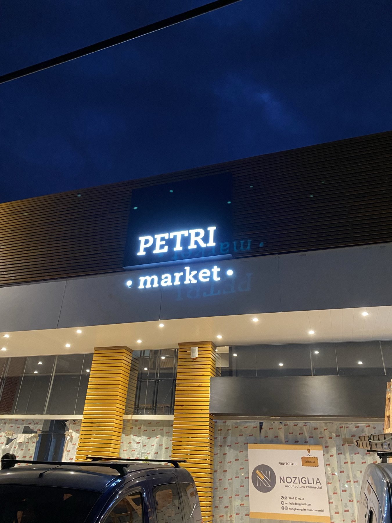
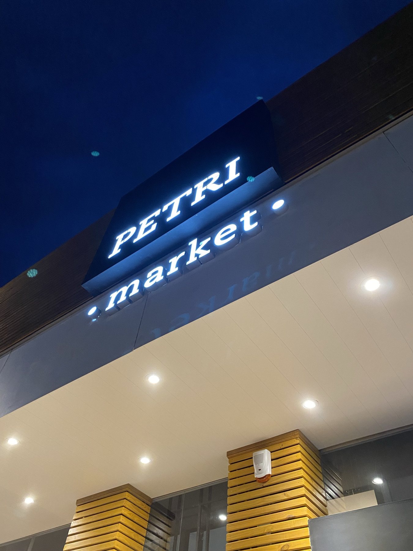
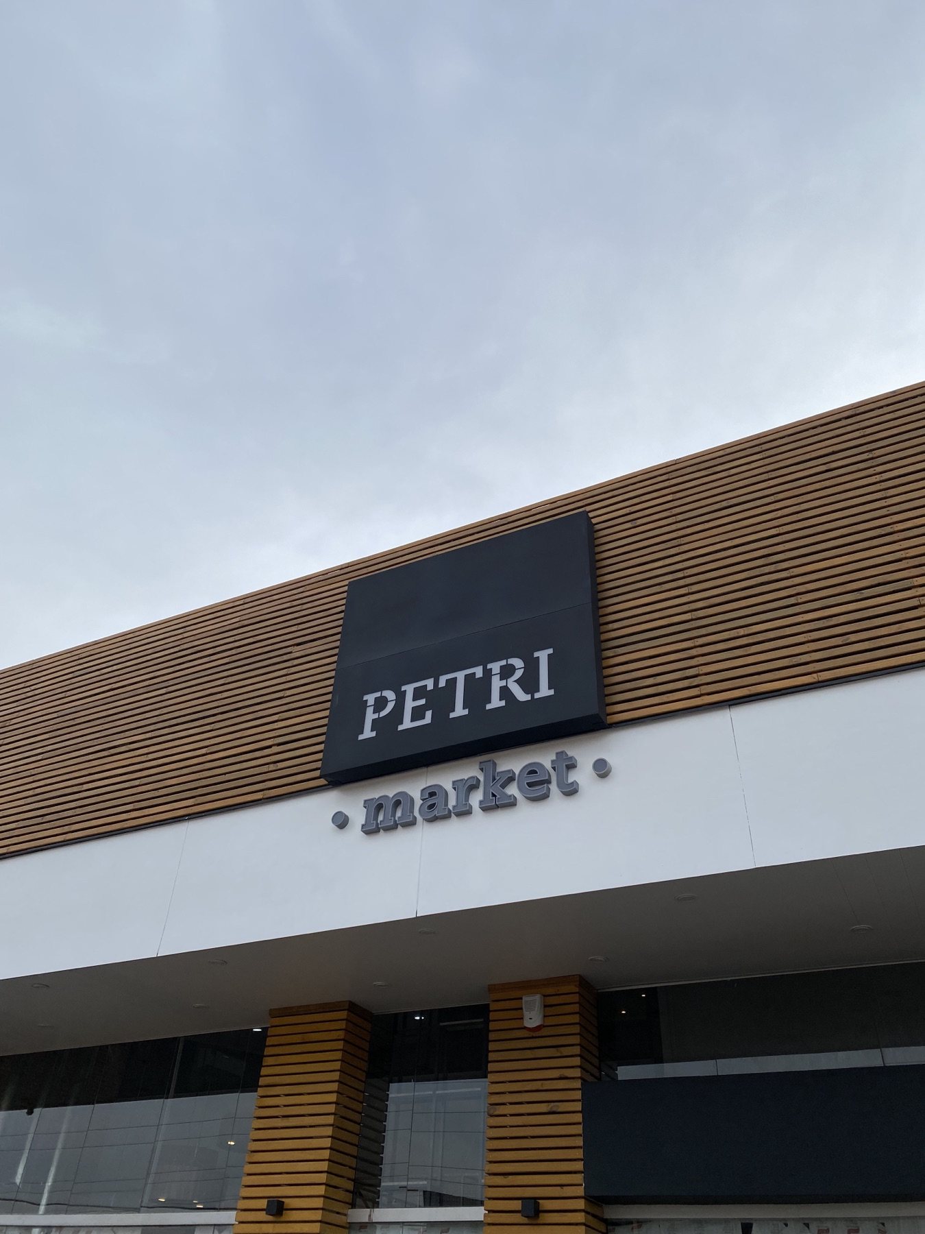
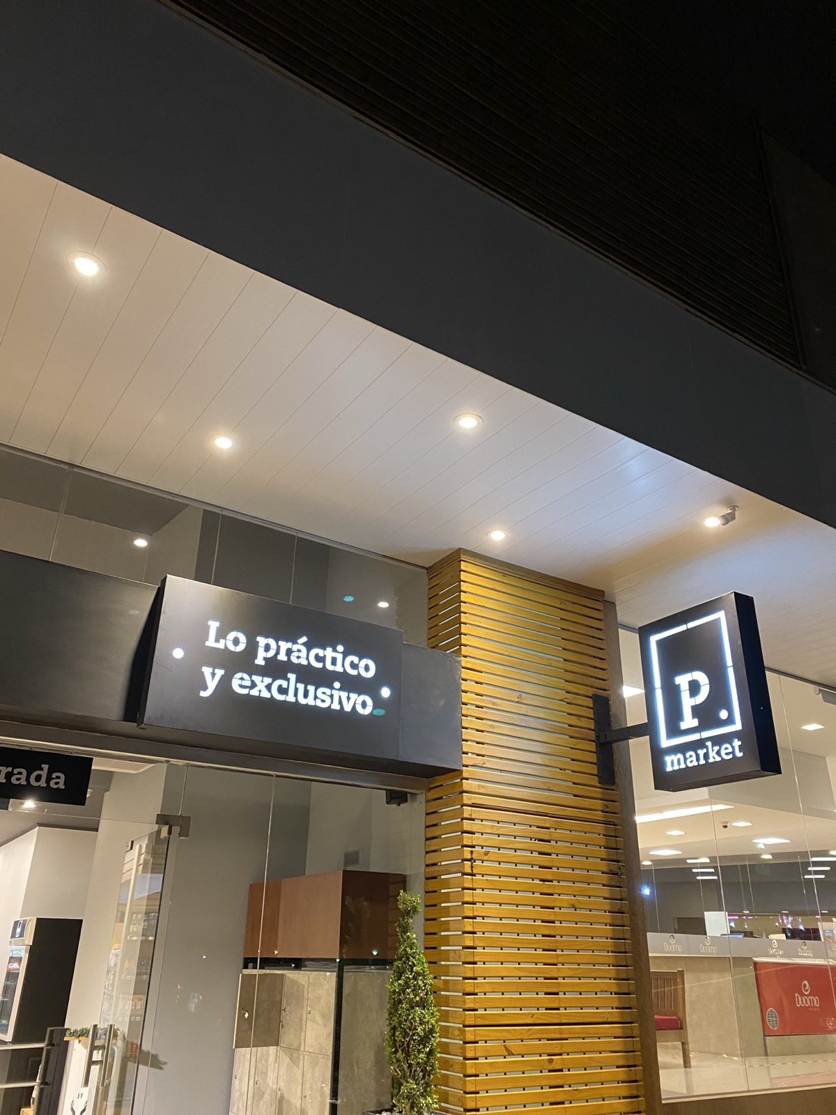
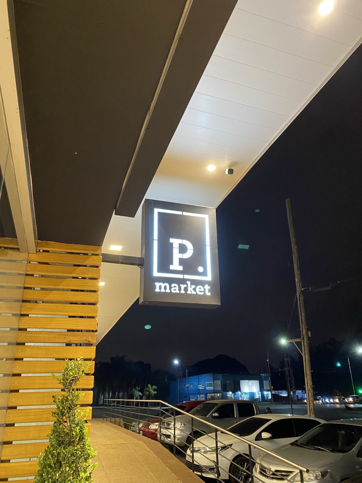
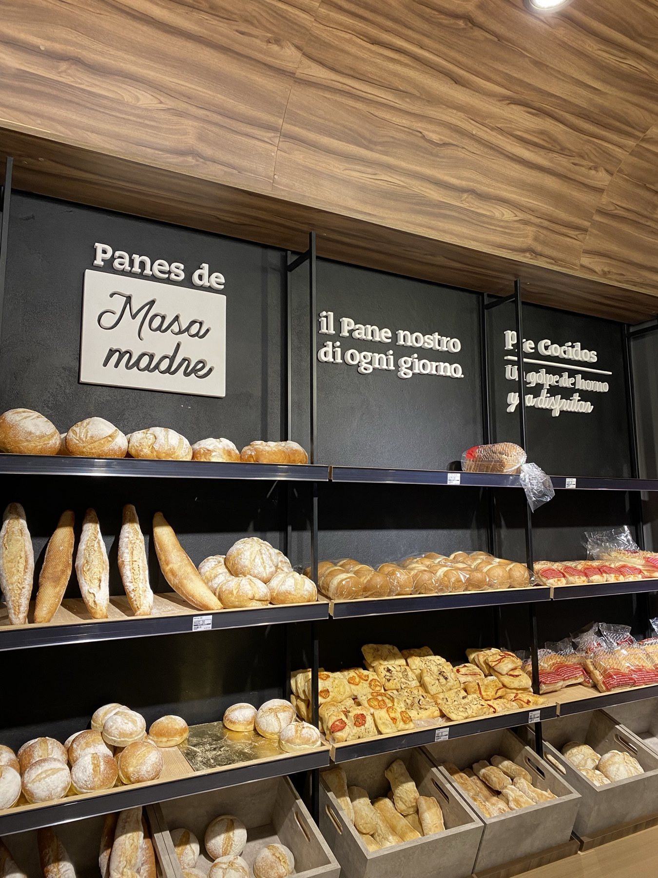
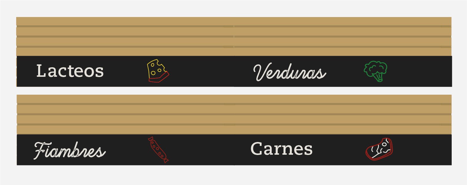
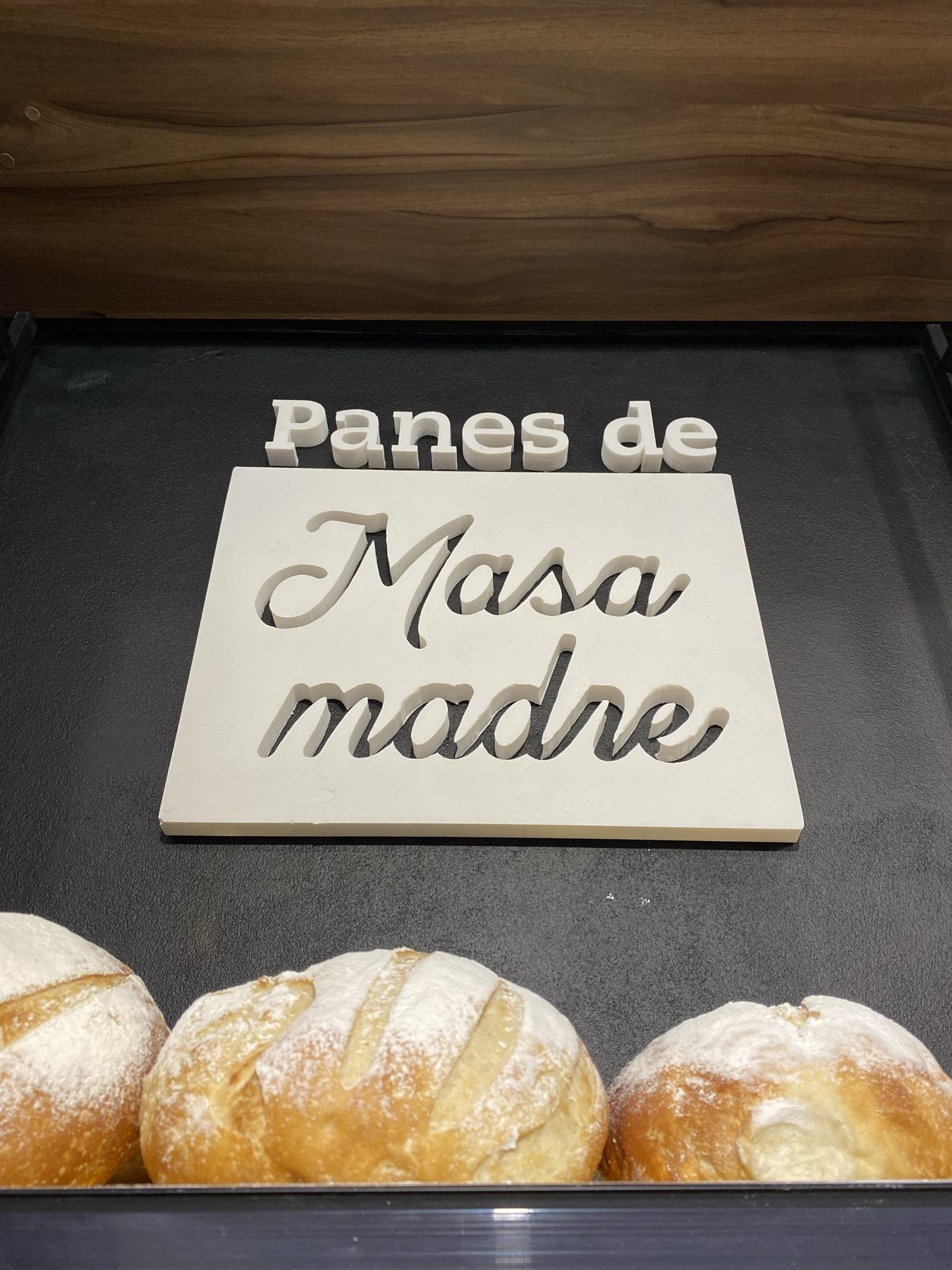
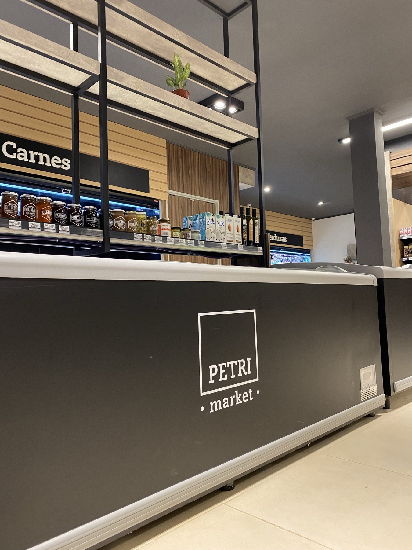
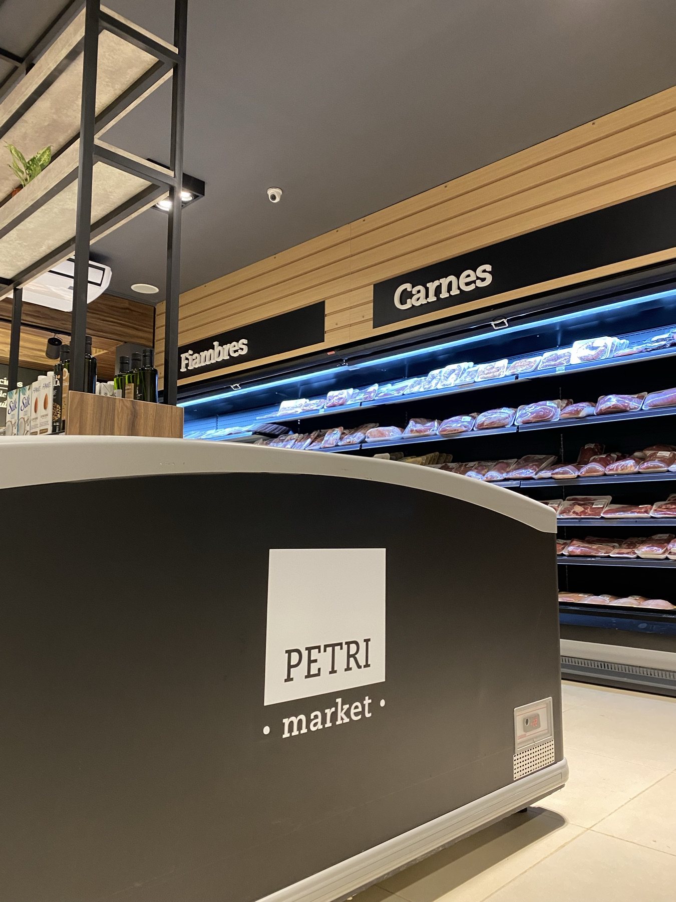
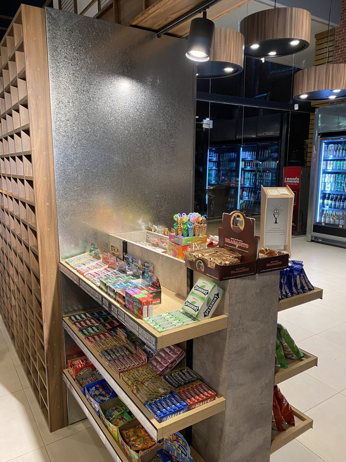
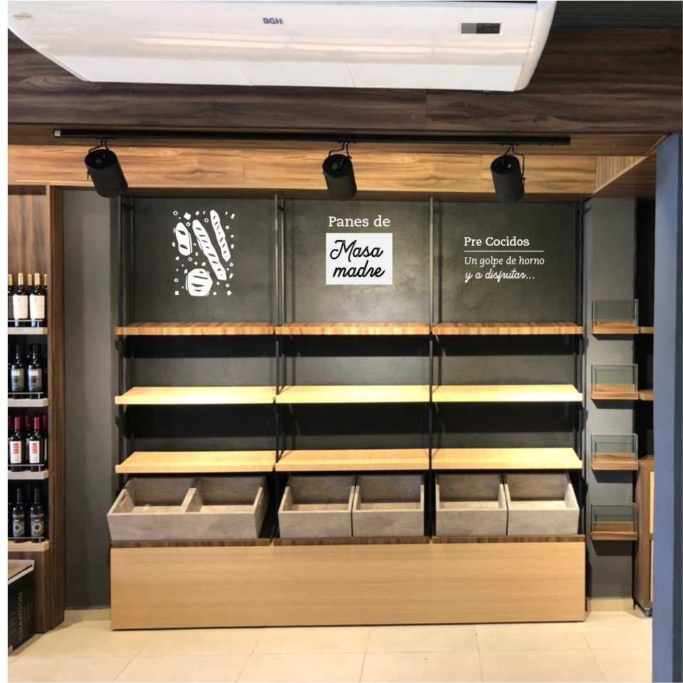
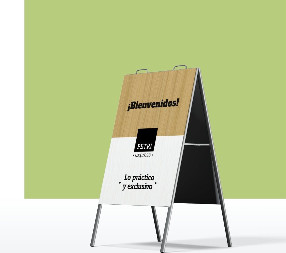
I designed the architectural facade — backlit signage, natural wood, and matte black steel — as well as interior navigational signage for dairy, produce, butchery, and sourdough bakery sections.
Collateral & Packaging
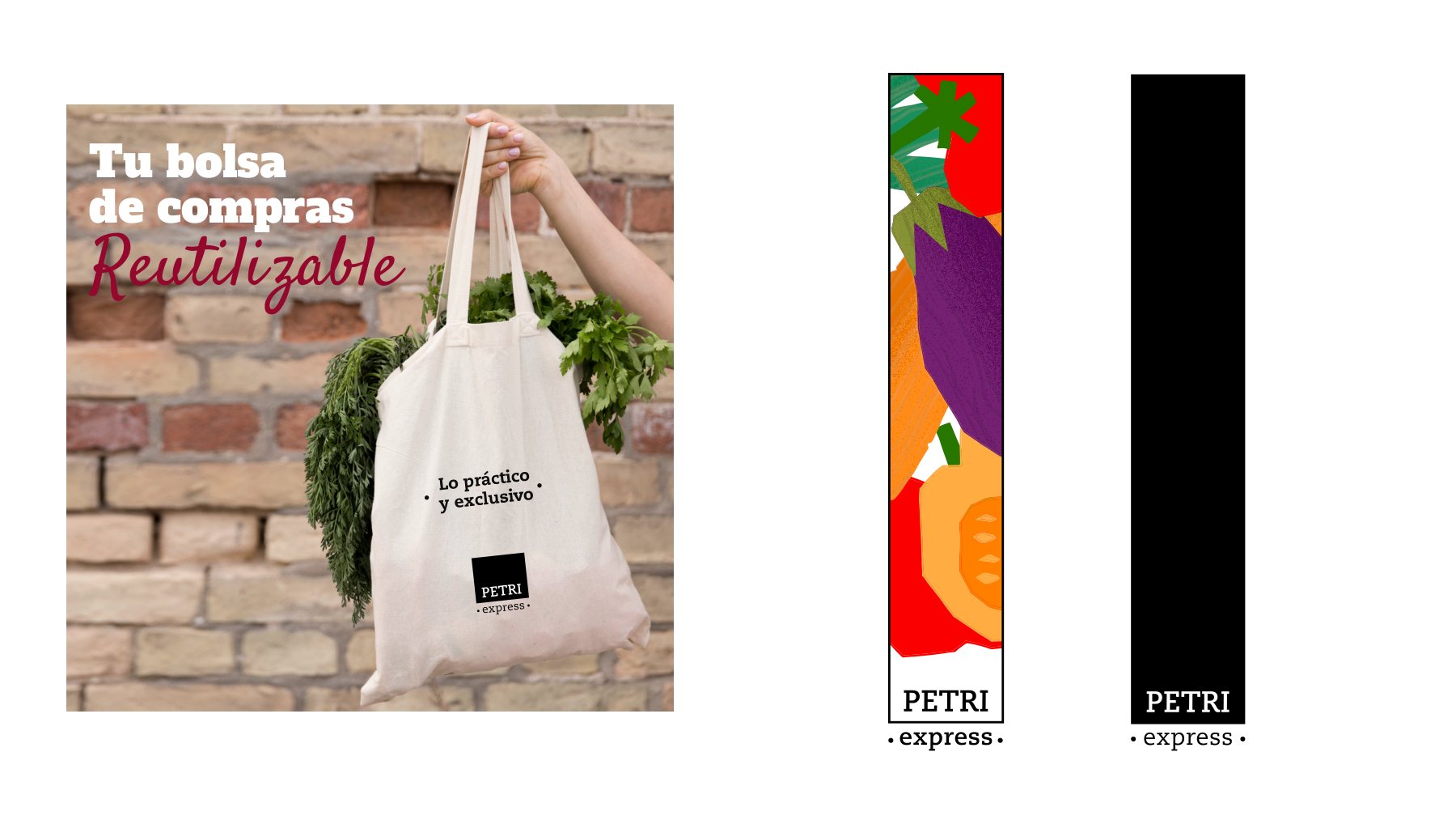
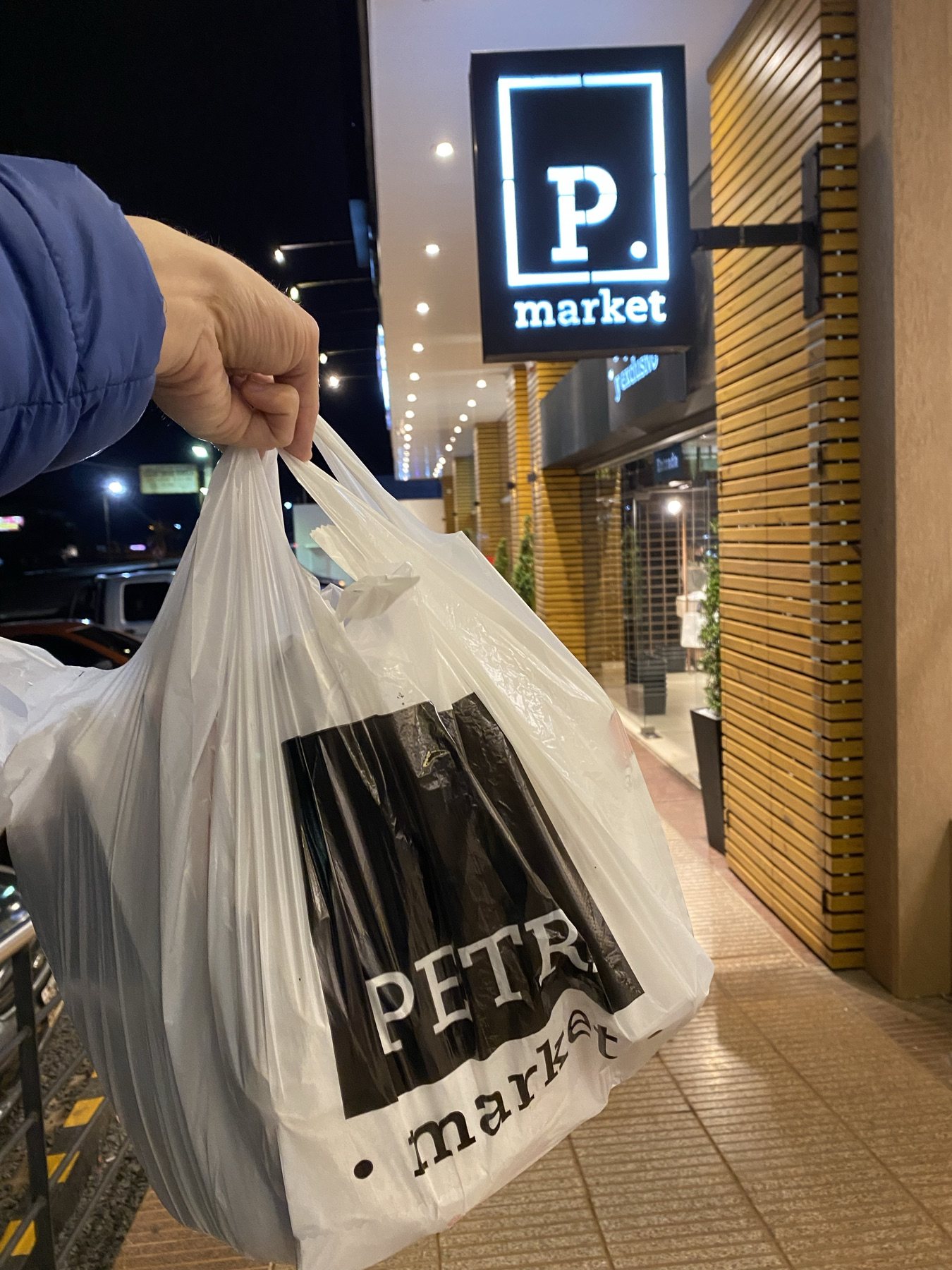
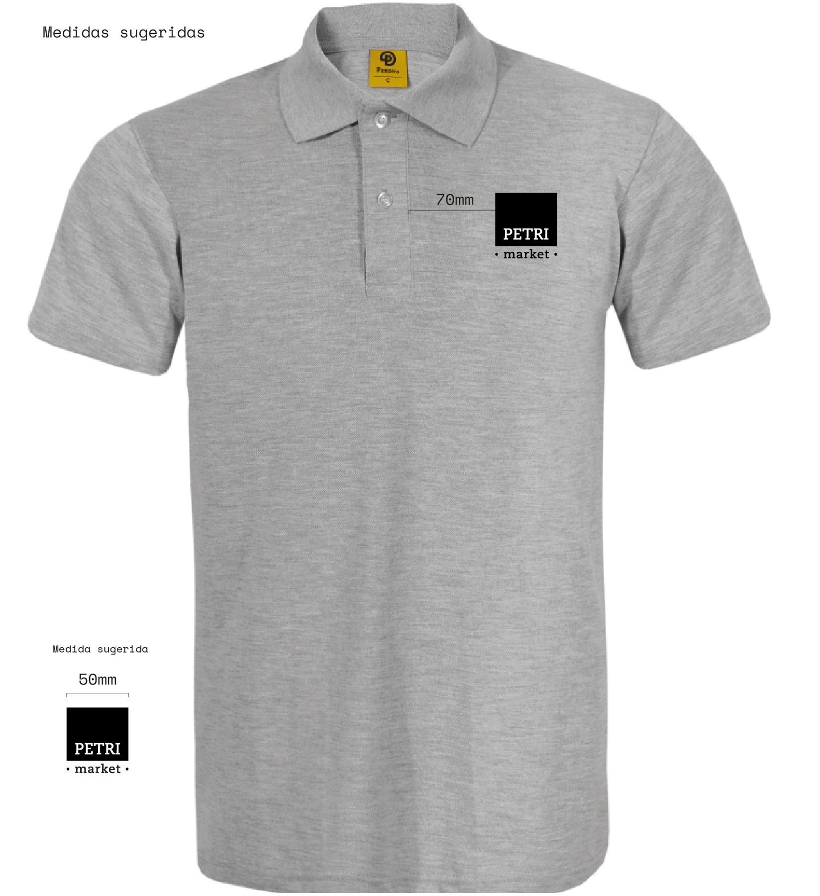
What customers carry and experience.

My role
From board strategy to the retail shelf.
Market analysis, positioning, brand identity, bespoke illustration system, storefront architecture, interior wayfinding, packaging, and opening campaign.
- Strategy
- Identity
- Illustration
- Environmental Design
- Signage
- Communication