Strategy · Identity · Retail · Packaging · Environmental graphics · Communications

Petri

A brand strategy truly delivers when it thrives across every format.

2022 — 2023

Bakery · Market · Posadas, Misiones

The starting point

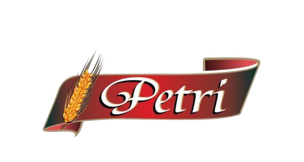
A beloved neighborhood bakery, with a visual identity trapped in the nineties.

Petri boasted 13 years of heritage, multiple busy locations in Posadas and Garupá, and dedicated patrons who cherished its product quality and warm service. However, its logo was visually cluttered, relied on complex process printing, and failed to reflect its true commercial growth.

The initial audit recommended bold intervention: distilling the mark to its core essence without losing the warmth people already recognized.
Brand platform

Close to our community. Close every single day.

The strategy structured Petri's natural strengths —freshness, service, accessibility— into a direct consumer promise. The historical family motto in Italian was preserved as a tribute to its immigrant roots.

Tagline

Close every single day.

Il pane nostro di ogni giorno

Mission

To deliver artisanal quality across all products, honoring customer trust while continuously elevating friendly, attentive service.

Values

  • Integrity
  • Accountability
  • Quality
  • Respect
  • Attentive care

Visual identity

A distinctive seal designed for quick reading across any medium.

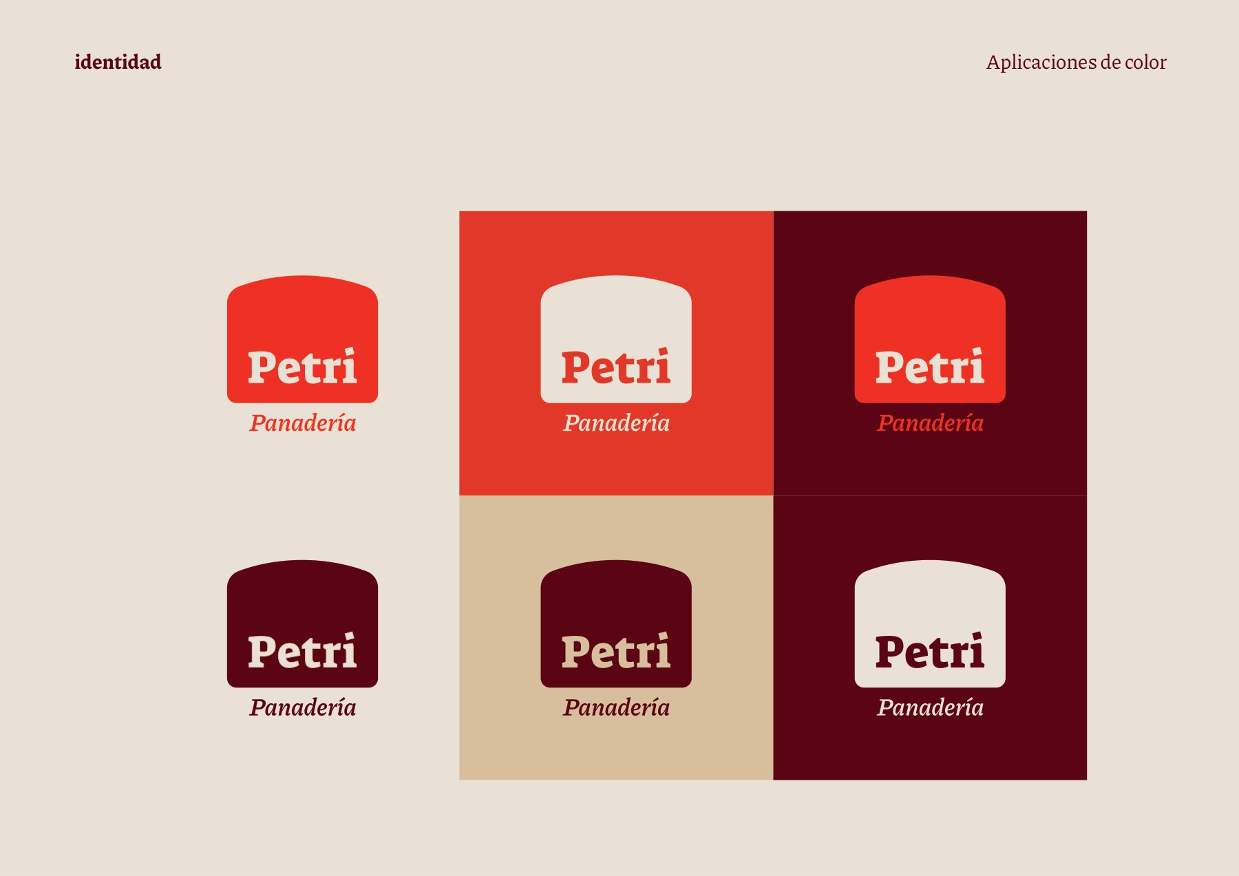
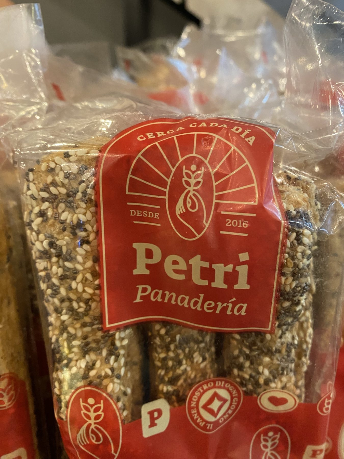
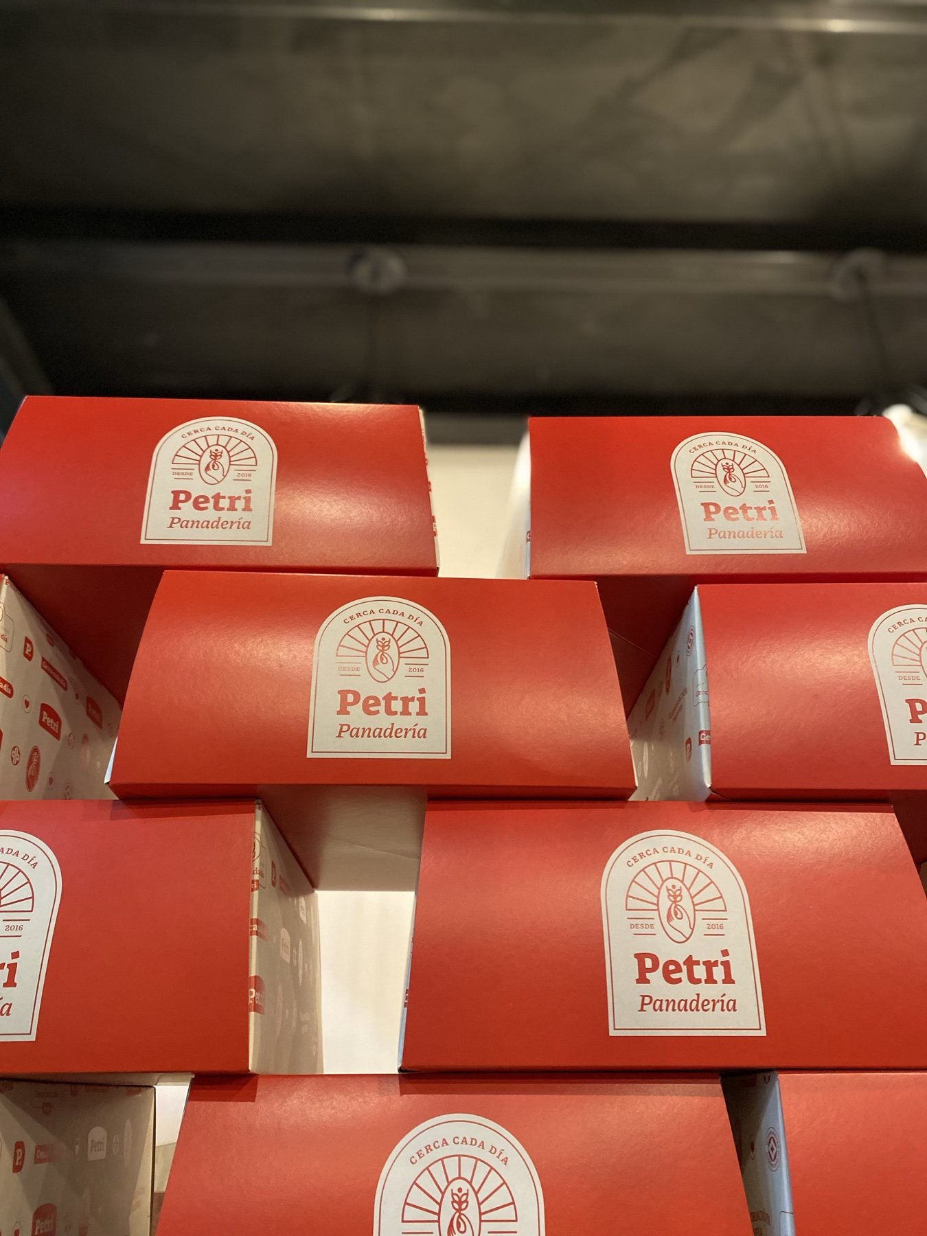
The silhouette of a traditional bakery oven tray holds the wordmark, paired with warm serif typography reflecting artisanal craft. A concise palette —Petri red, cream, gold, and burgundy— ensures punchy reproduction even in 1- or 2-color print runs.

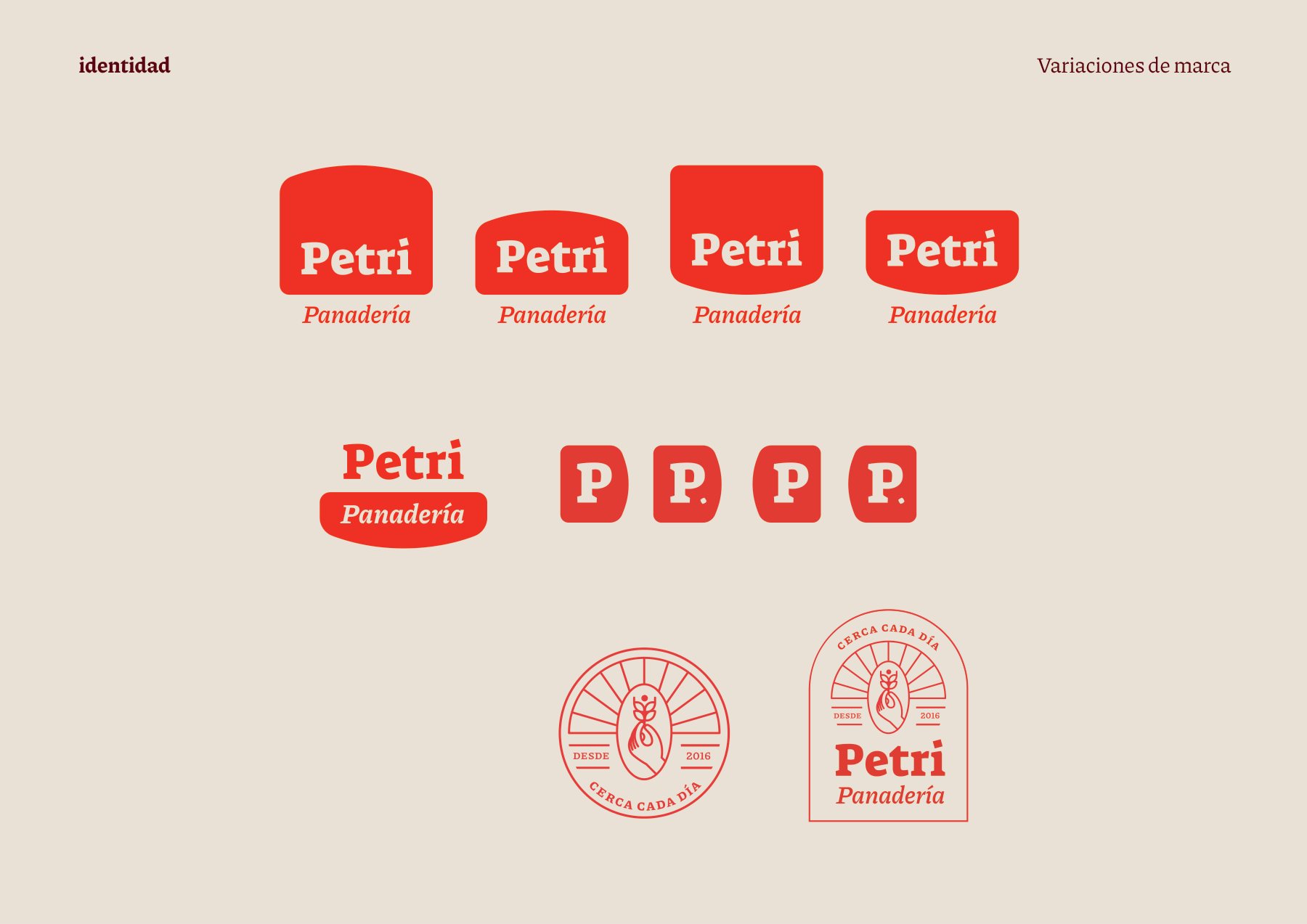
Arch seal
Since 2016
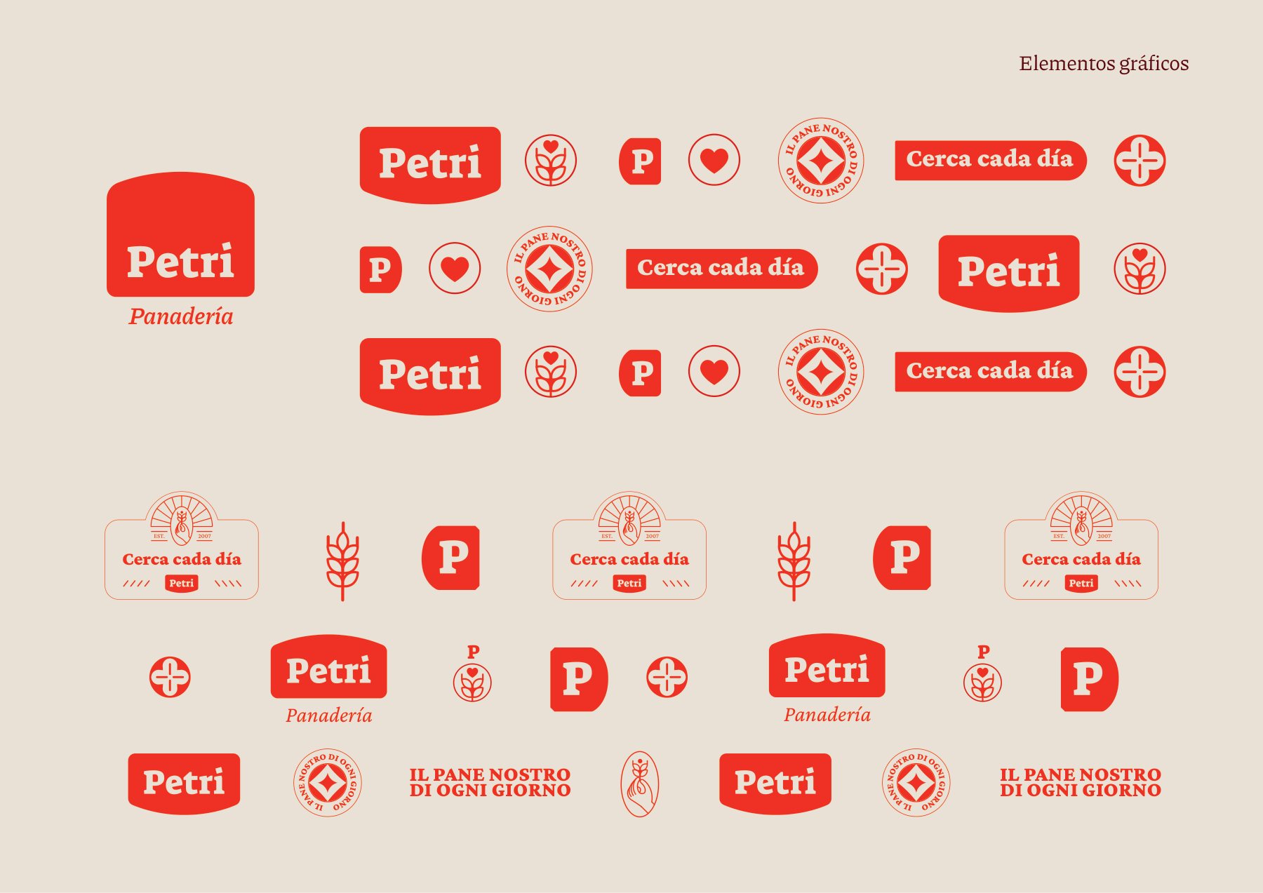
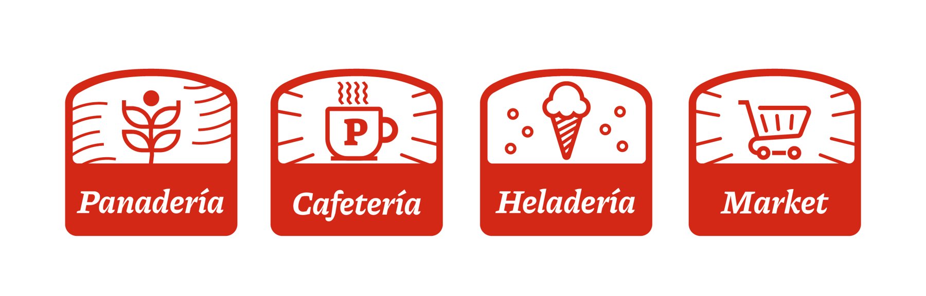
Symbol set
AaCerca cada díaPiazzolla · Suez One · Apfel Grotezk
Typography
Crema
#EDE5D8
Harina
#D7C3A0
Rojo Petri
#E23829
Dorado
#FBC33C
Bordó
#5B0414
Sistema de elementos
Visual system
Variaciones de marca
Lockup variants
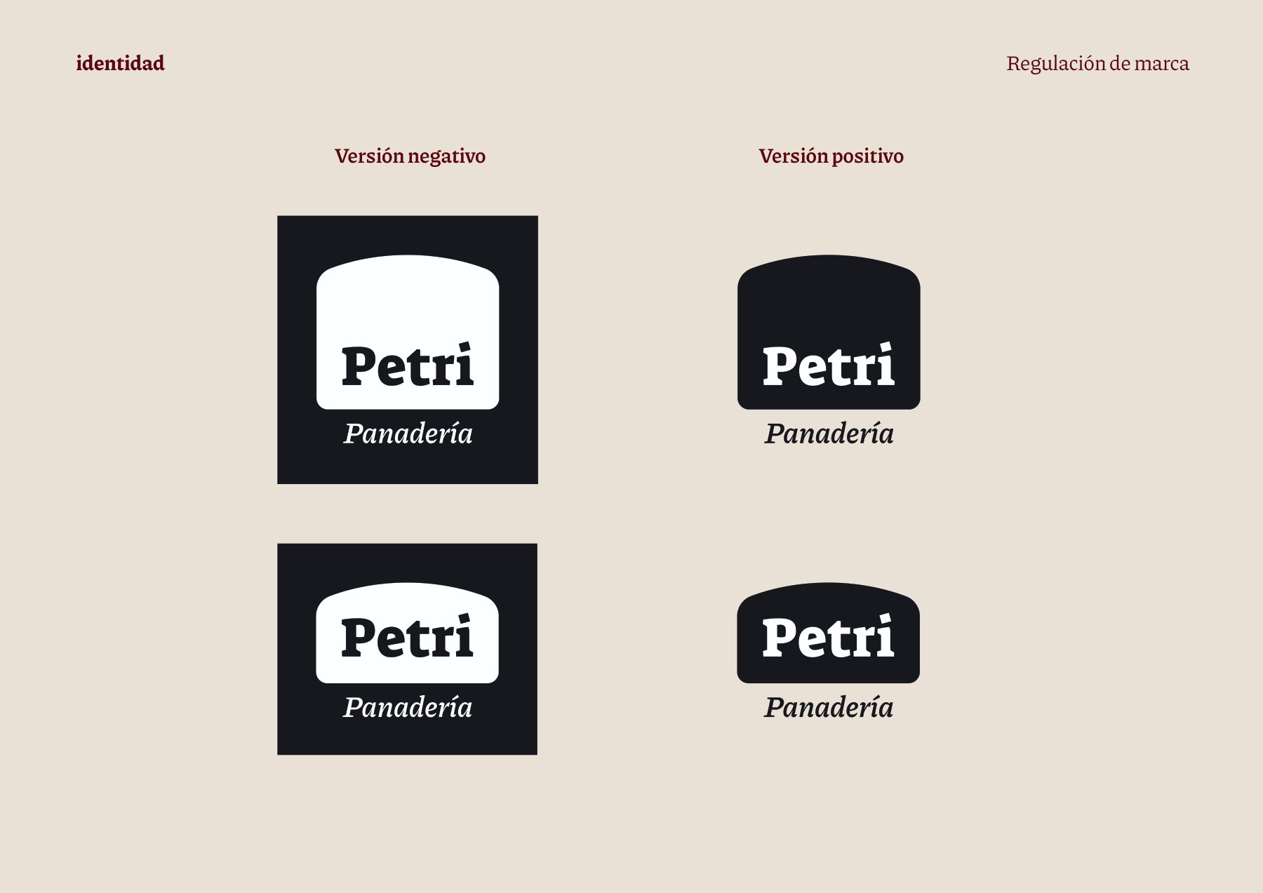
Versiones negativo y positivo
Negative · positive
Pattern
Aplicaciones de color
Color applications

Patterns

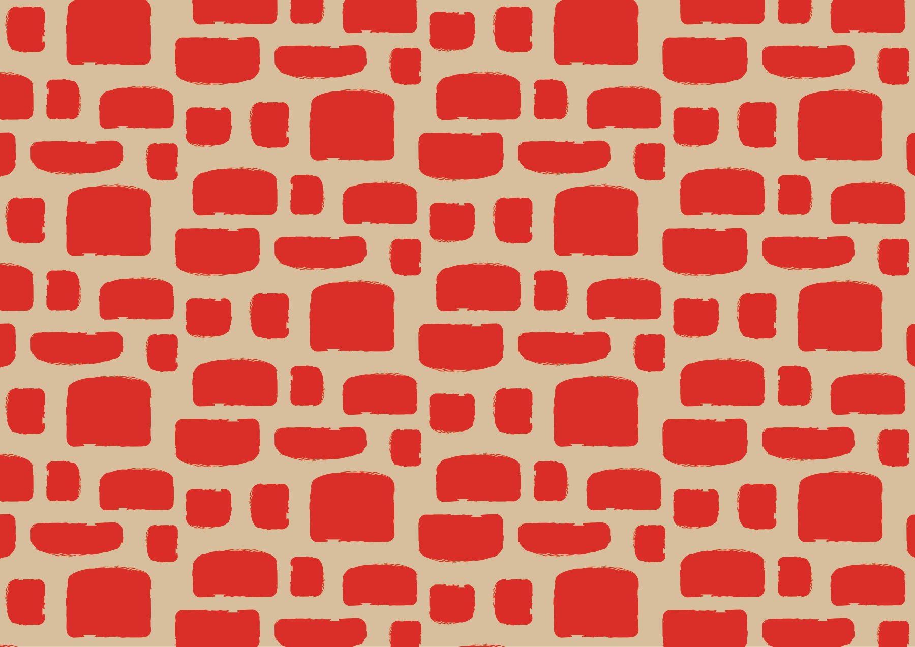
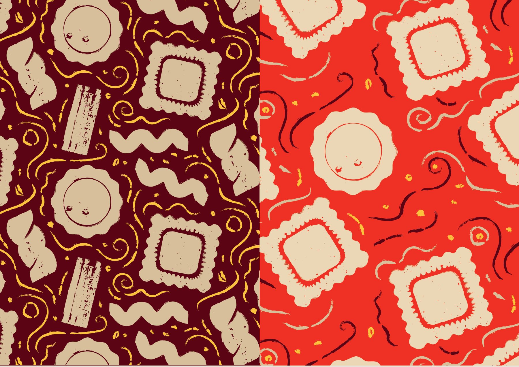
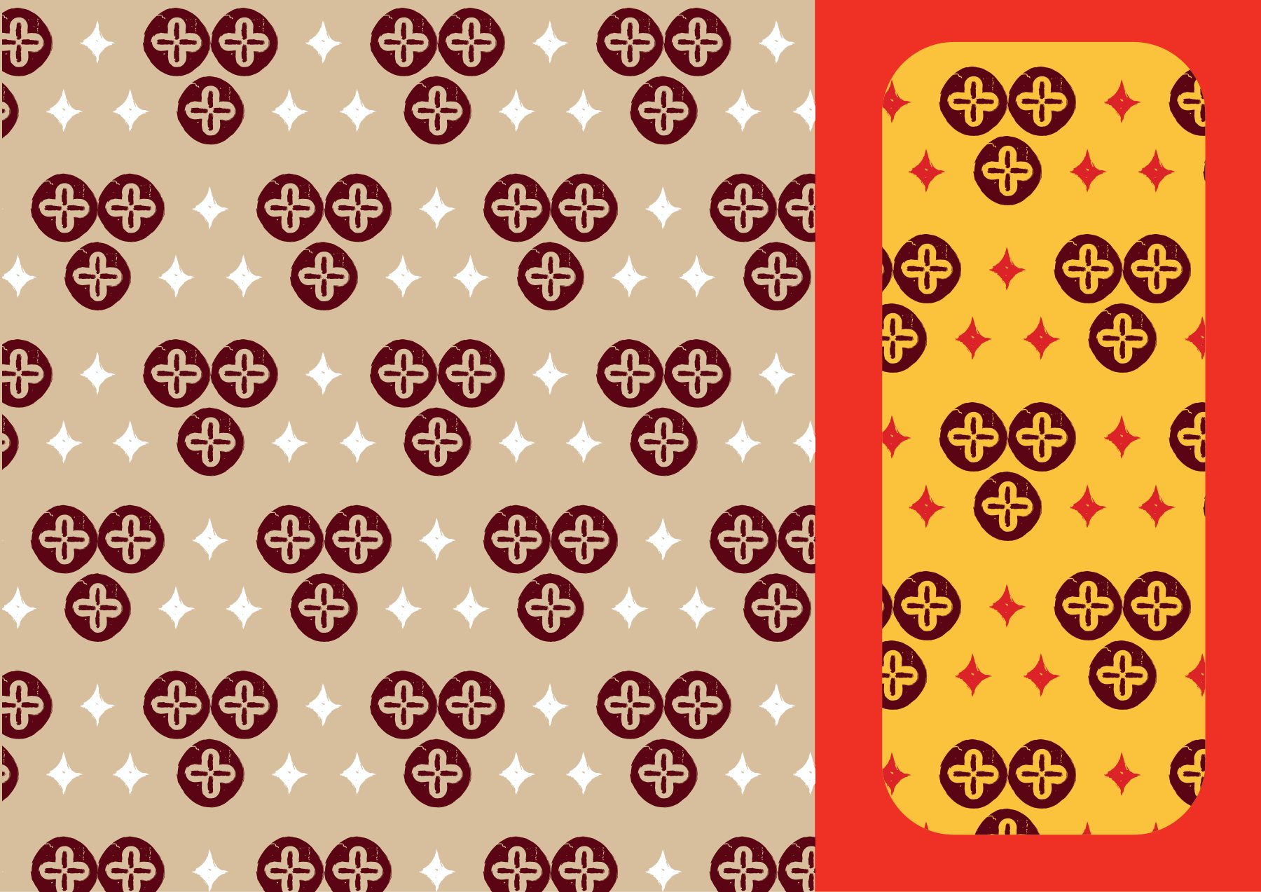
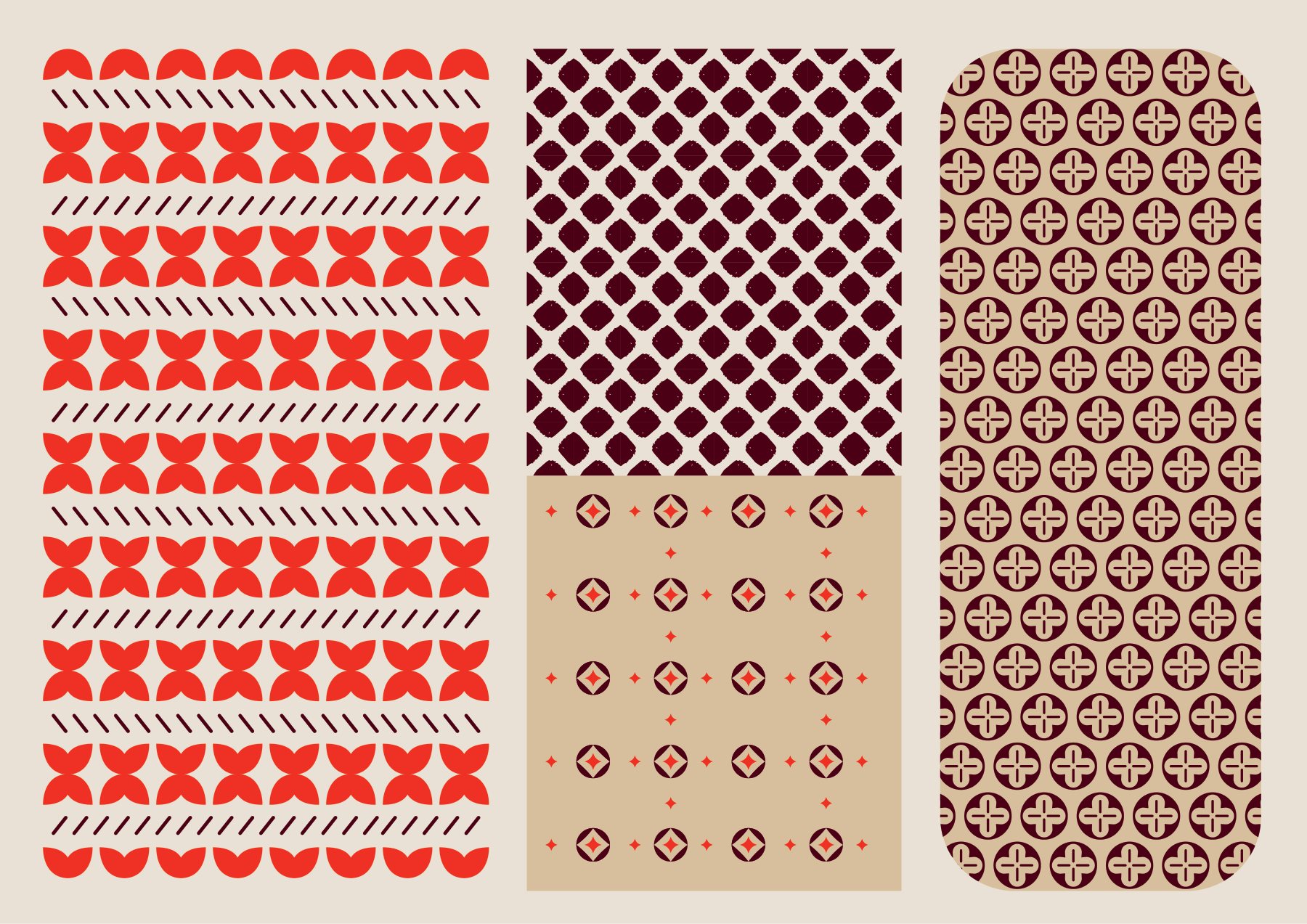
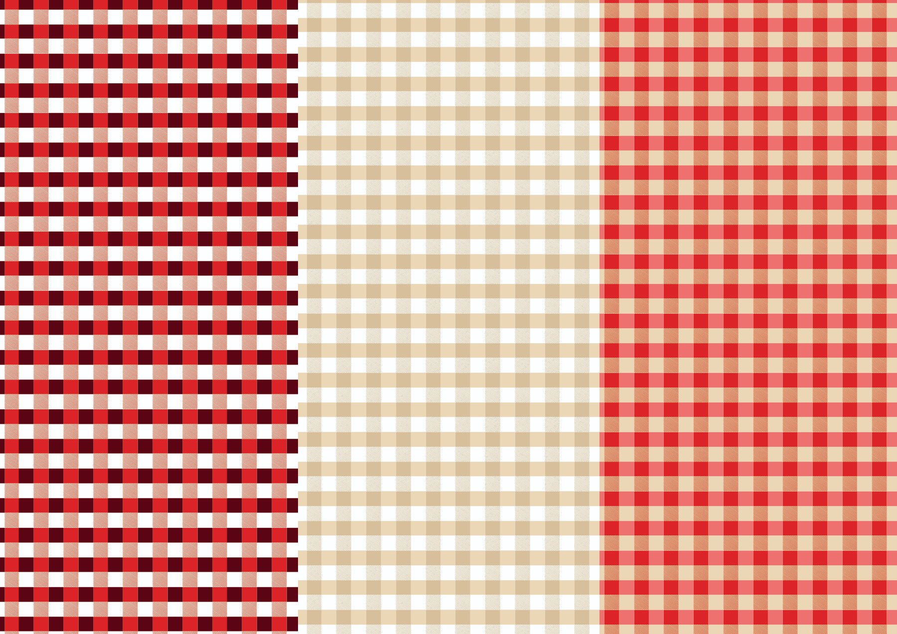
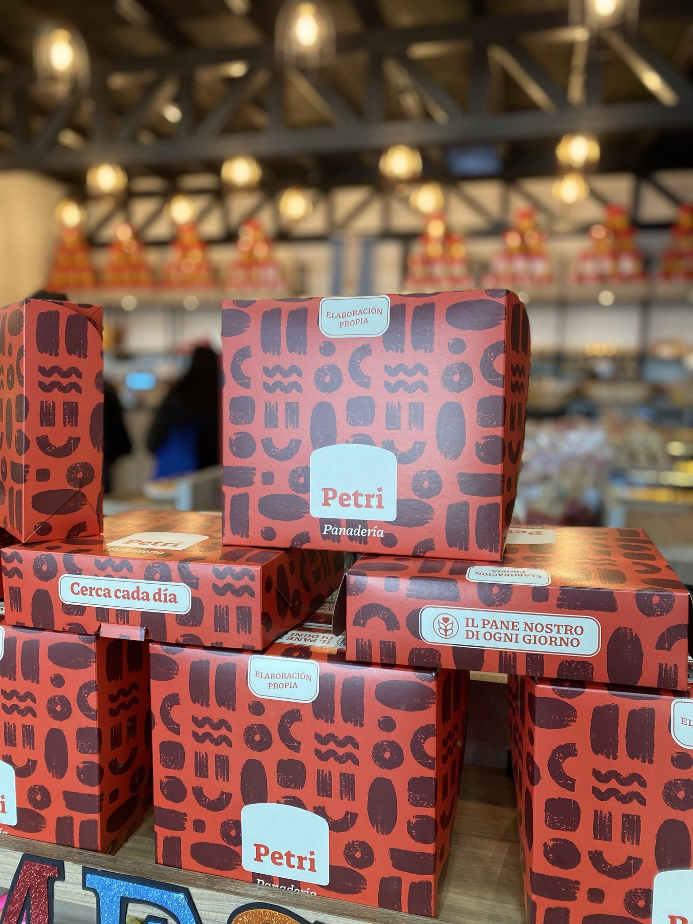
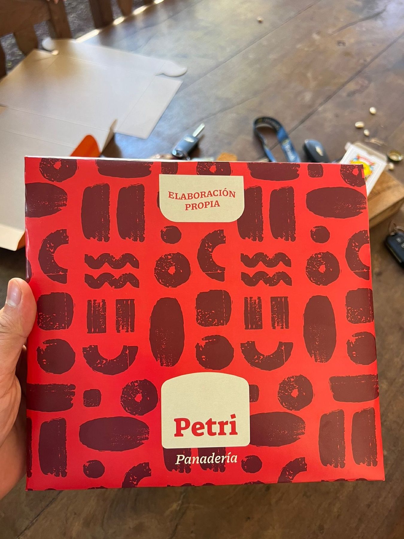
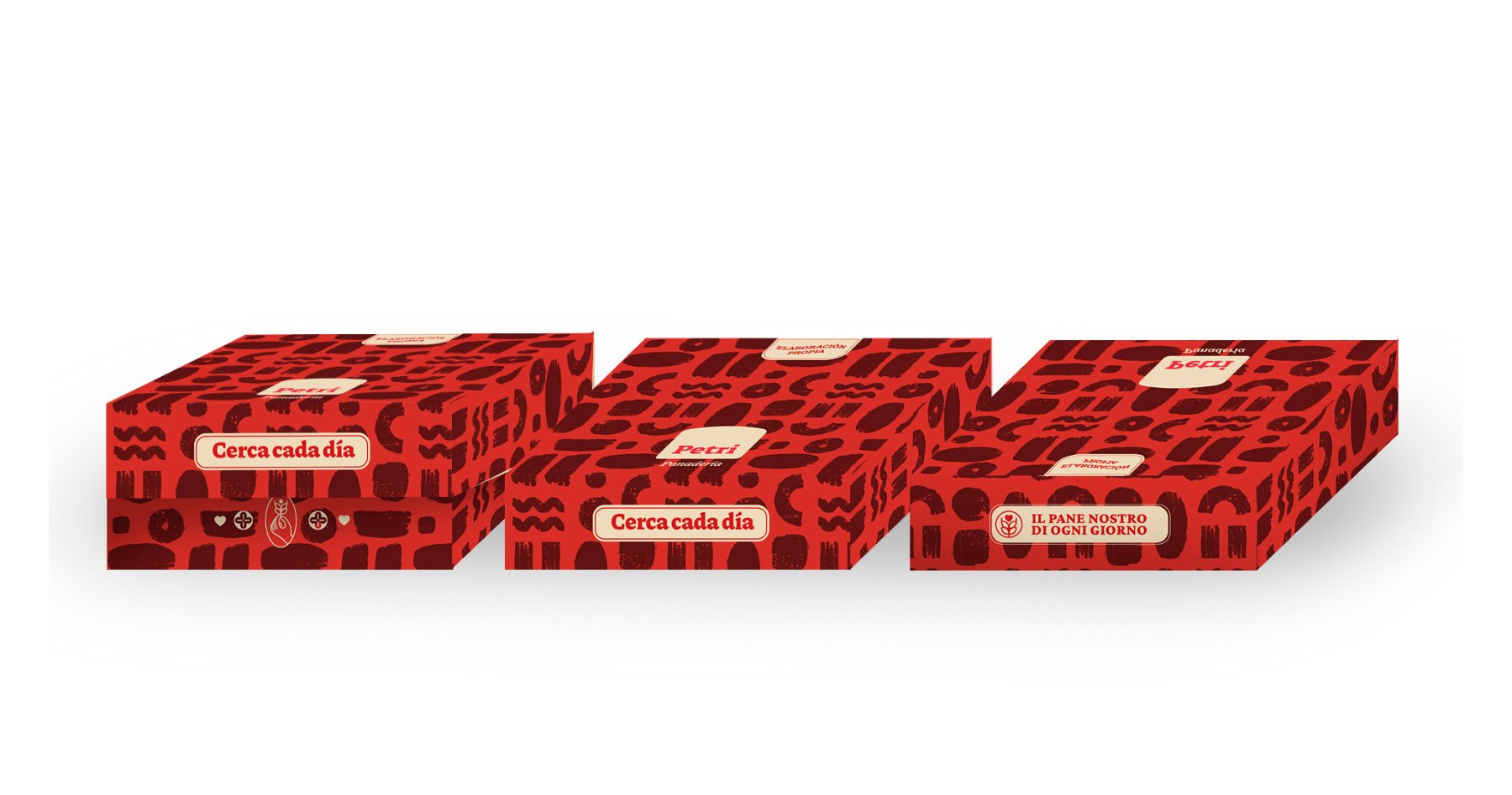
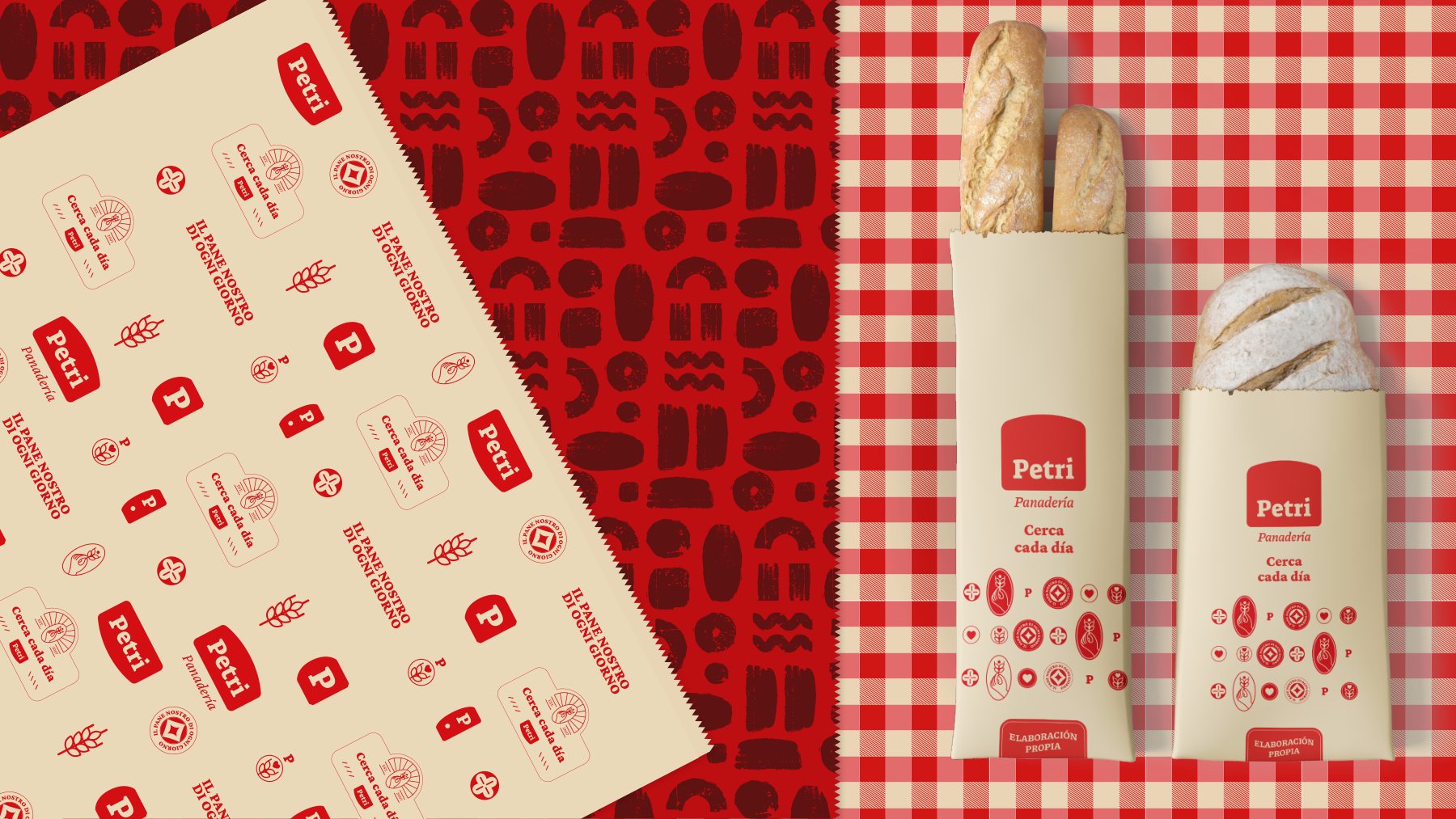
Bread loaves, pasta ribbons, and picnic tablecloths: neighborhood bakery warmth turned into an iconic geometric pattern.

Packaging design

The brand that families bring back home.

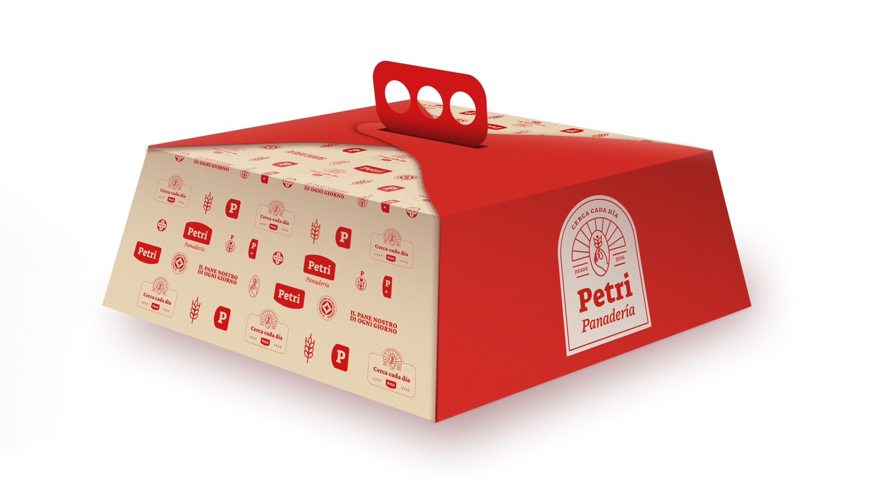
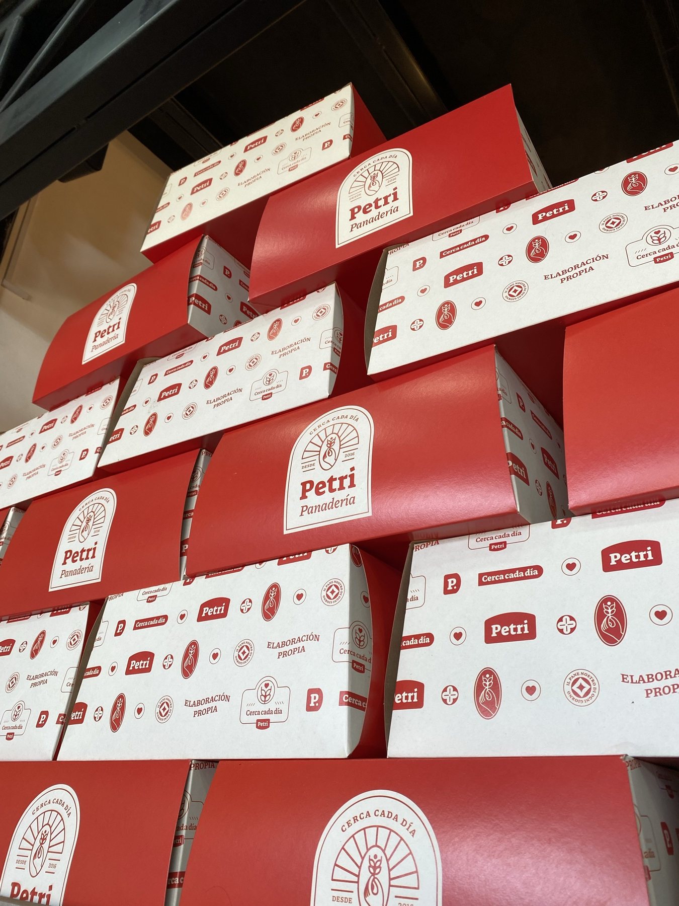
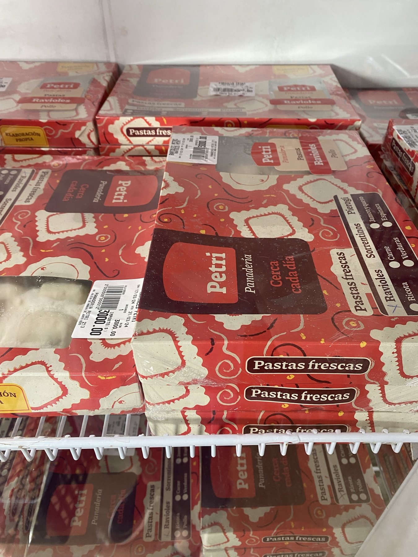
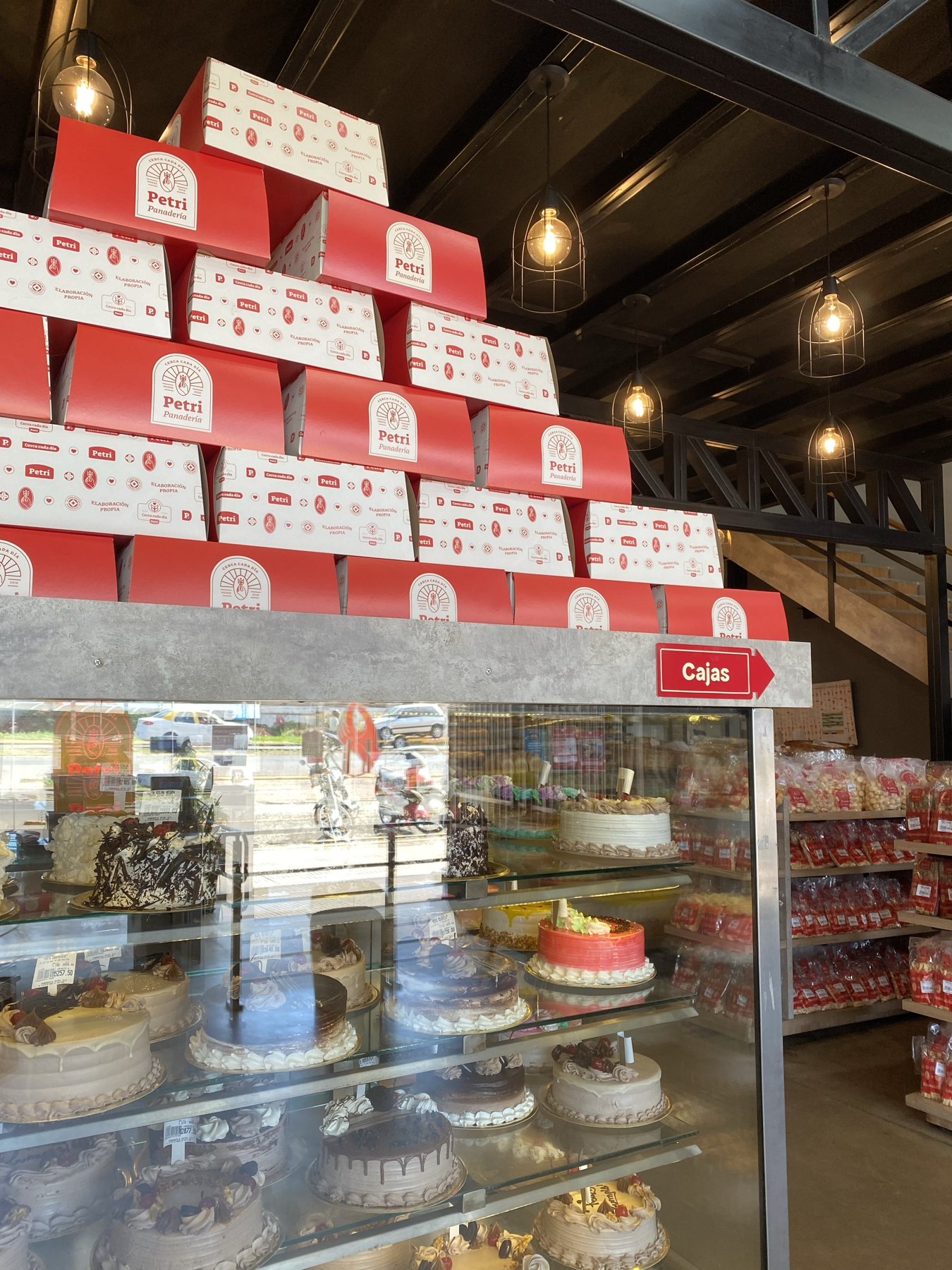
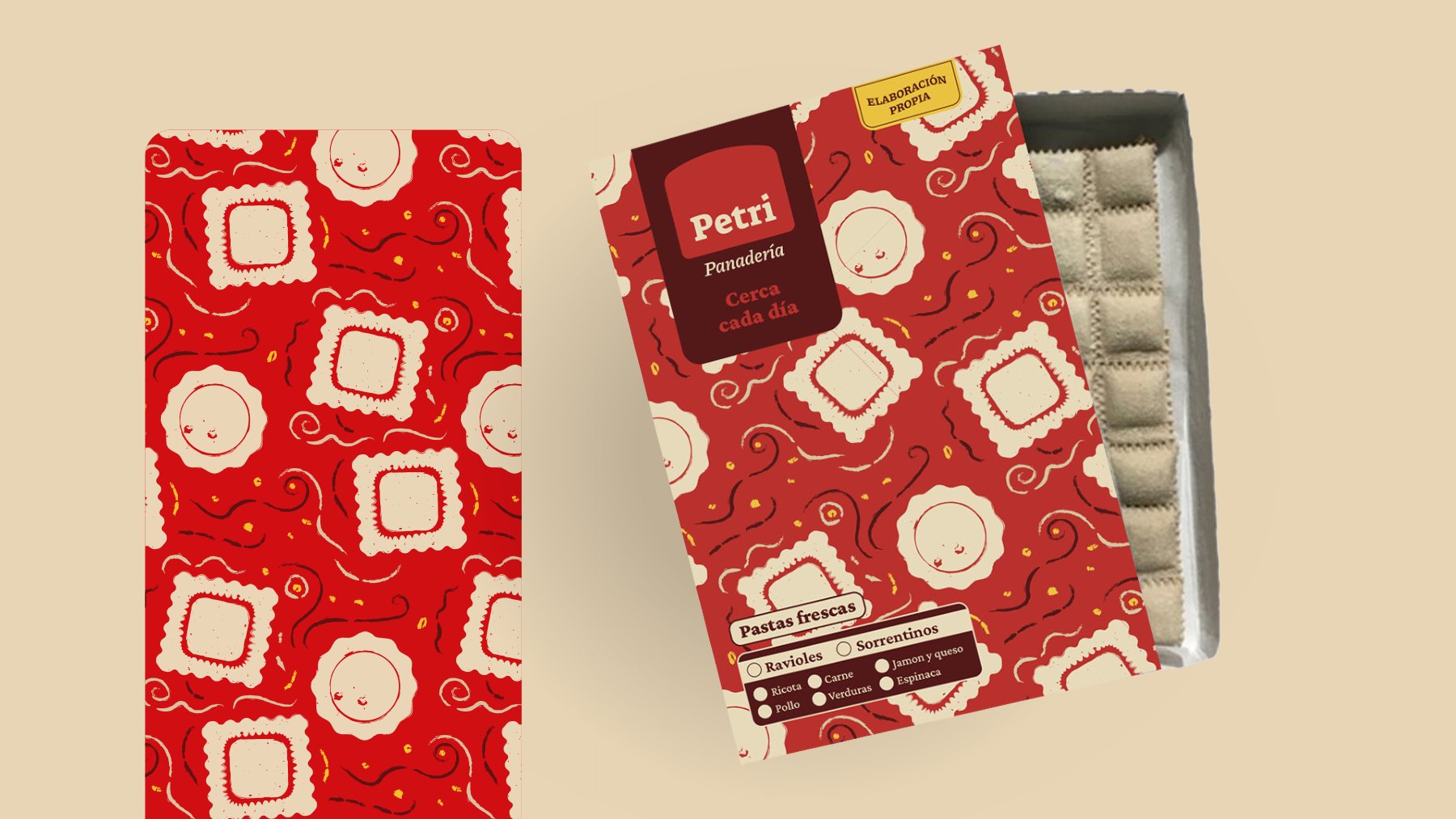
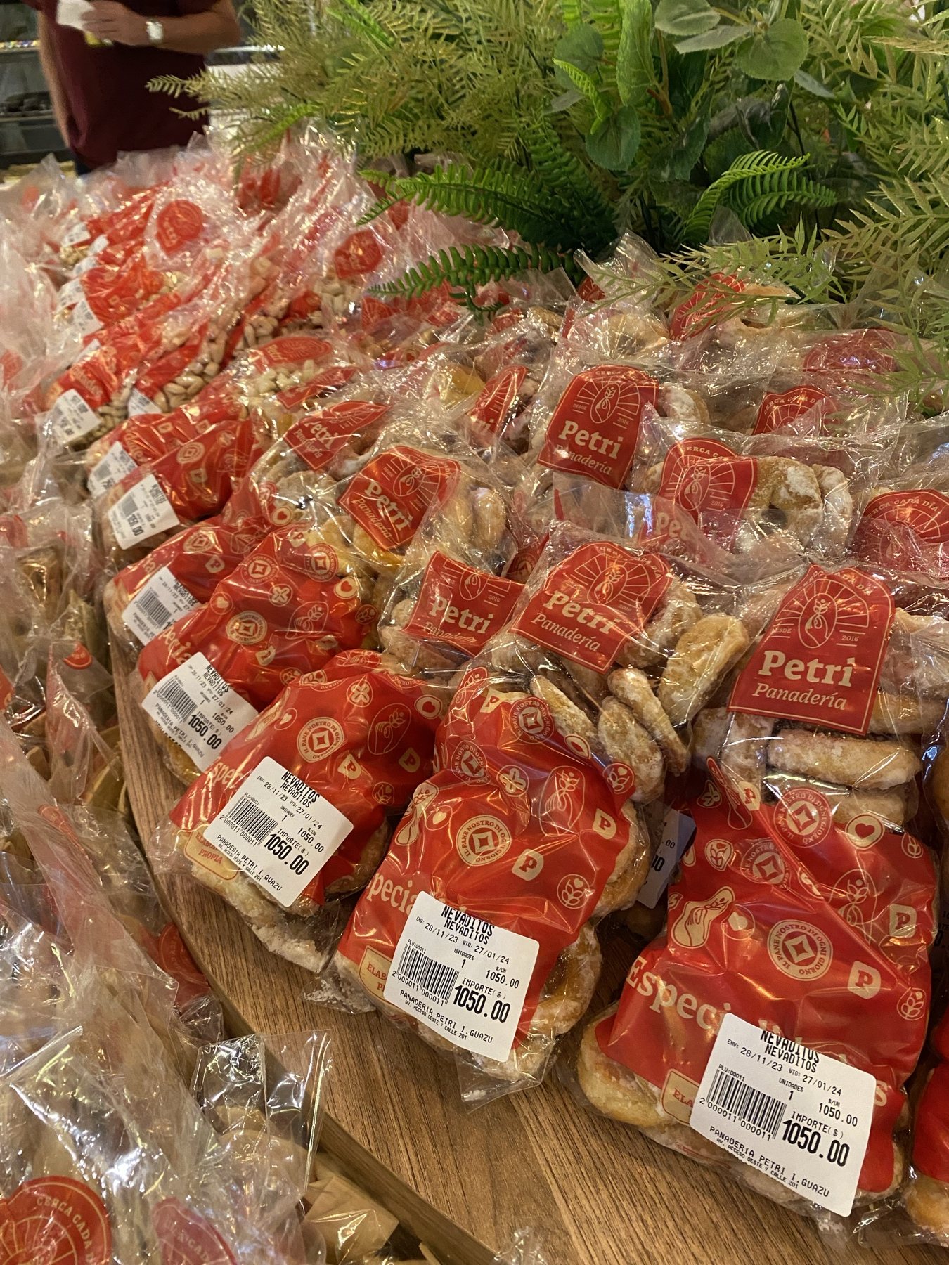
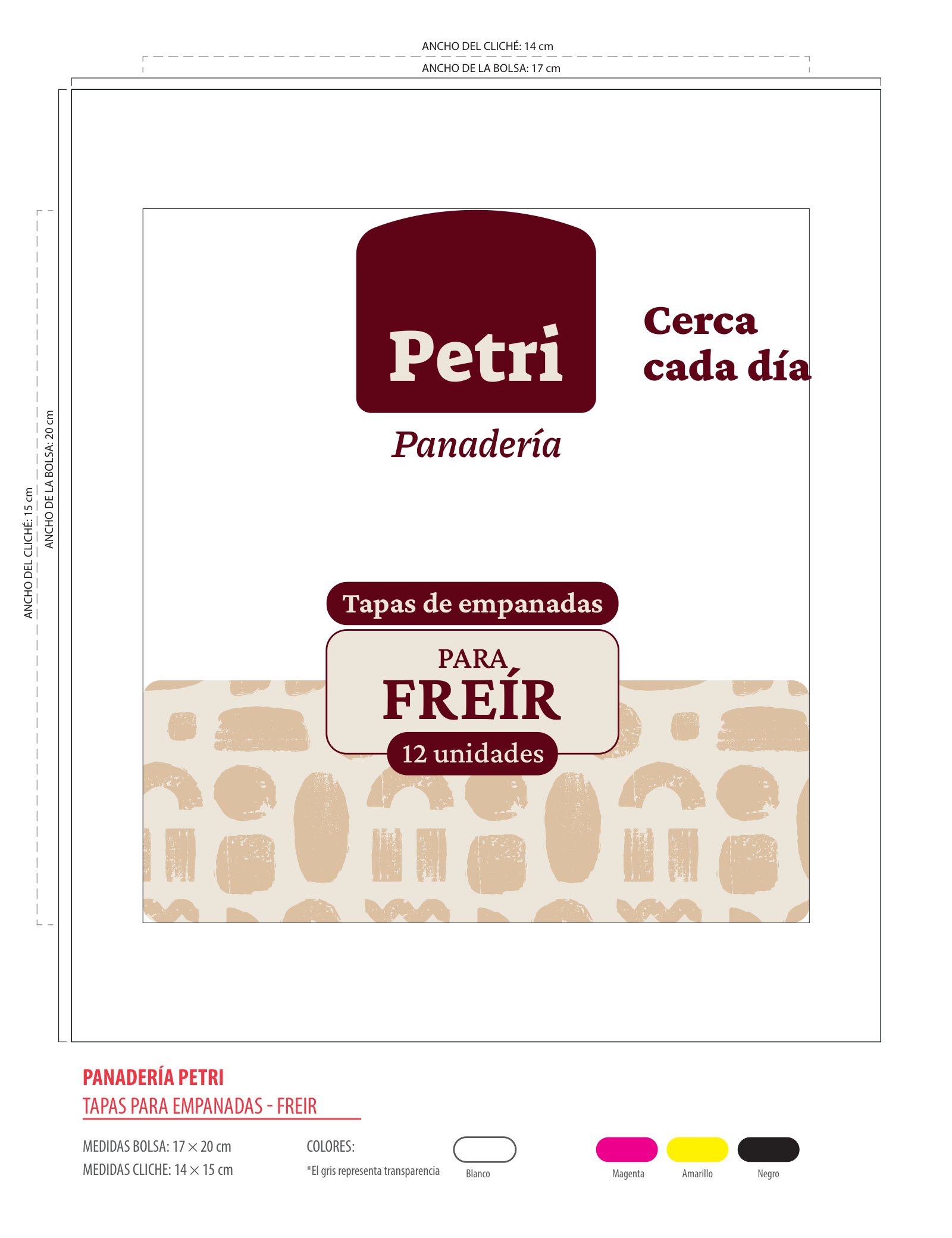
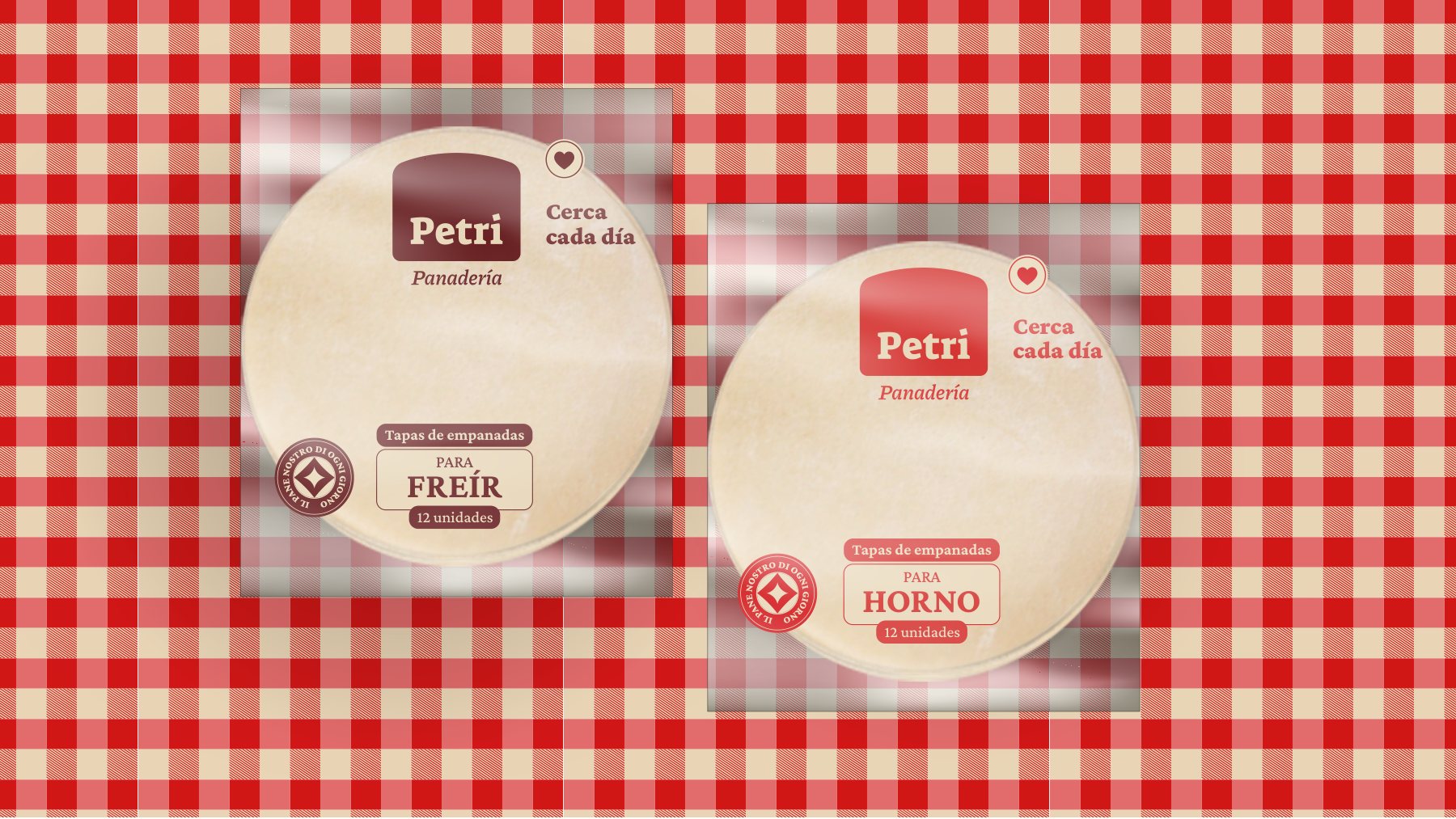
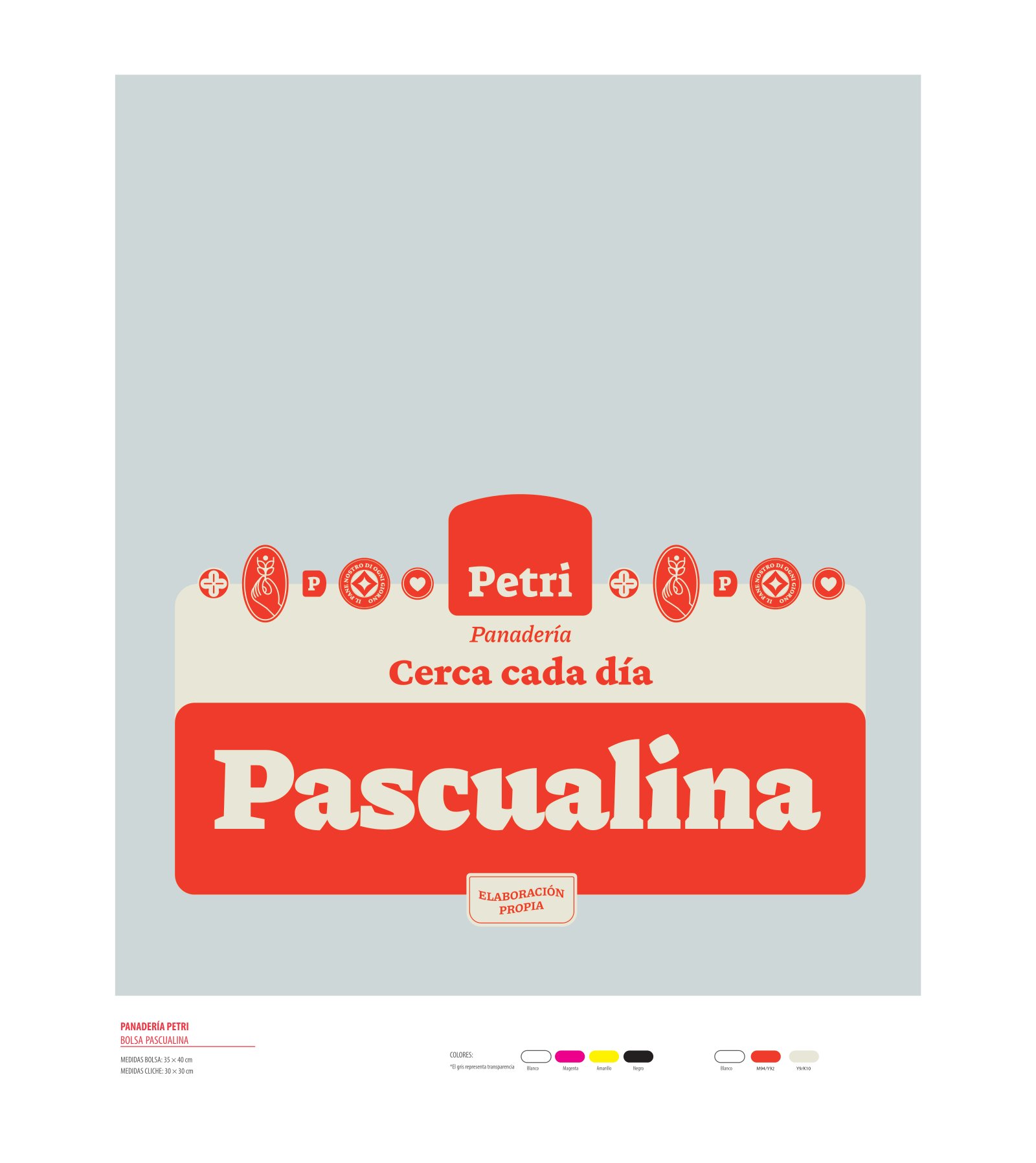
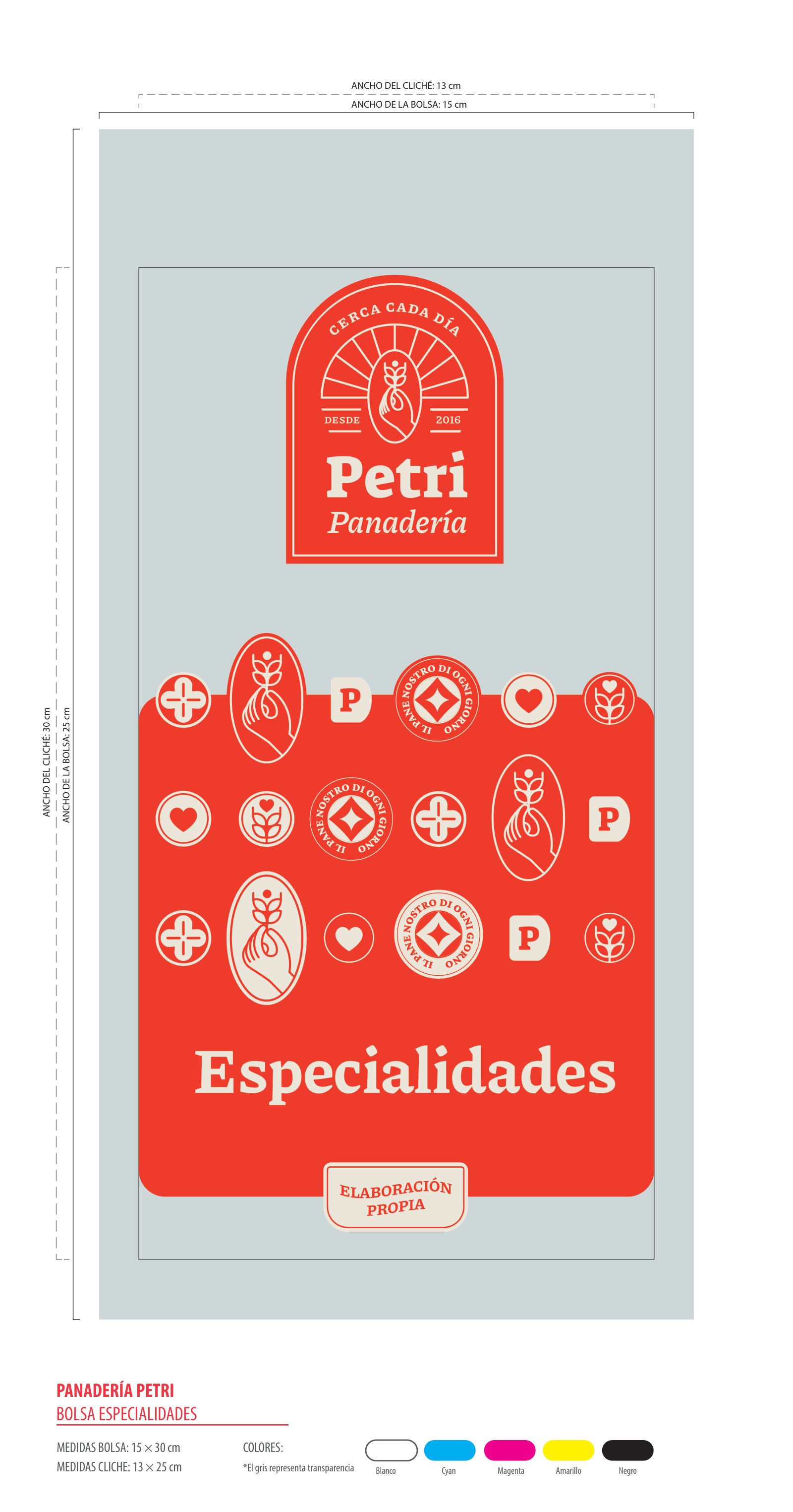
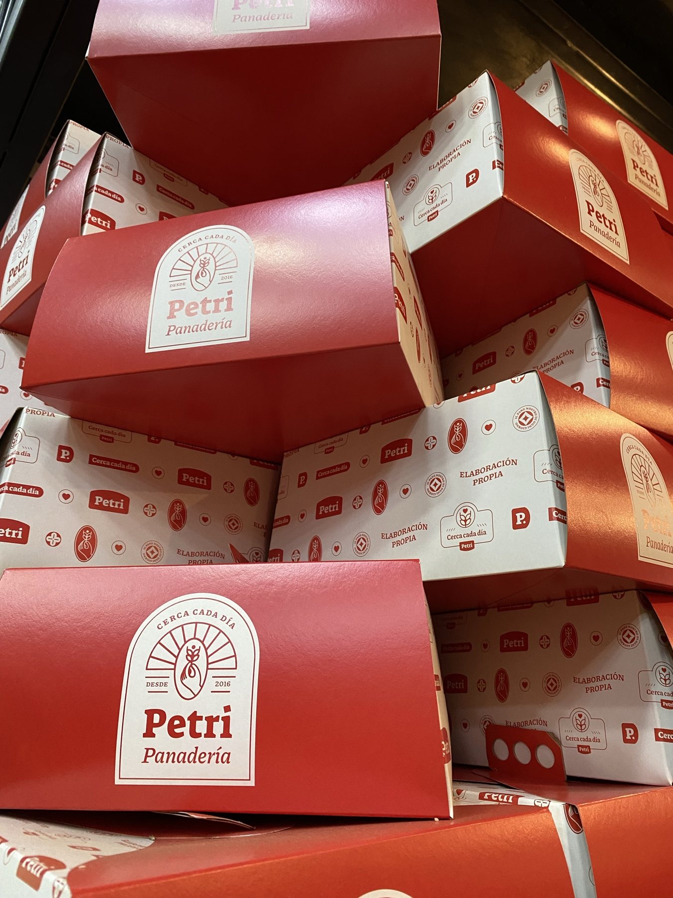
Boxes, paper bags, and wrappers for each distinct product category. A unified die-cut template accommodates four pattern variants by specialty, unified by the Petri seal.
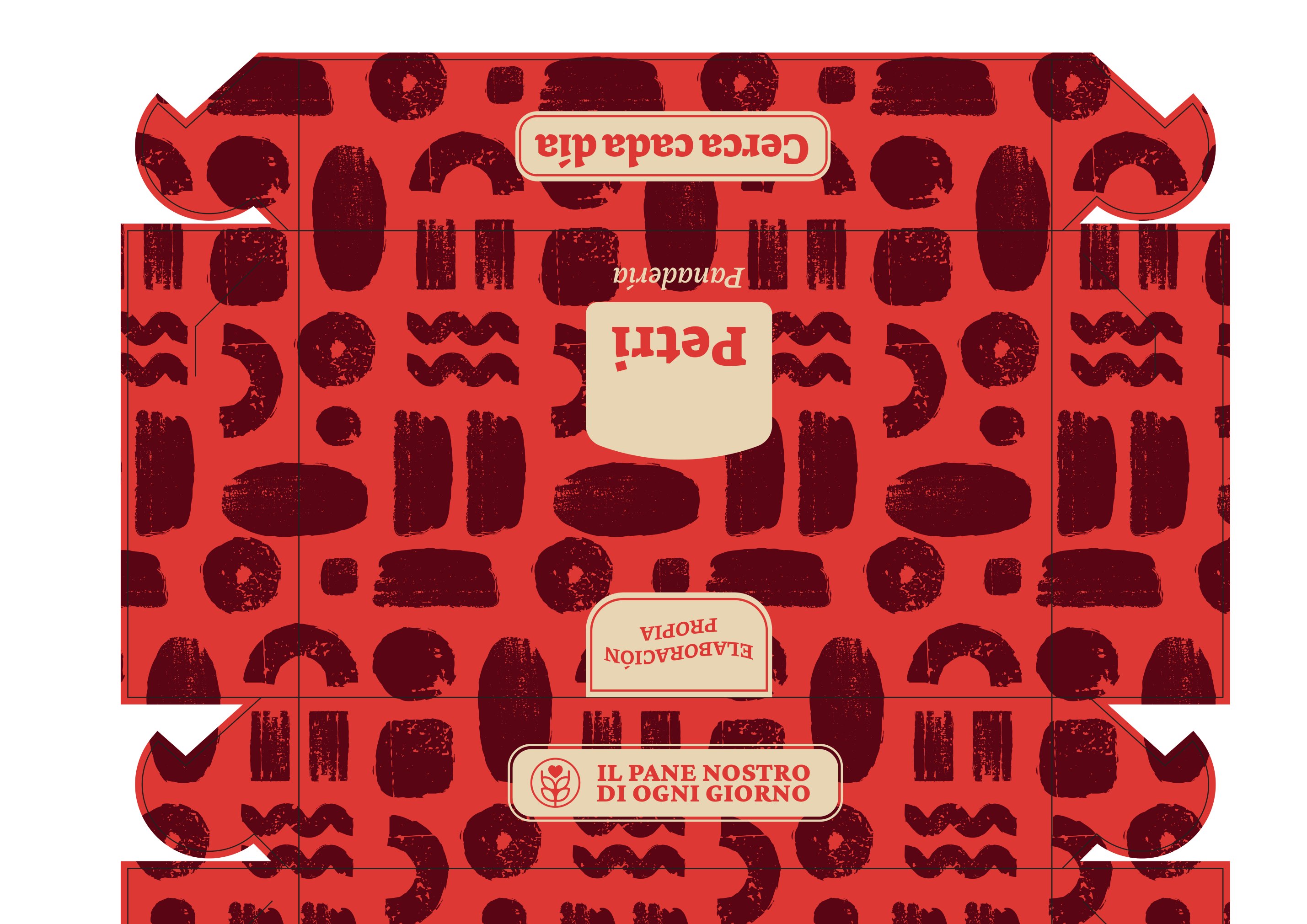
Troquel impreso de la caja
Technical die-cut mechanical
From blueprint to carton · 686 × 425 × 156 mm die-cut
Cake boxes · in store
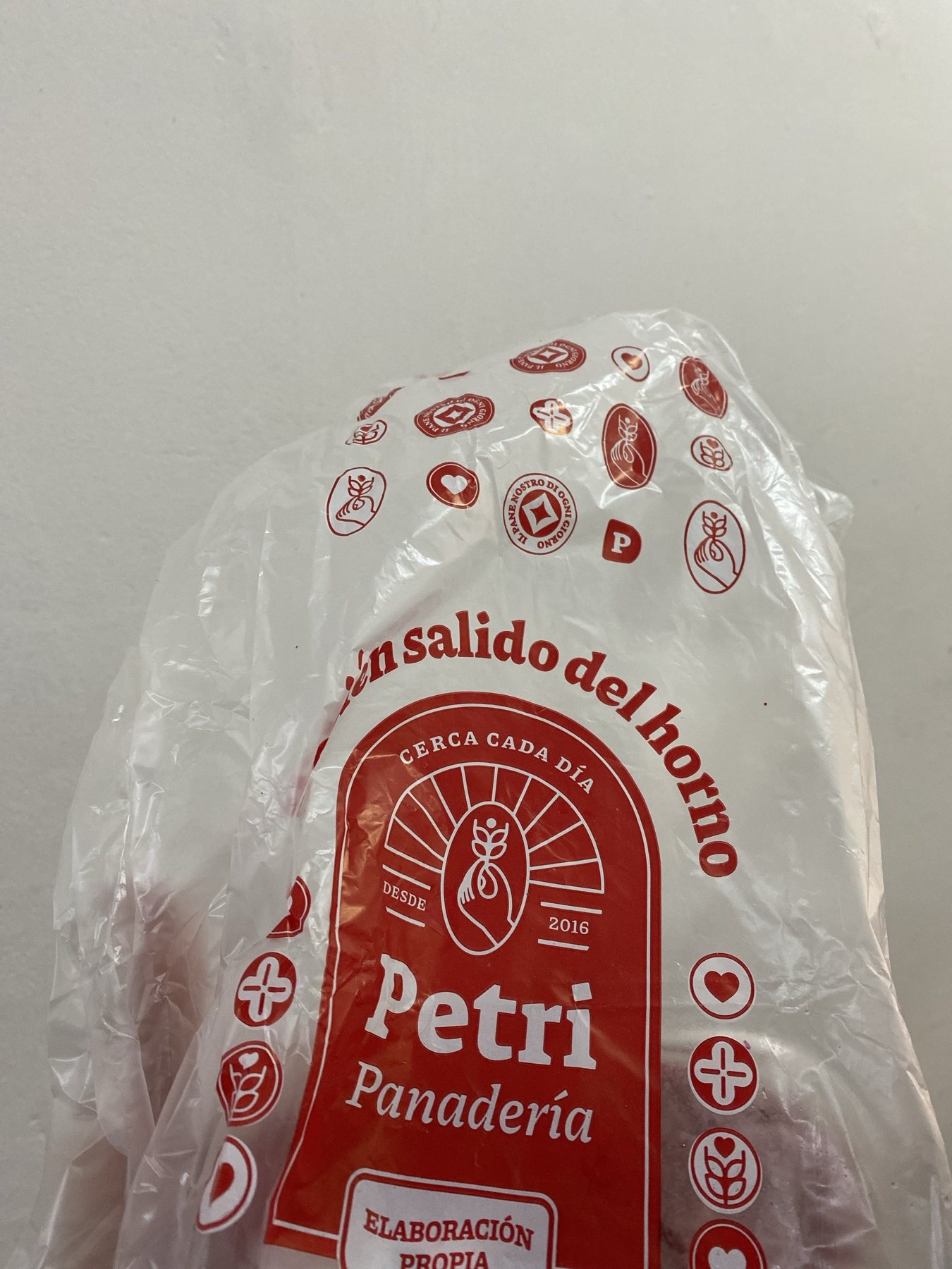
Artisanal bread bag
Artisanal bread bag
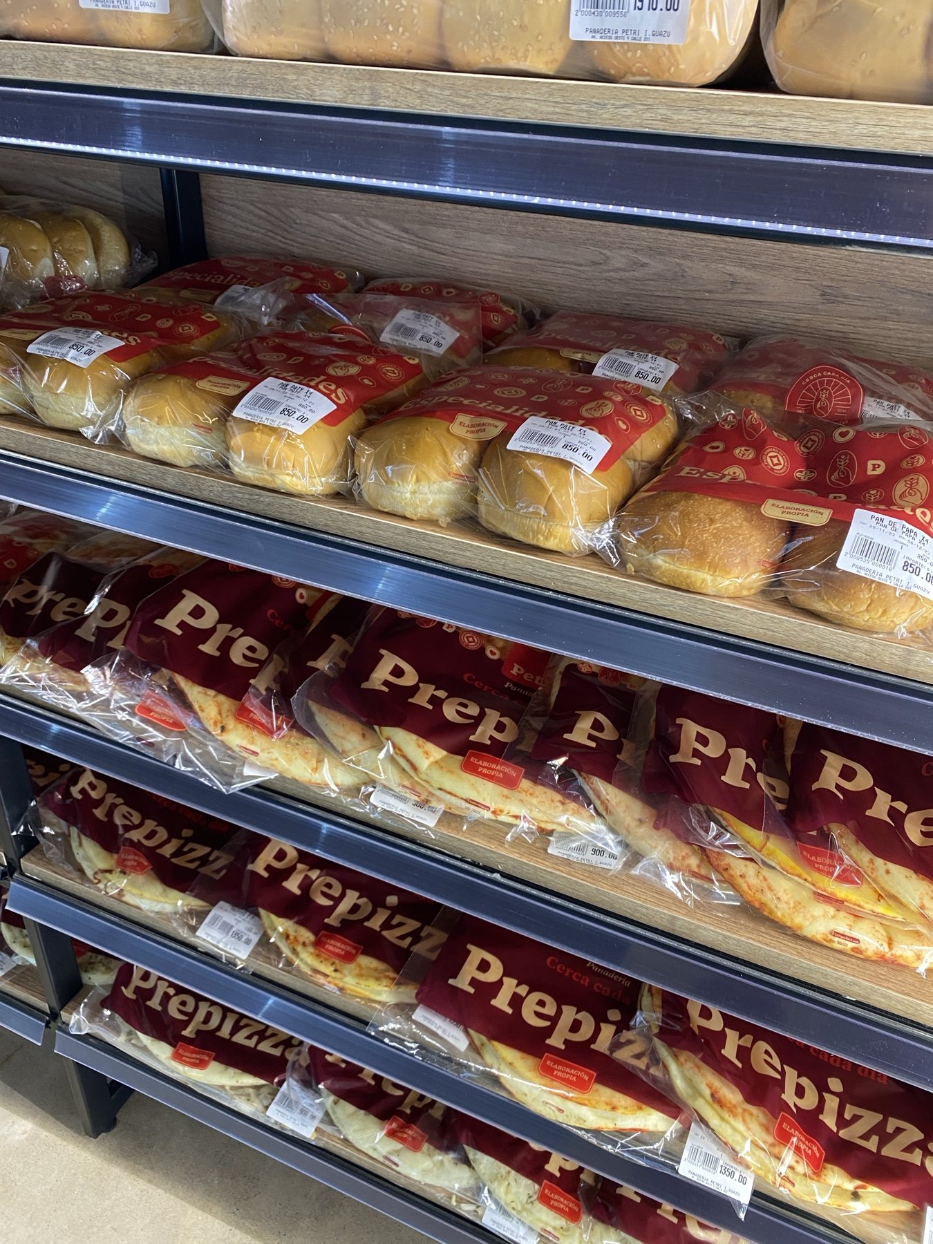
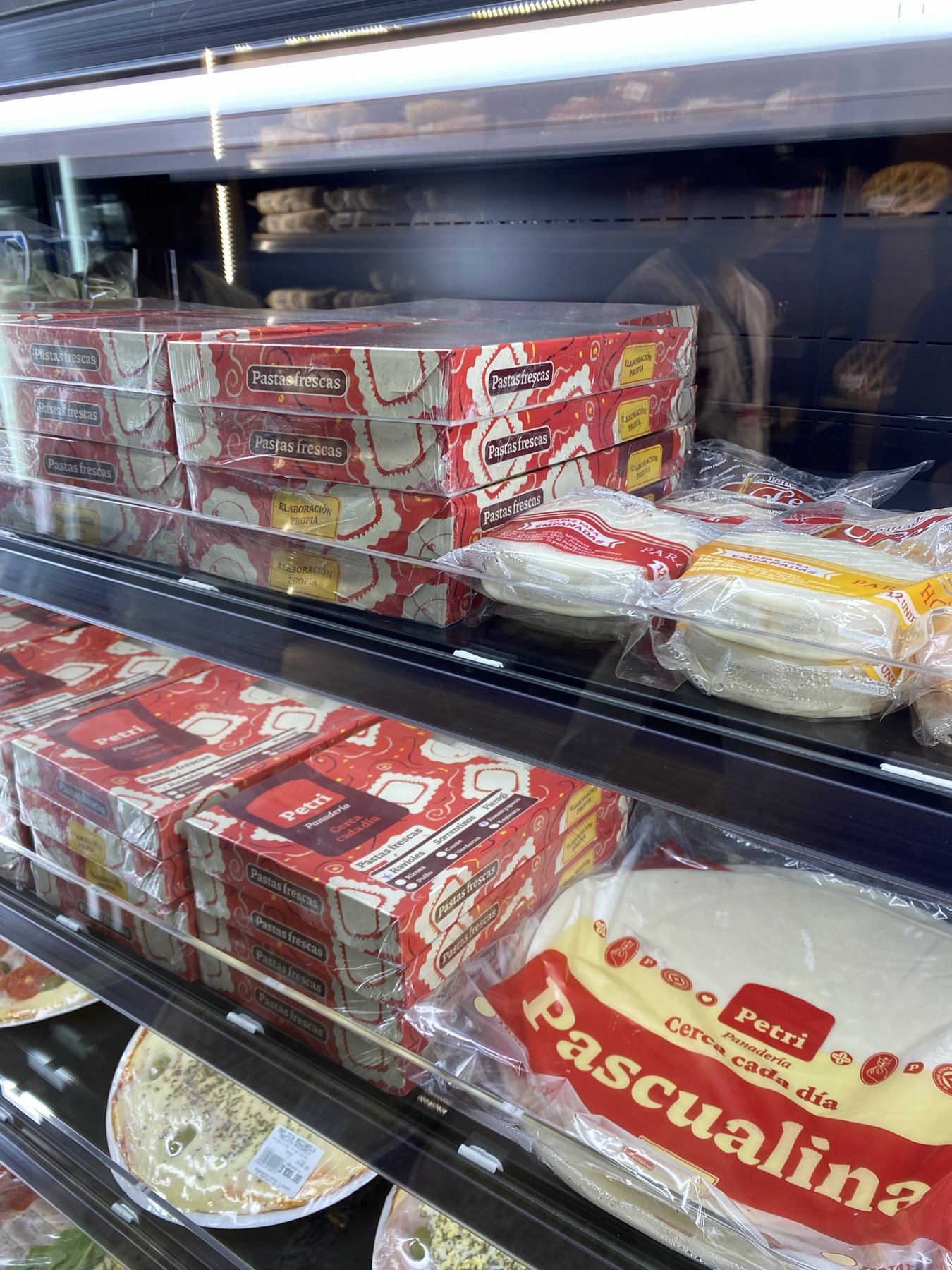
Pre-baked pizza · shelf
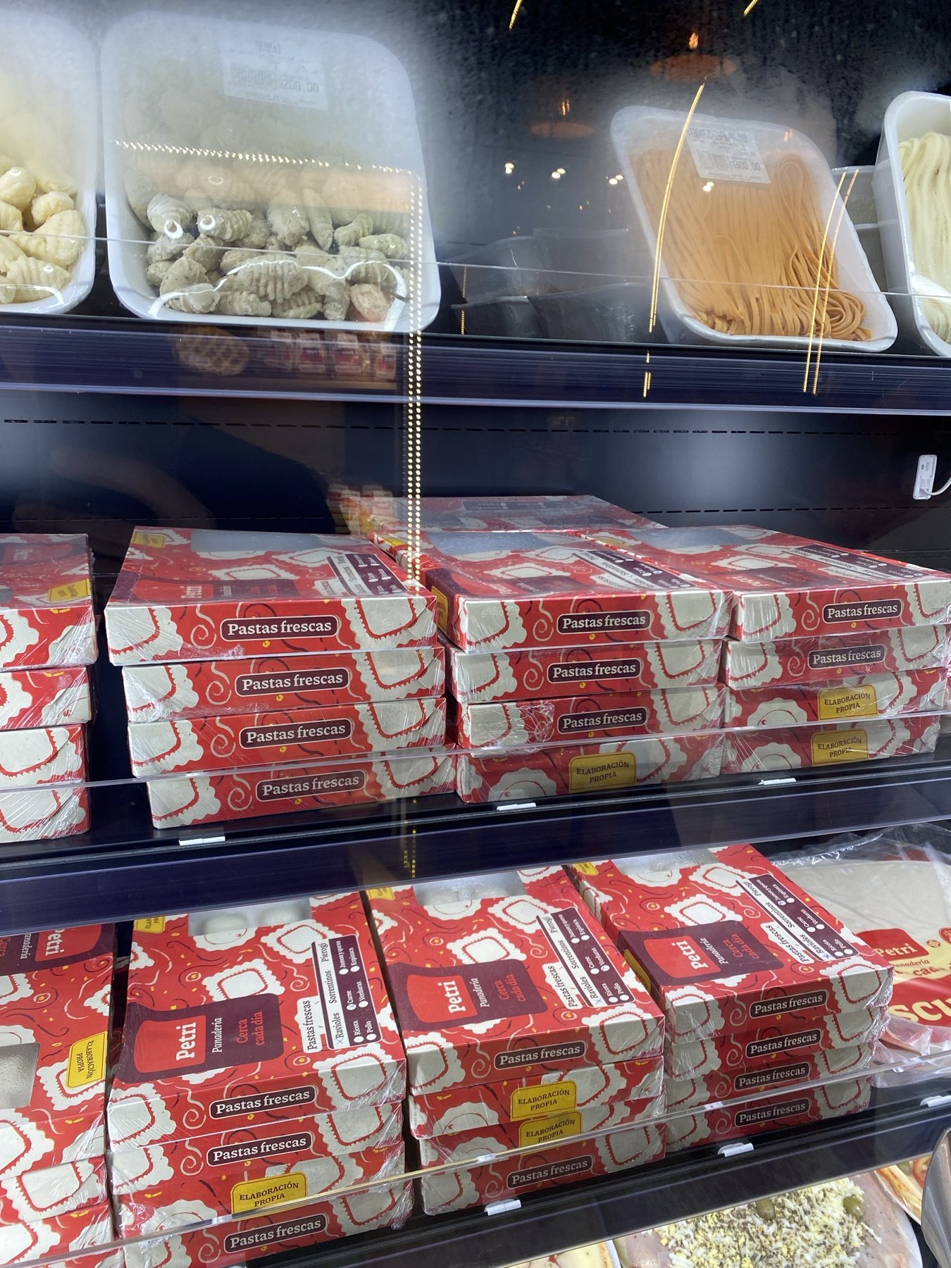
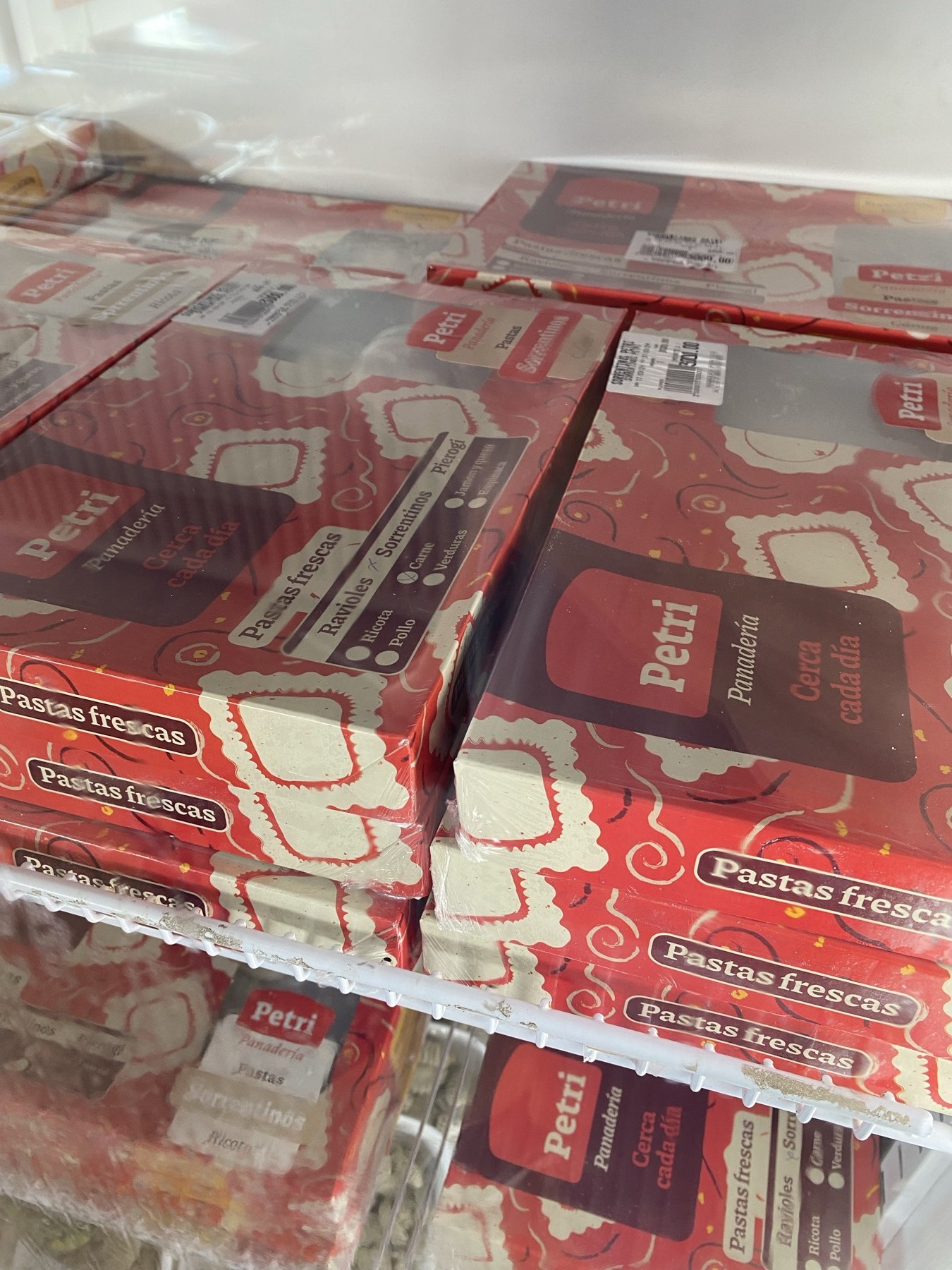
Fresh pasta & quiche
Pastry box
Pastry box
Fresh out of the oven
Stacked packaging cartons
Baked goods
Baked goods
Confectionery boxes
Confectionery boxes
Handmade fresh pasta
Pastry gift box
Pastry gift box
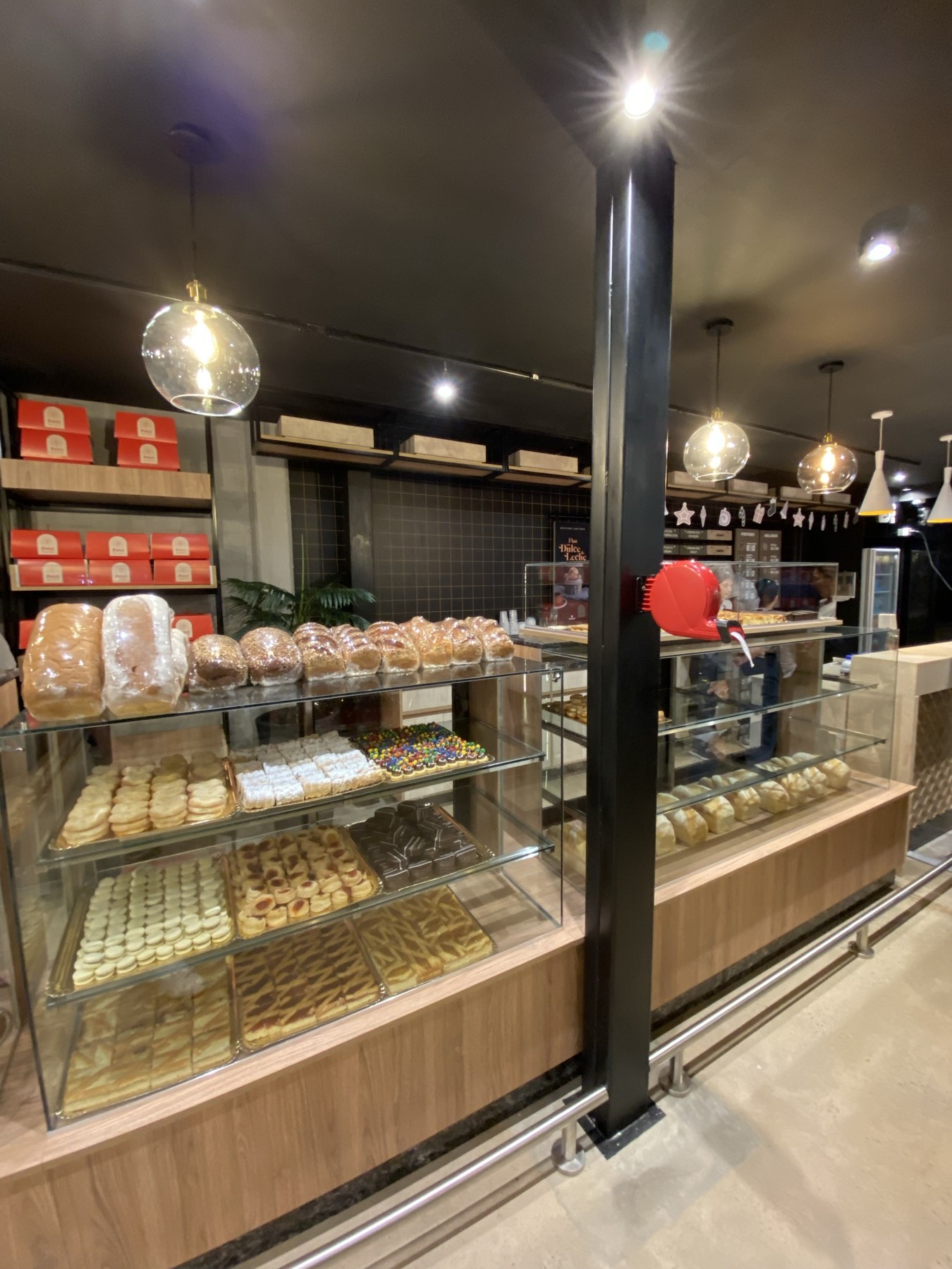
Display counter
Display counter
Pizza boxes
Pizza boxes
Order counter
Order counter
Pasta carton
Pasta carton
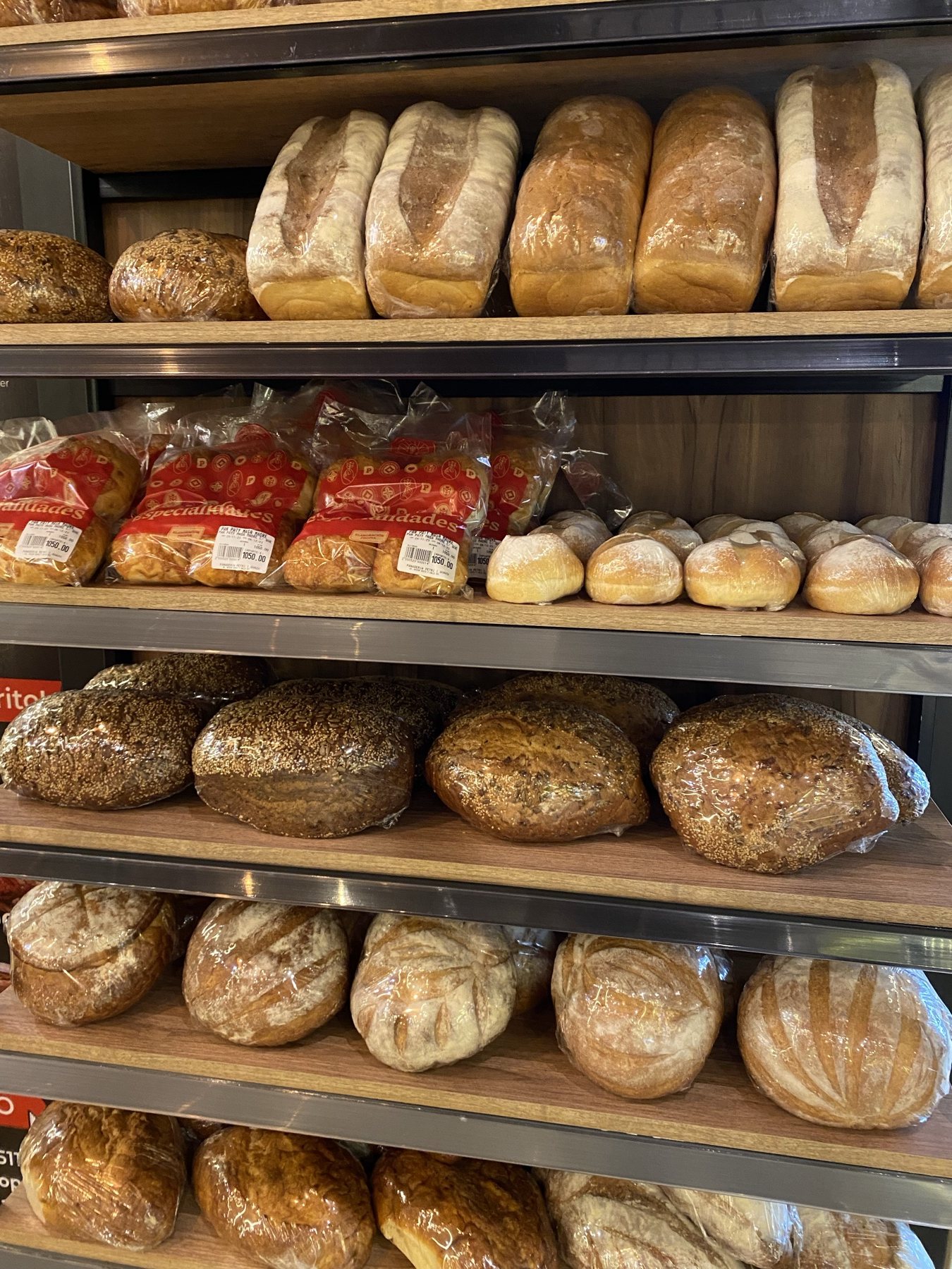
Bakery loaves
Bakery loaves
Kraft bread bags
Kraft bread bags
Chilled cases
Chilled cases
Display windows
Display windows
Fresh pasta · retail display

From technical blueprint to physical packaging

Every packaging format was engineered with exact pre-press mechanicals —creasing, fold tolerances, and pantones— before arriving on store shelves.
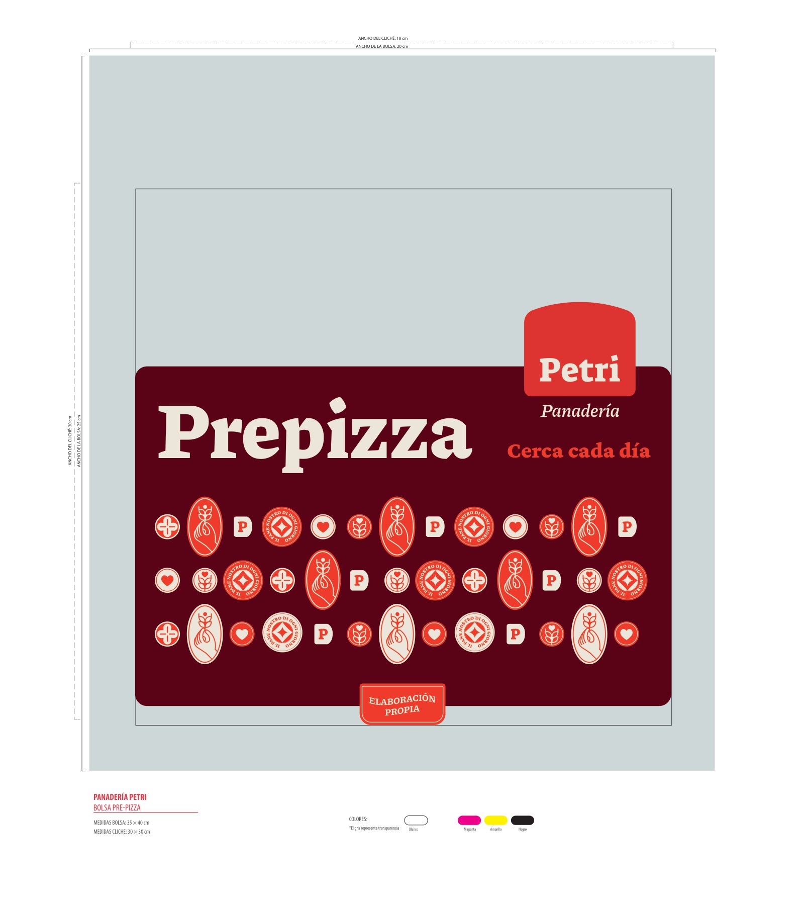
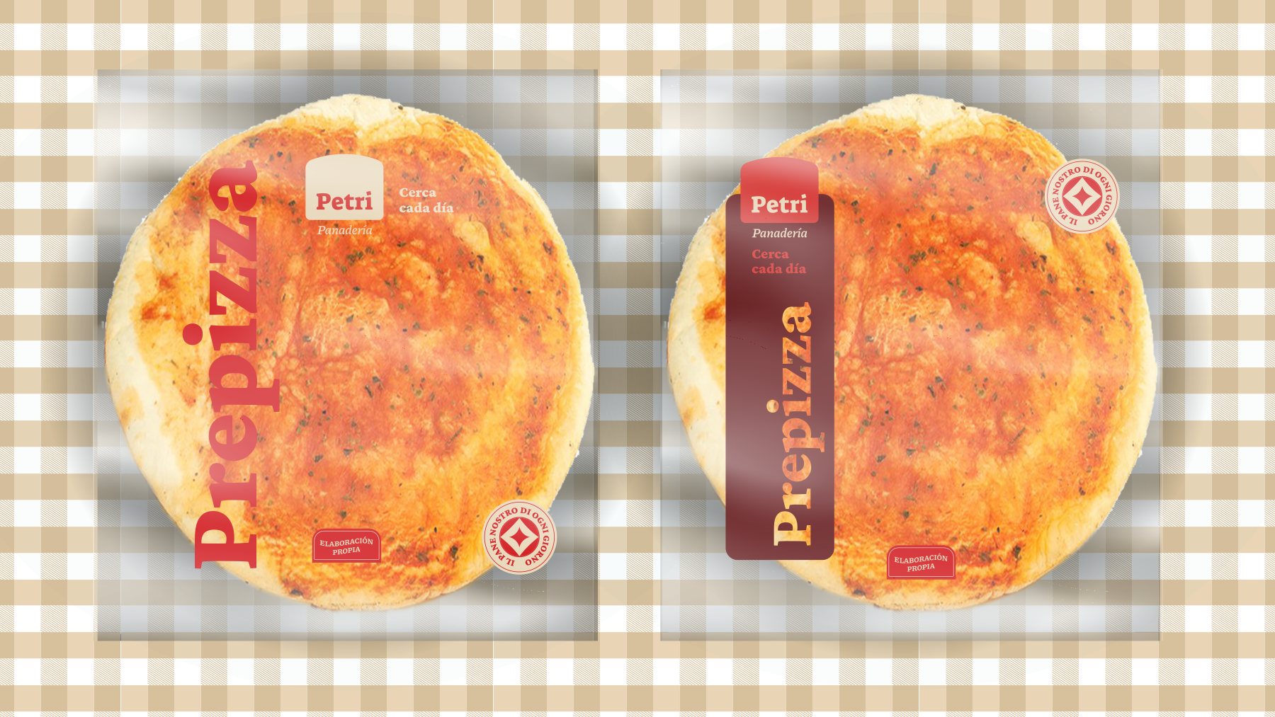
Pizza base · original
Mechanical
Pizza base
Pizza base
Empanada wrappers · original
Mechanical
Empanada wrappers
Empanada wrappers
Tart crusts · Specialties · original
Mechanical
Tart crusts · Specialties
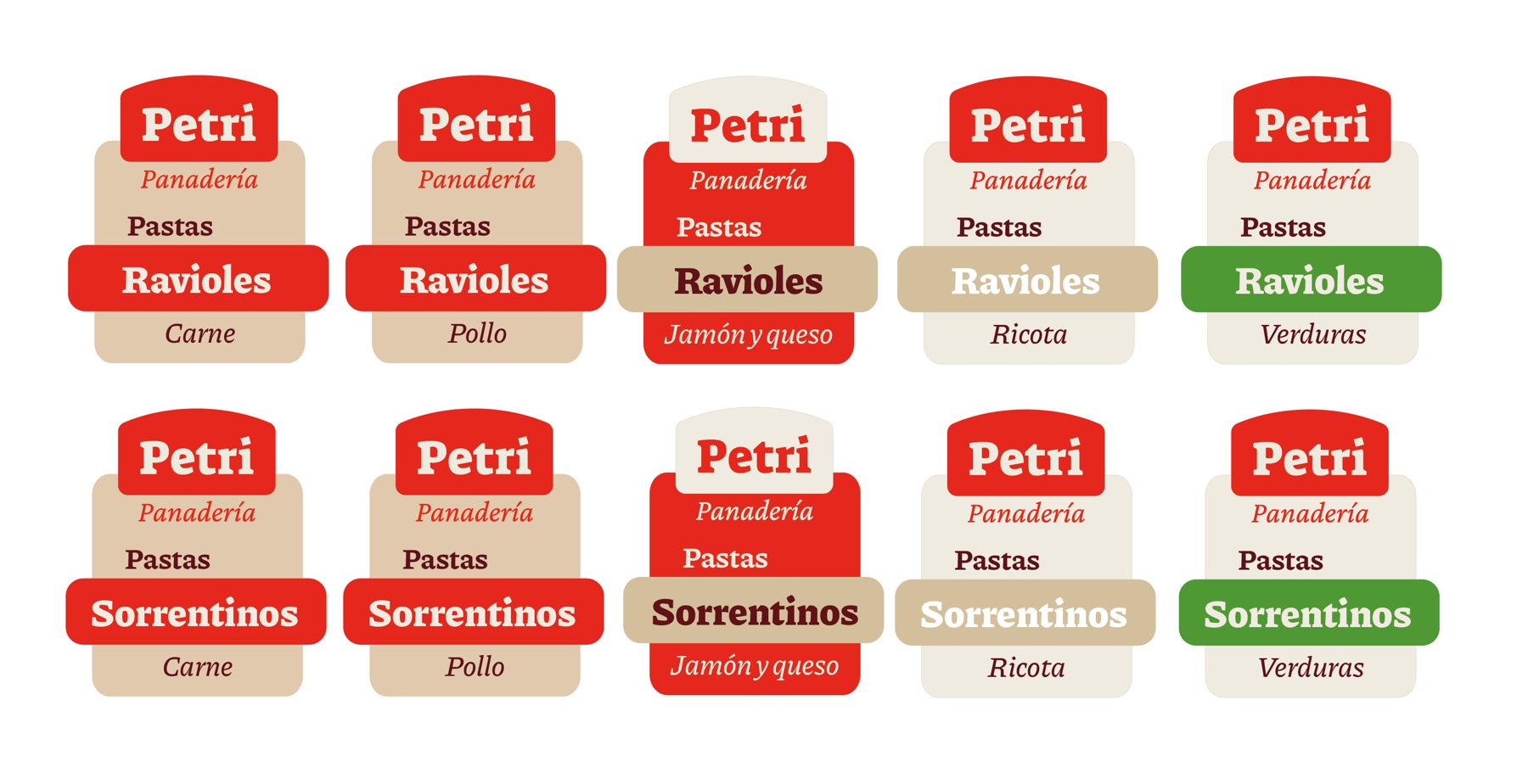
Etiquetas de pastas frescas
Pasta labels
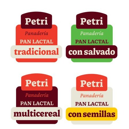
Etiquetas de pan lactal
Sliced bread labels
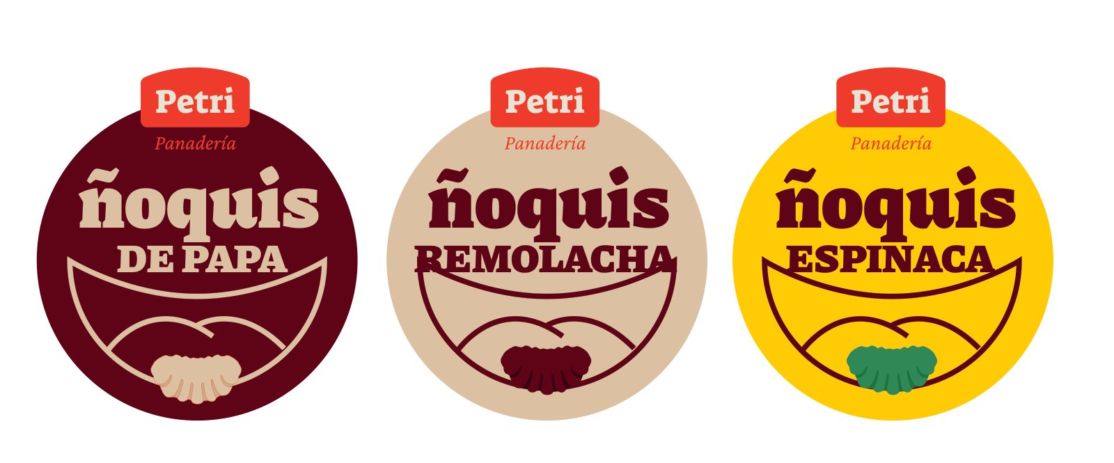
Etiquetas de ñoquis
Gnocchi packaging
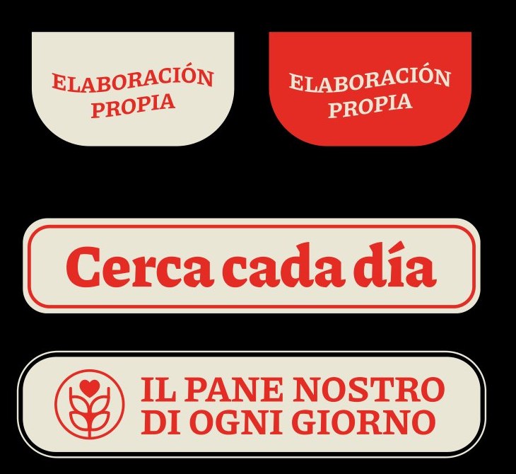
Stickers de cierre
Packaging seal stickers

Environmental graphics & storefronts

Three storefronts, one unmistakable architectural presence.

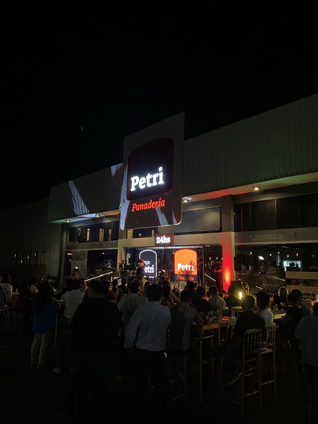
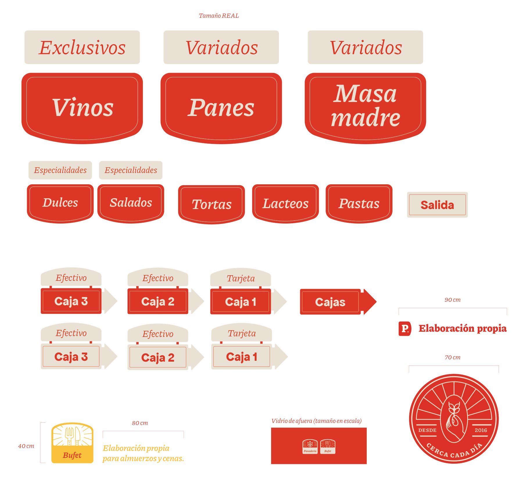
Designed exterior facades, illuminated dimensional signage, vinyl storefront displays, and interior retail wayfinding for each branch. Engineered for instant recognition day and night.

01

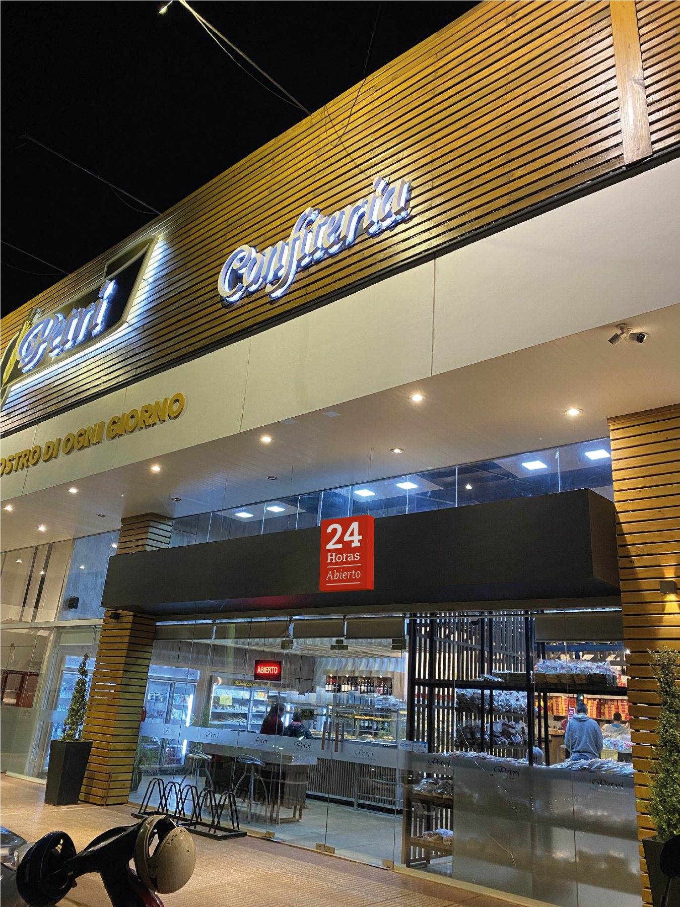
Bakery 213

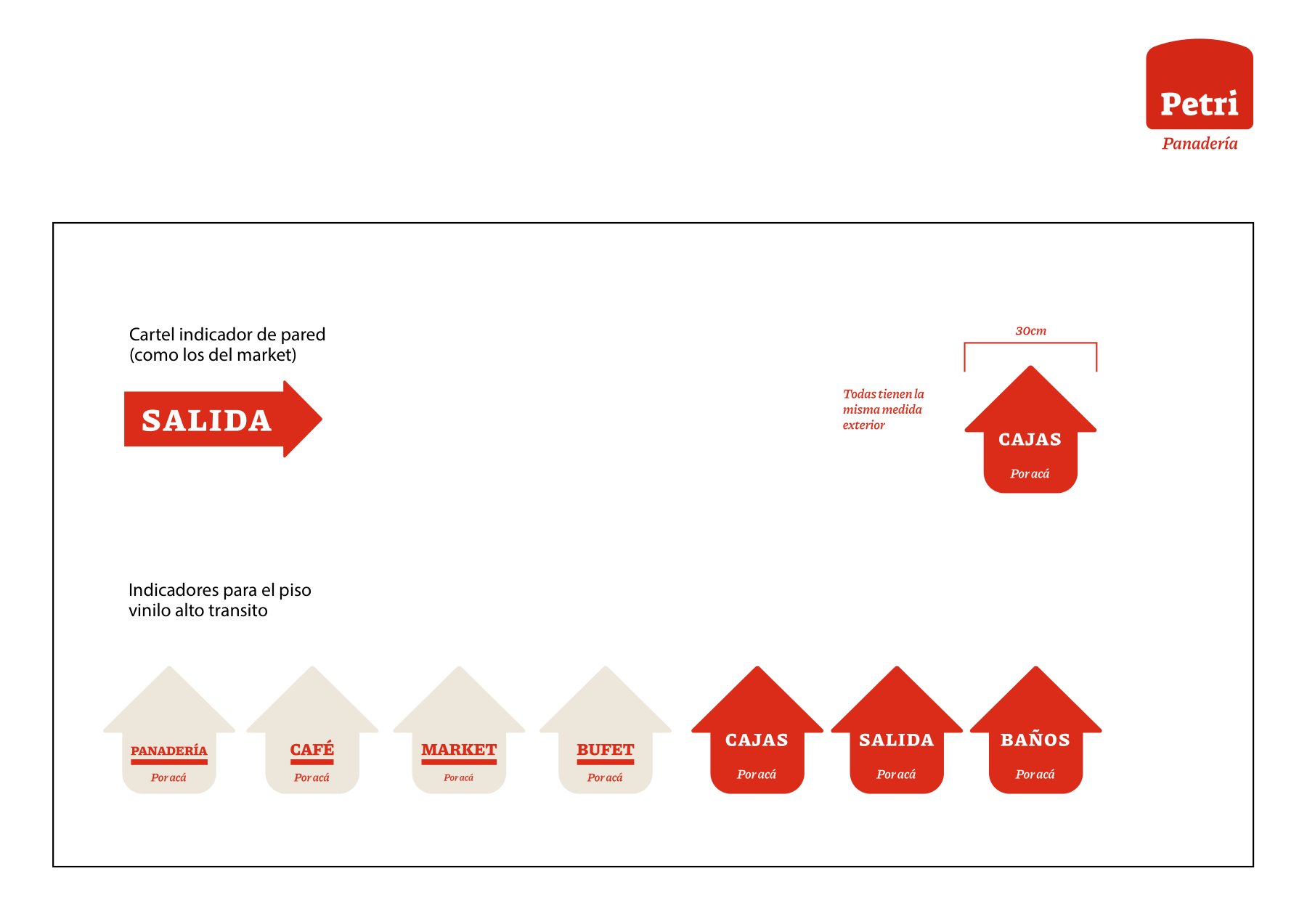
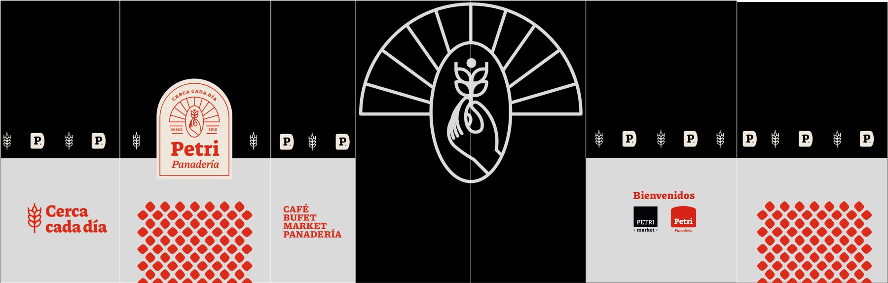
Nighttime facade: 24-hour illuminated red steel sign with acrylic lettering, window graphics, and internal floor/wall wayfinding.
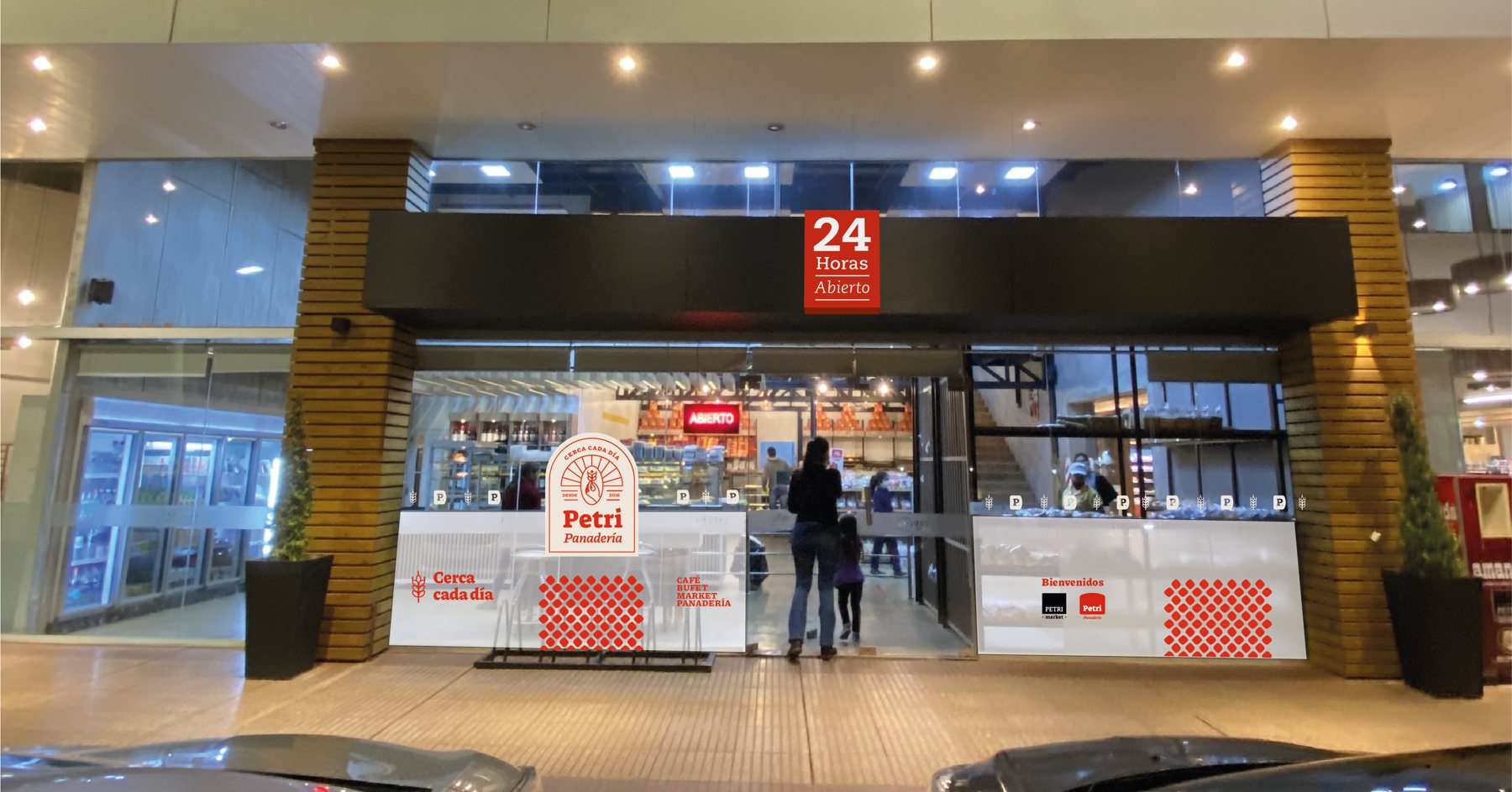
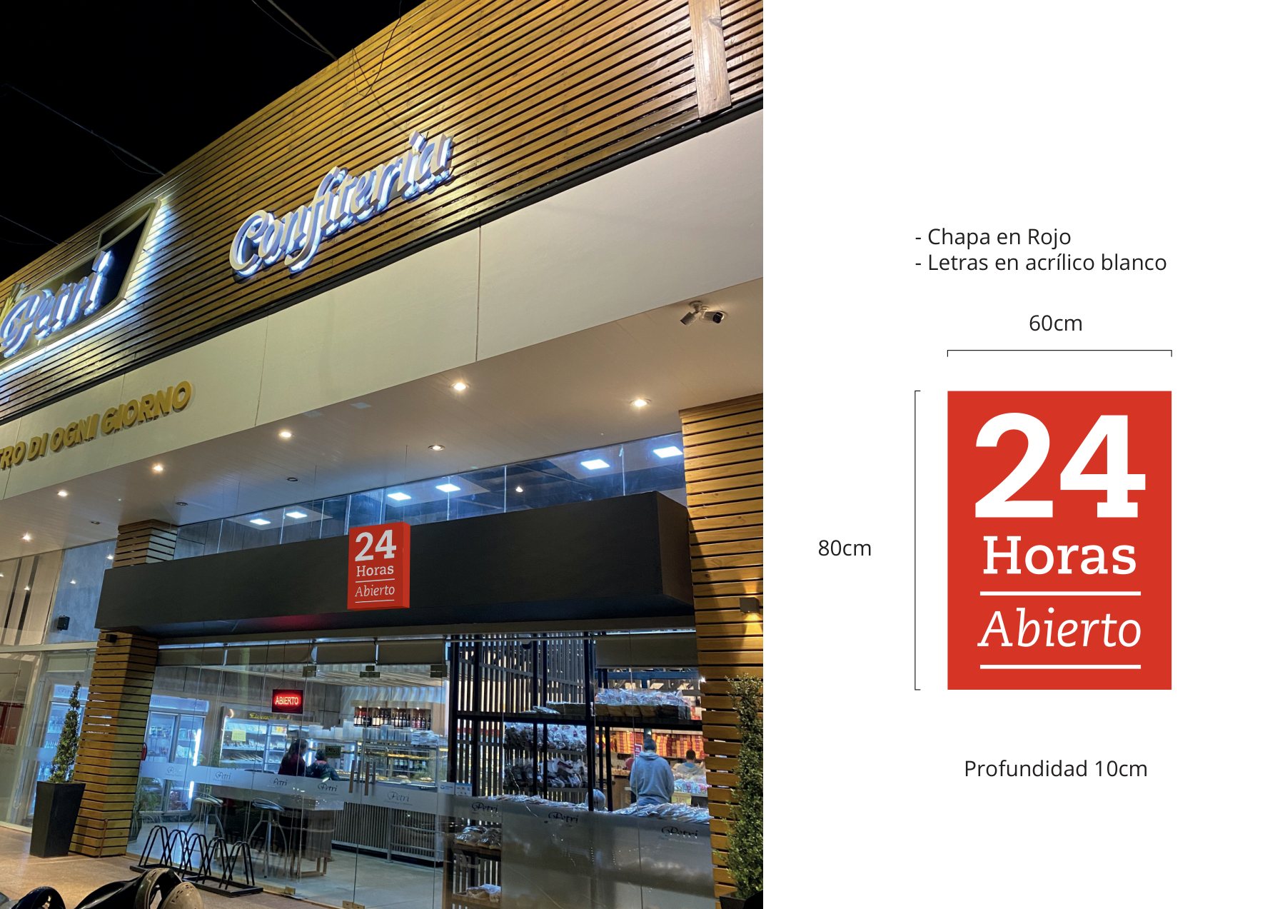
Bakery 213 · Storefront · night
Storefront · night
Bakery 213 · 24-hr sign · mechanical
24-hr sign · mechanical
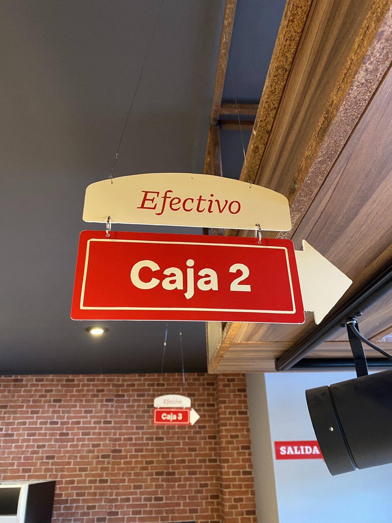
Bakery 213 · Checkout signage
Checkout signage
Bakery 213 · 24-hr exterior sign
24-hr exterior sign
Bakery 213 · Wayfinding arrows & plaques
Wayfinding arrows & plaques
Bakery 213 · Window vinyl graphics
Window vinyl graphics
02

Itaembé

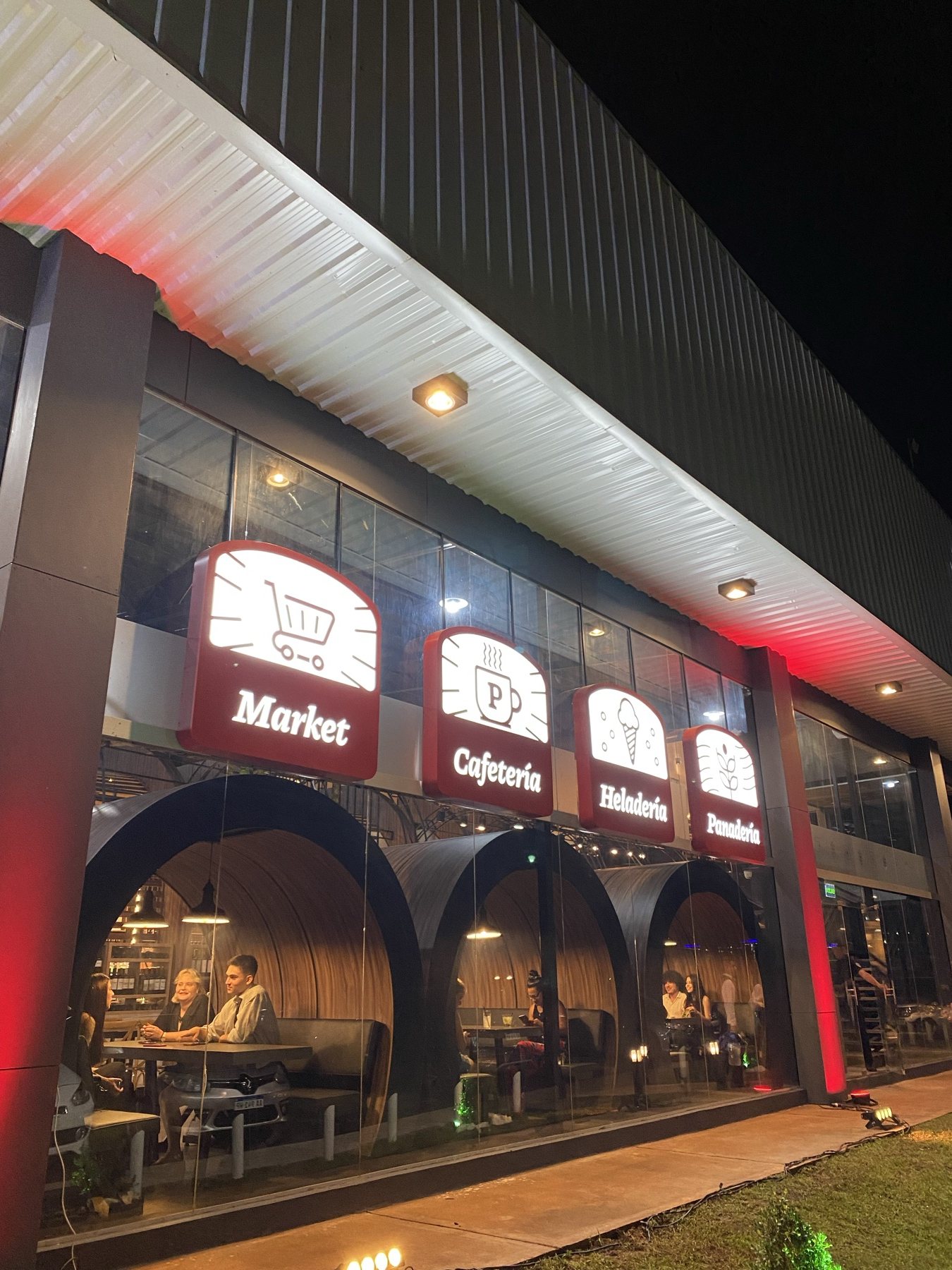
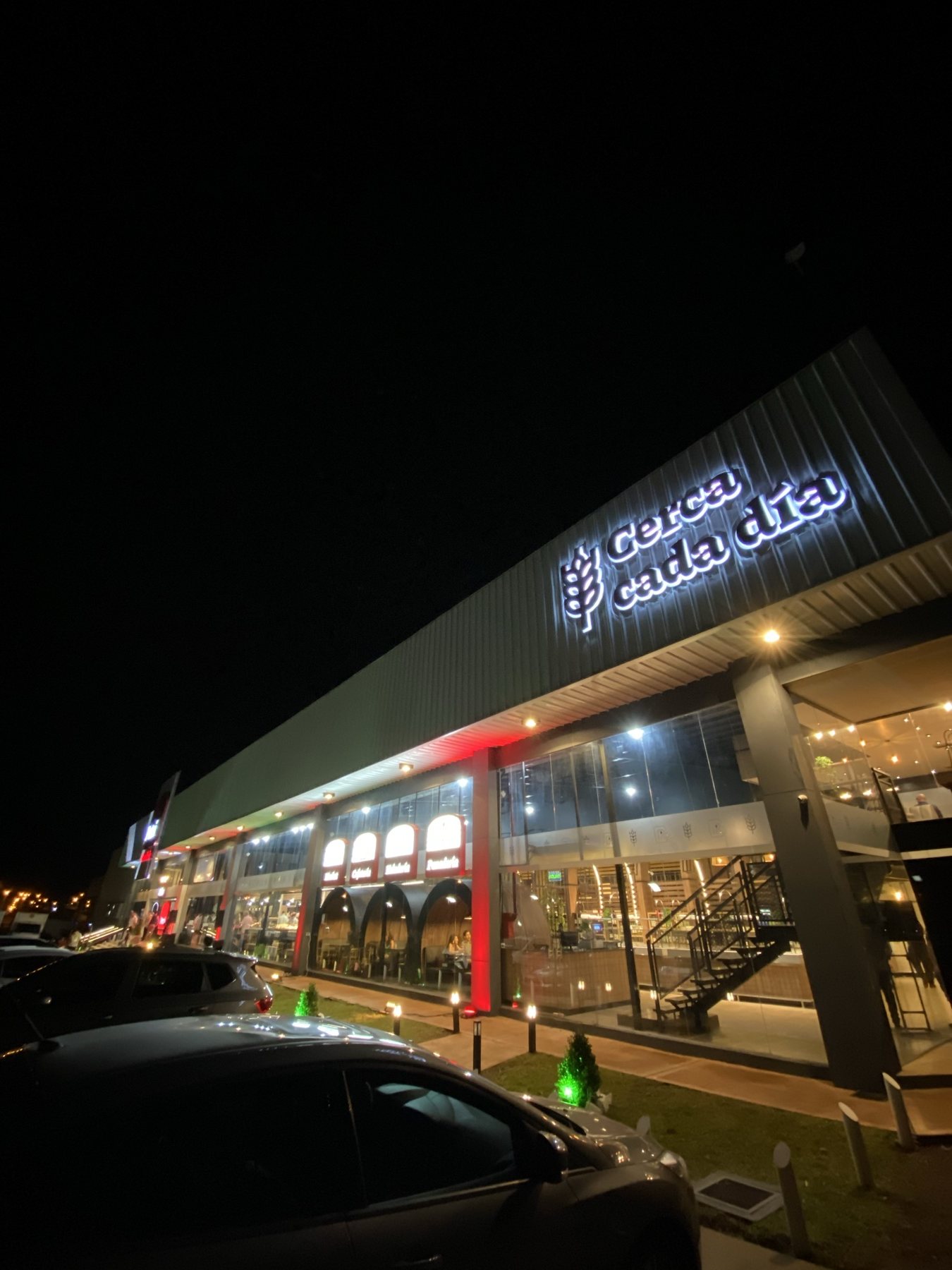
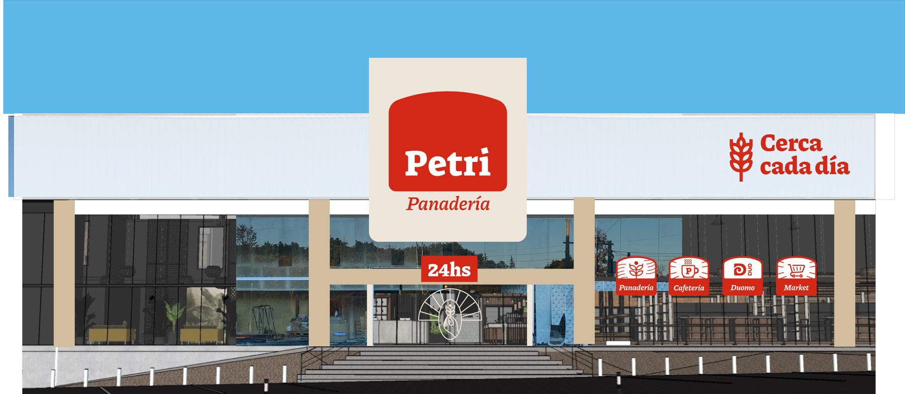
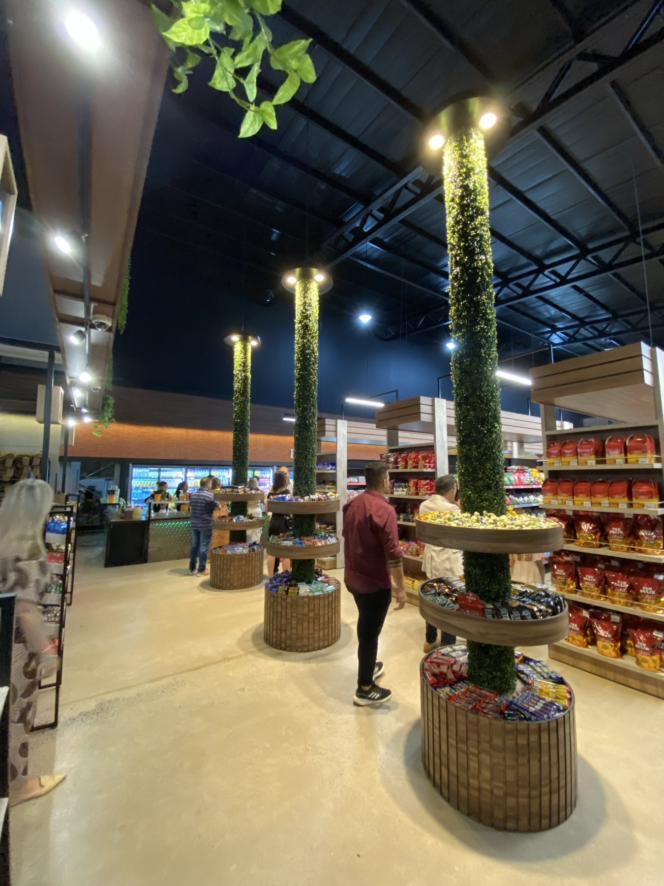
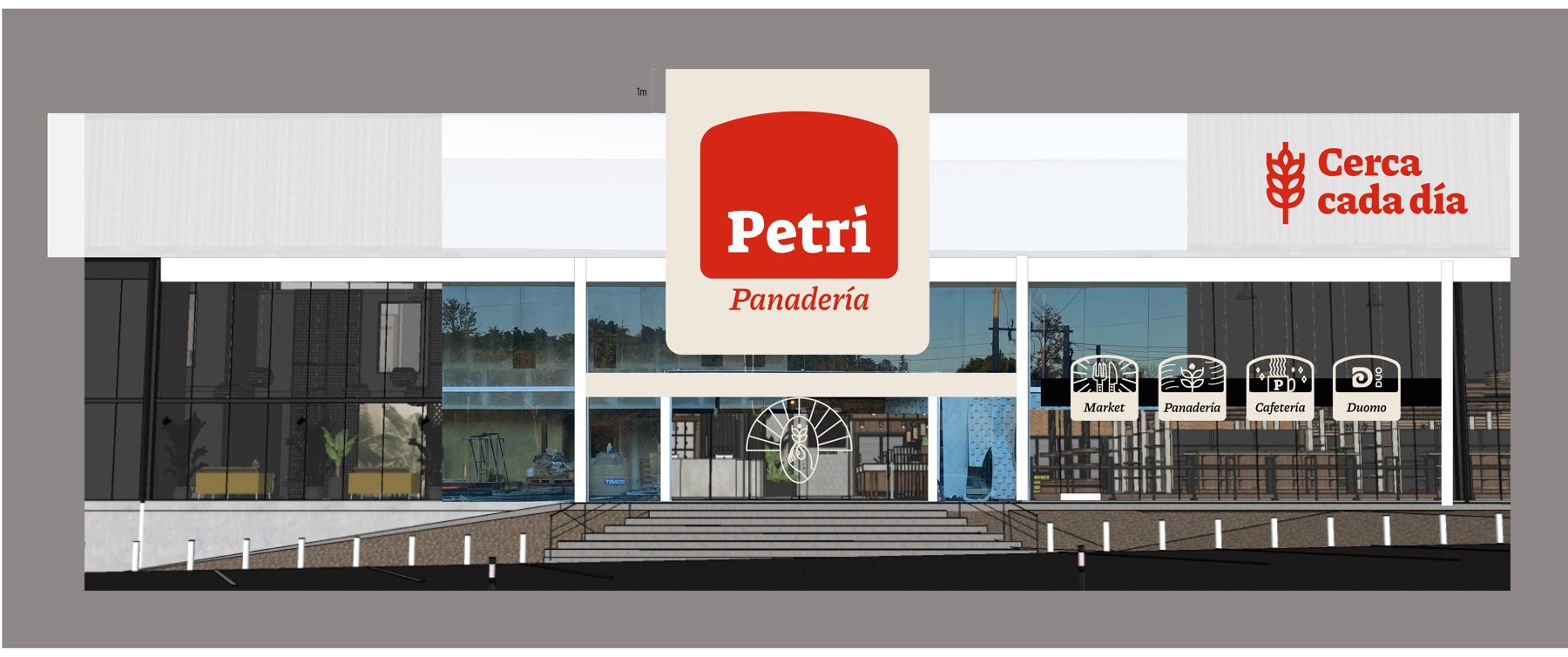
Large-format highway facade for the flagship location: monumental seal, tagline, and category icons (bakery, cafe, Duomo gelato, and market) readable from the expressway.
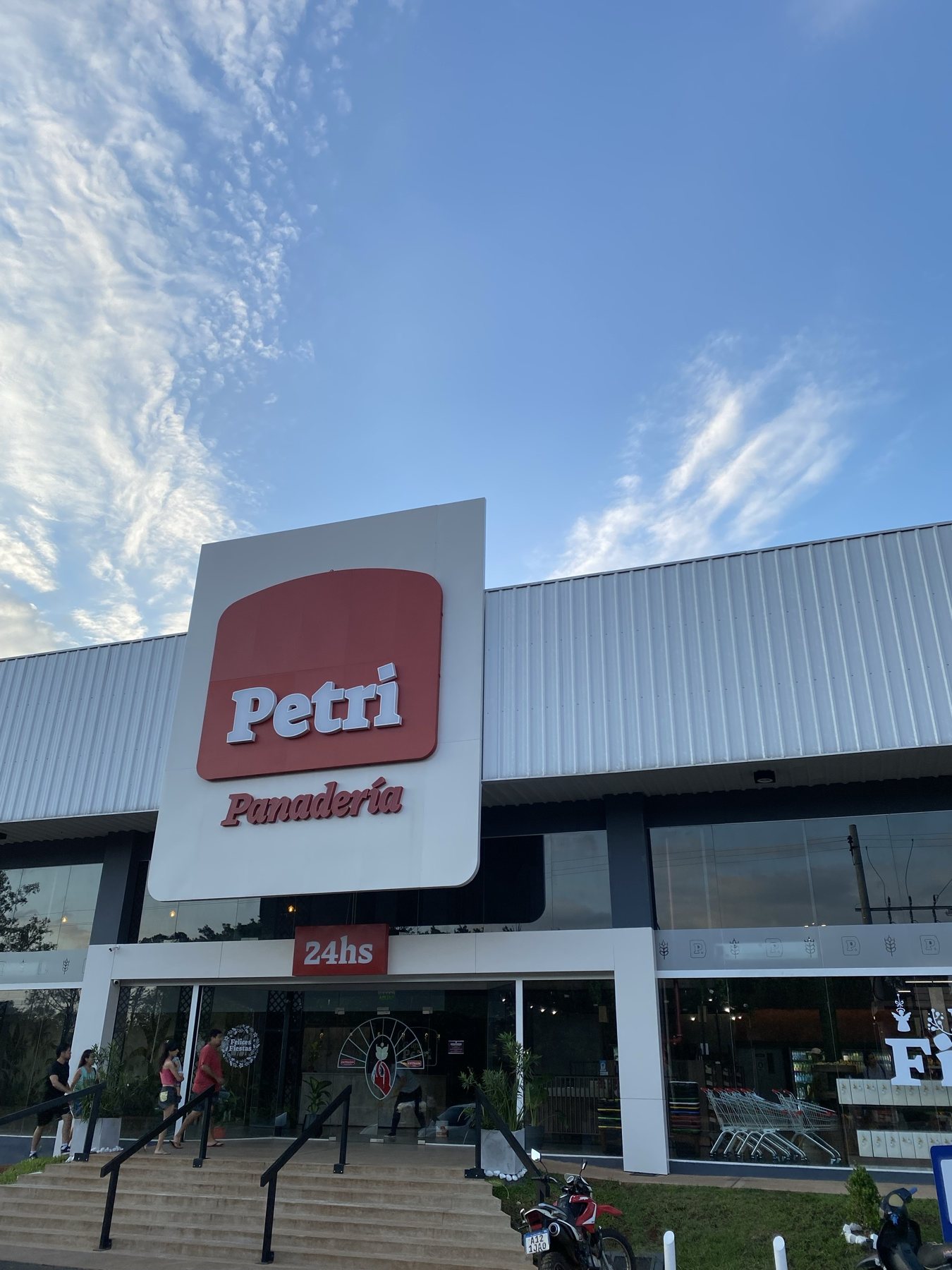
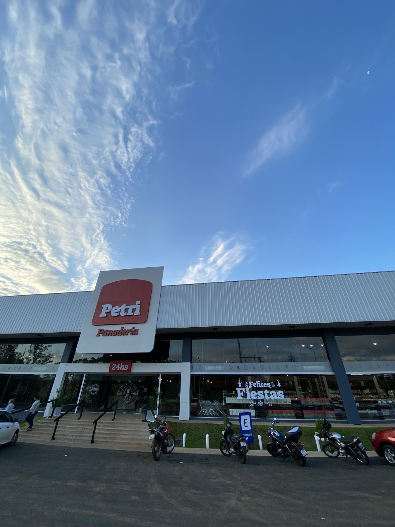
Itaembé · Facade · new flagship
Facade · new flagship
Itaembé · Facade · daytime
Facade · daytime
Close every day · night
Itaembé · Category icons · night
Category icons · night
Itaembé · Full facade · night
Full facade · night
Itaembé · Facade · final rendering
Facade · final rendering
Grand opening
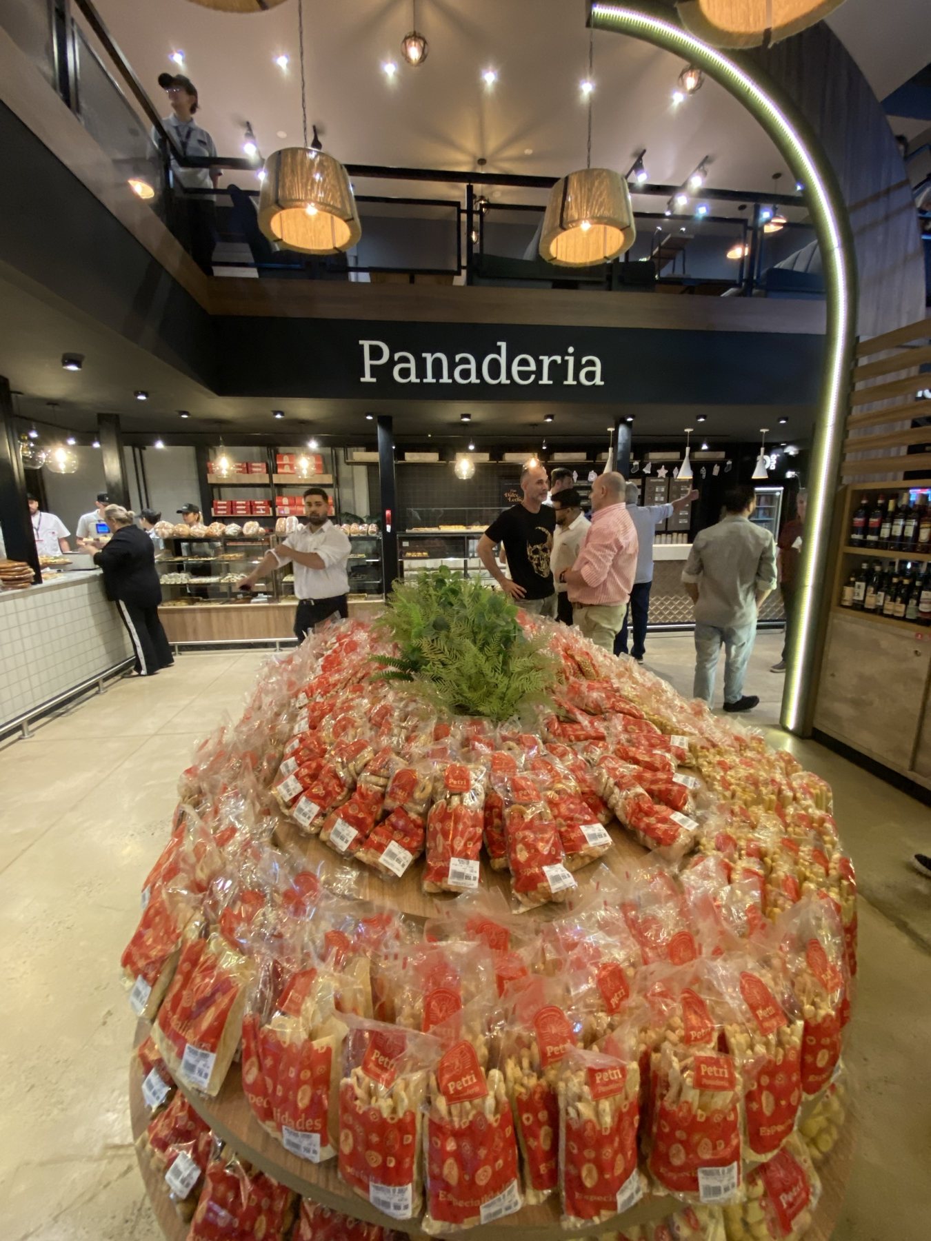
Itaembé · Interior retail area
Interior retail area
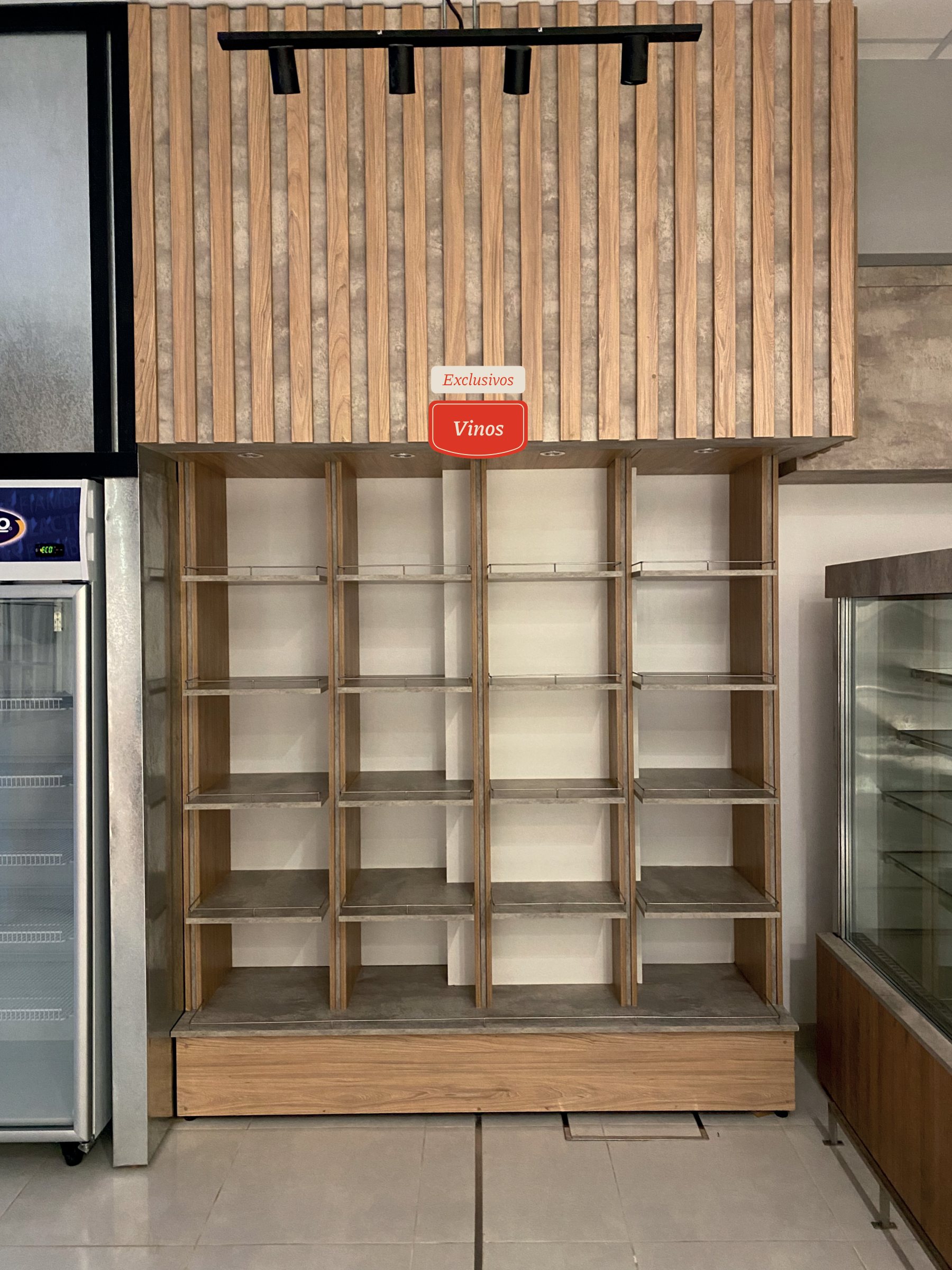
Itaembé · Category signage
Category signage
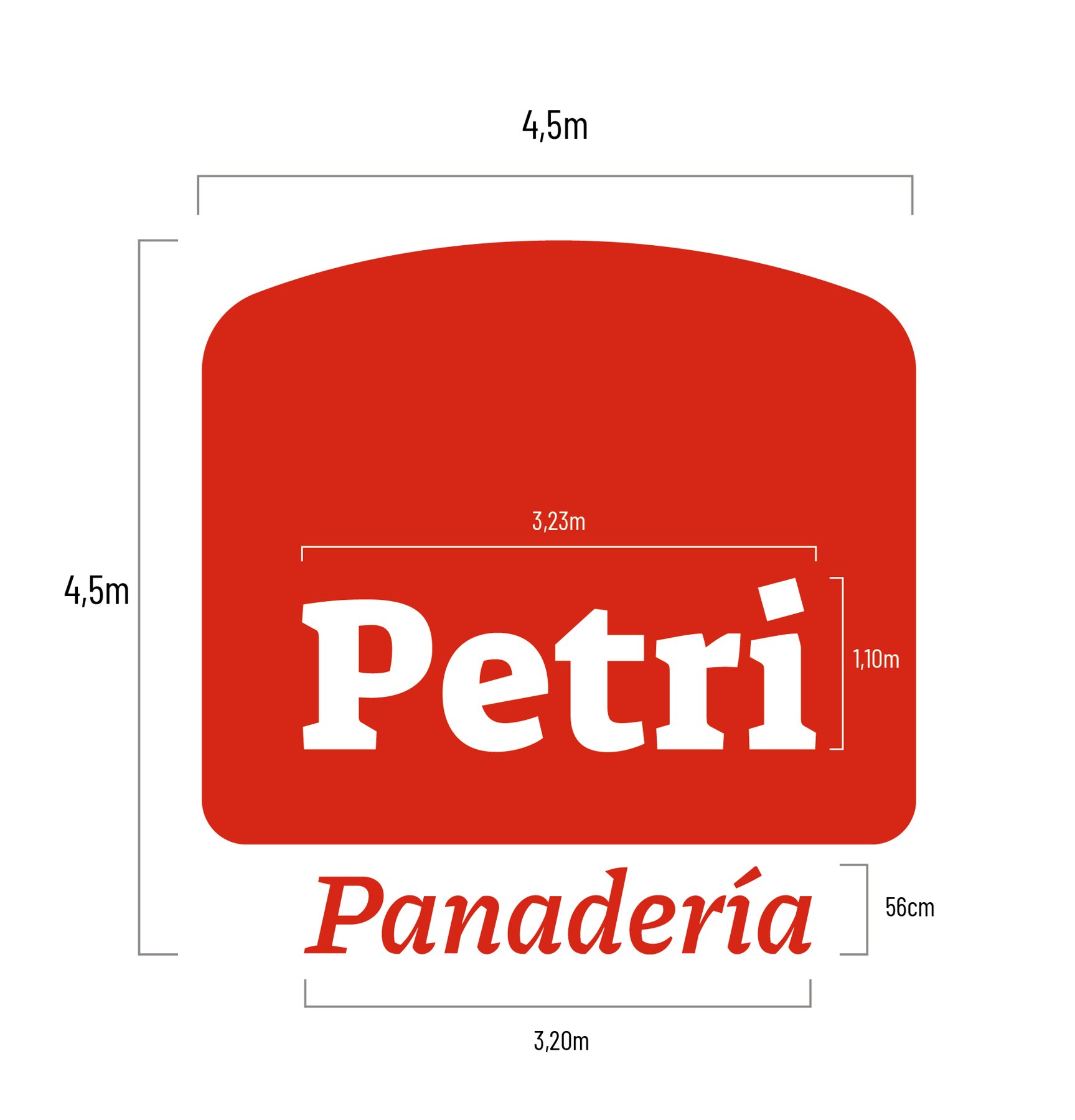
Itaembé · Main facade sign · 4.5 m
Main facade sign · 4.5 m
Itaembé · Category icon suite
Category icon suite
Itaembé · Architectural dimensions
Architectural dimensions
Itaembé · Opening day
Opening day
03

Chacabuco

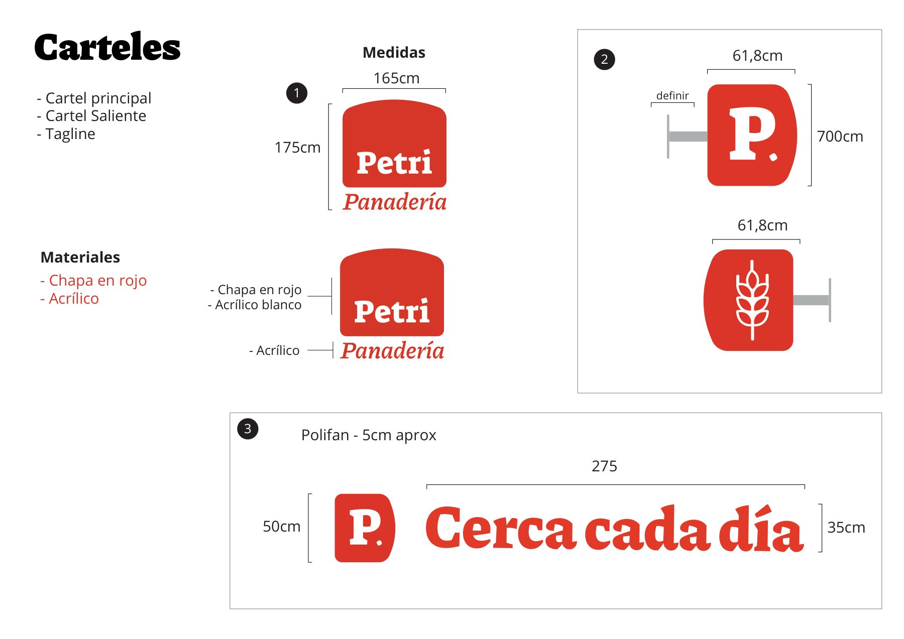
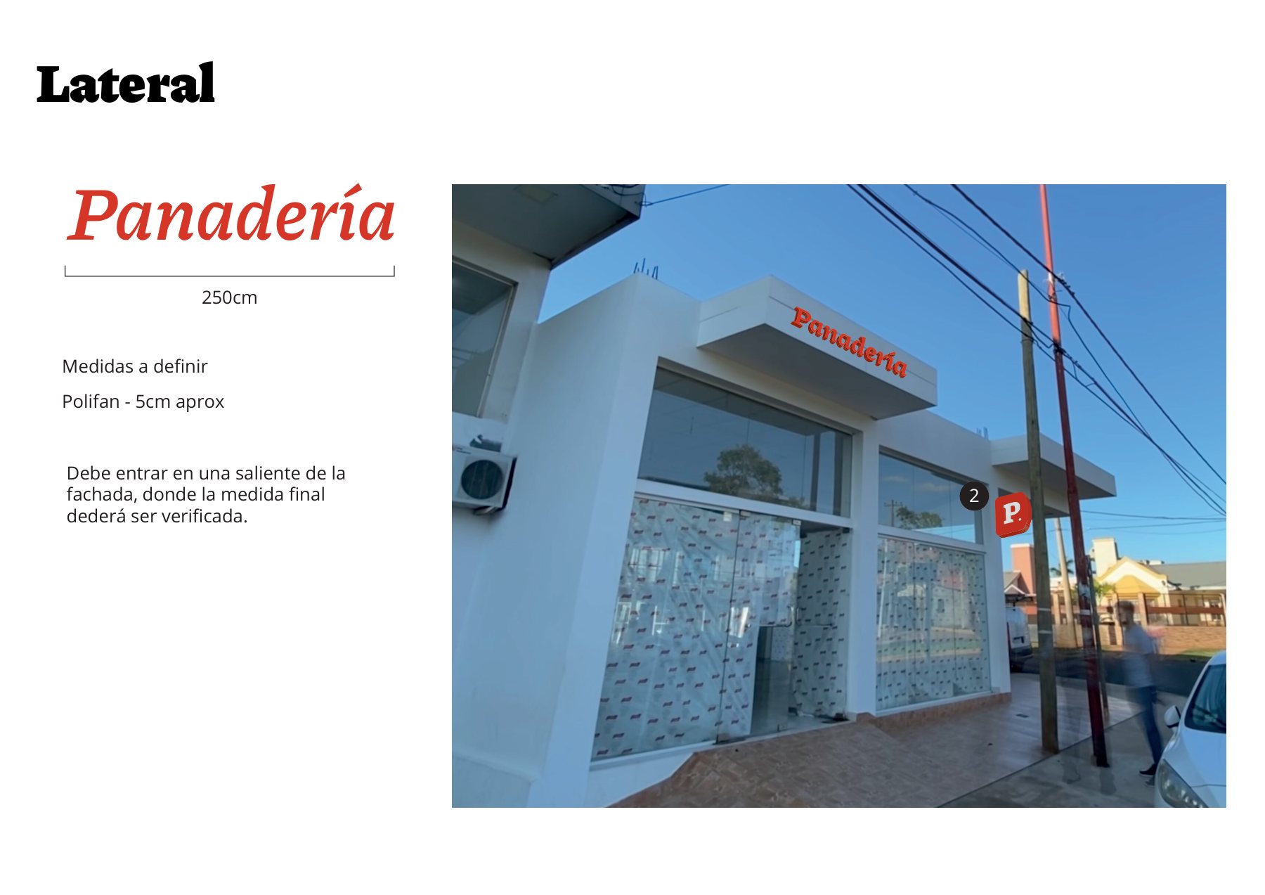
Transforming a plain white building into a vibrant Petri branch: projecting blade sign, primary facade lettering, side tagline, and comprehensive interior checkout signage.
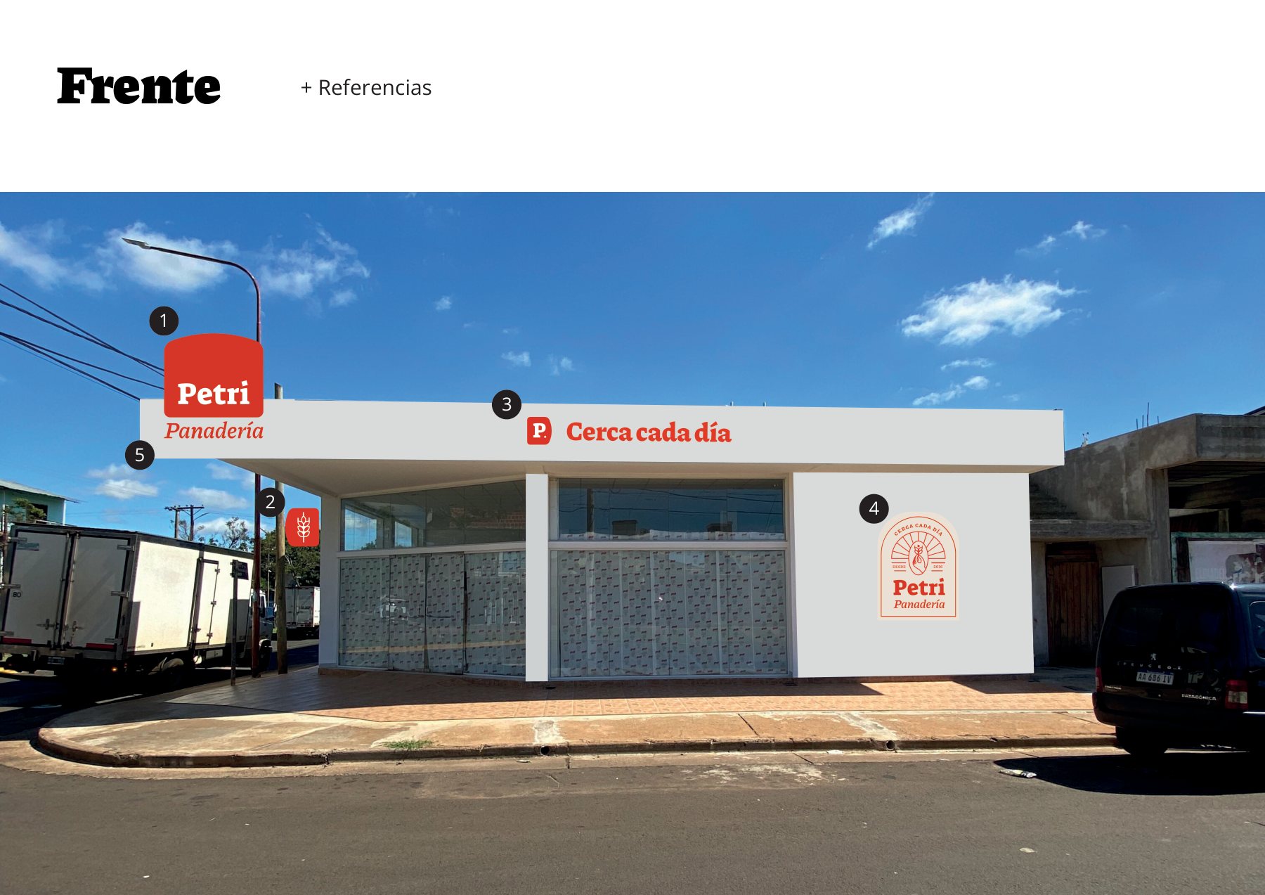
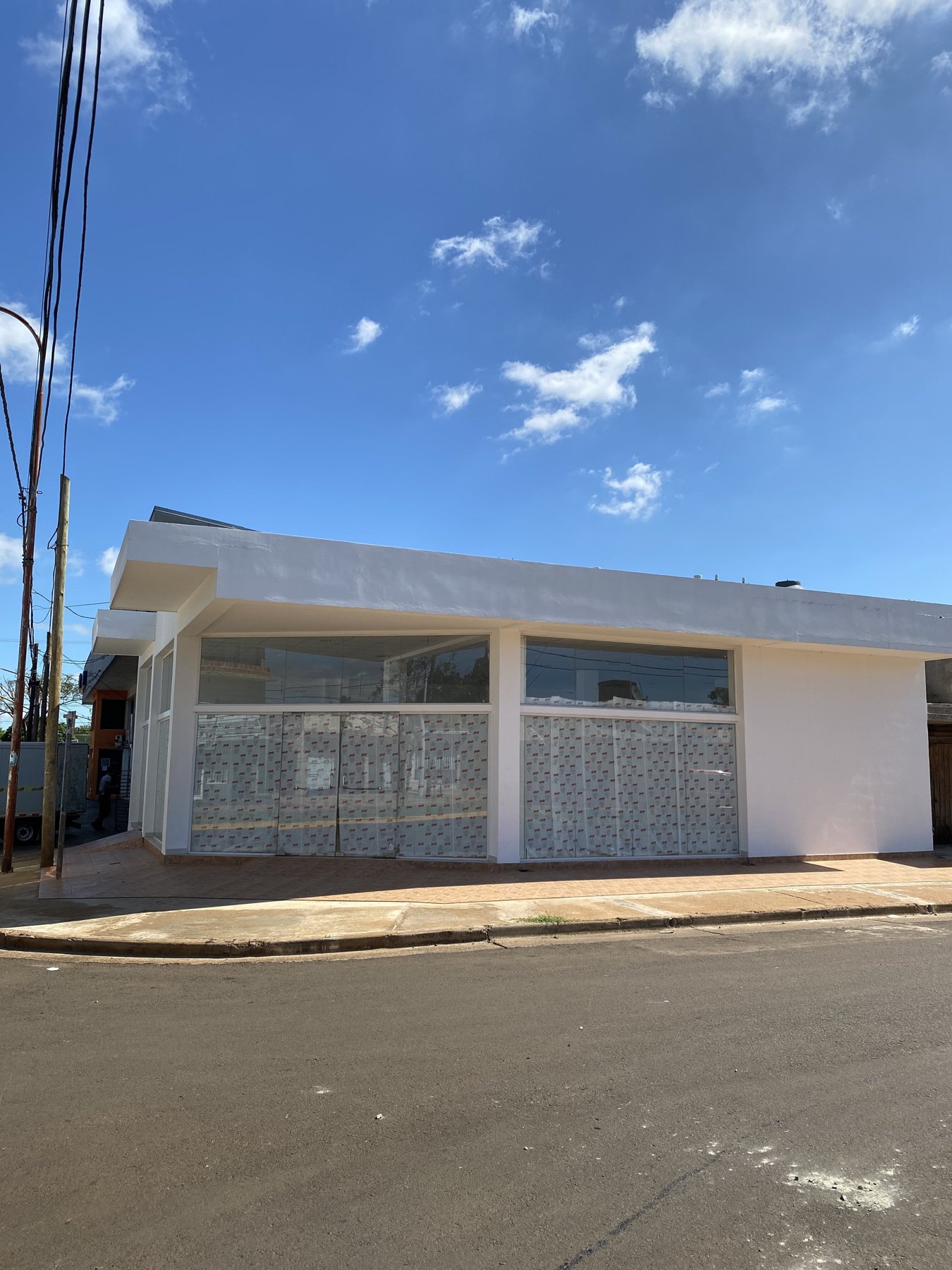
Chacabuco · Main entrance
Main entrance
Chacabuco · Before renovation
Before renovation
Chacabuco · Signs · technical specs
Signs · technical specs
Chacabuco · Side facade
Side facade
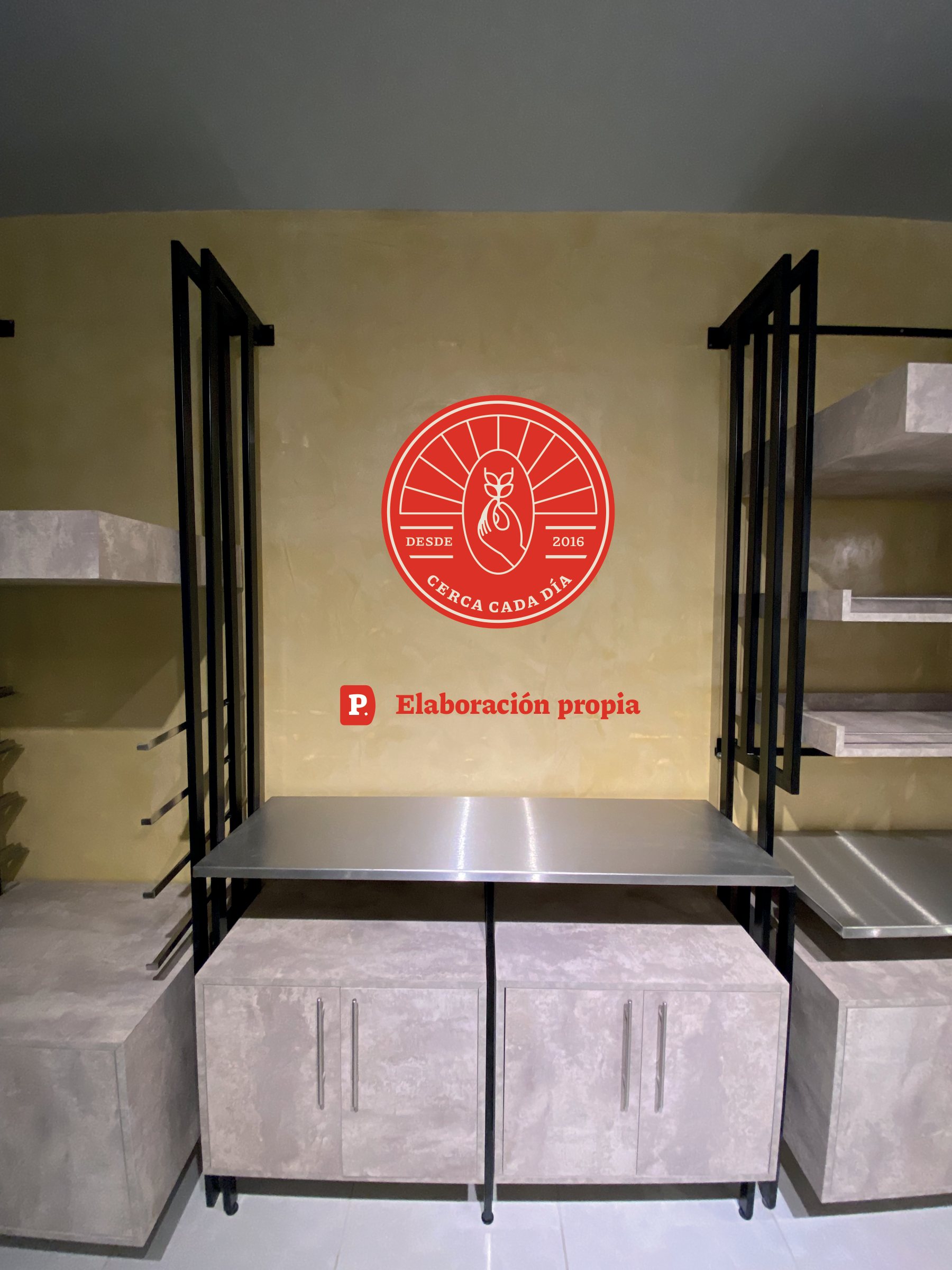
Chacabuco · In-house bakery sign
In-house bakery sign
Chacabuco · Checkout & department signage
Checkout & department signage
Chacabuco · Interior category sign
Interior category sign

Street visibility

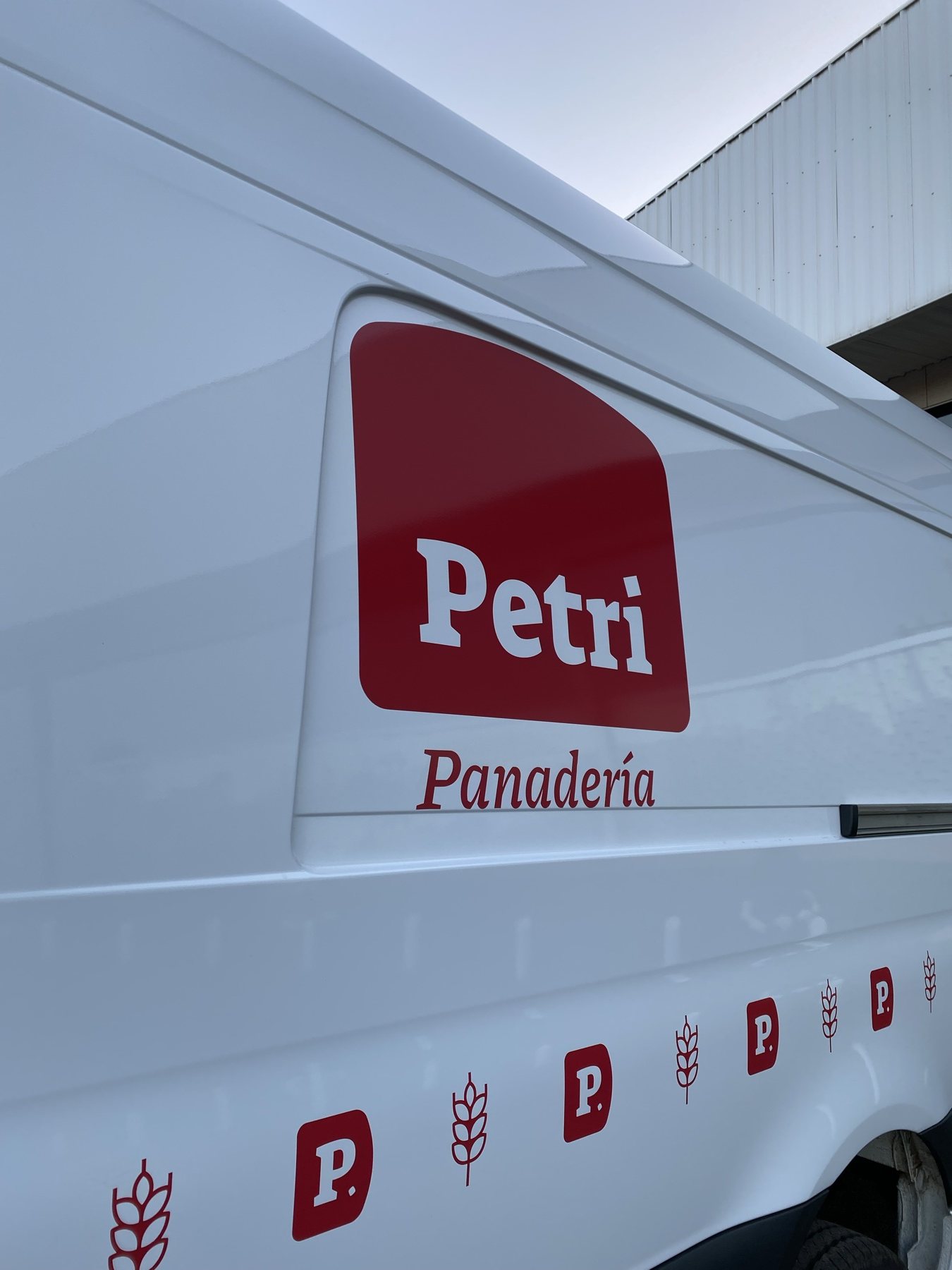
The brand moving across town.
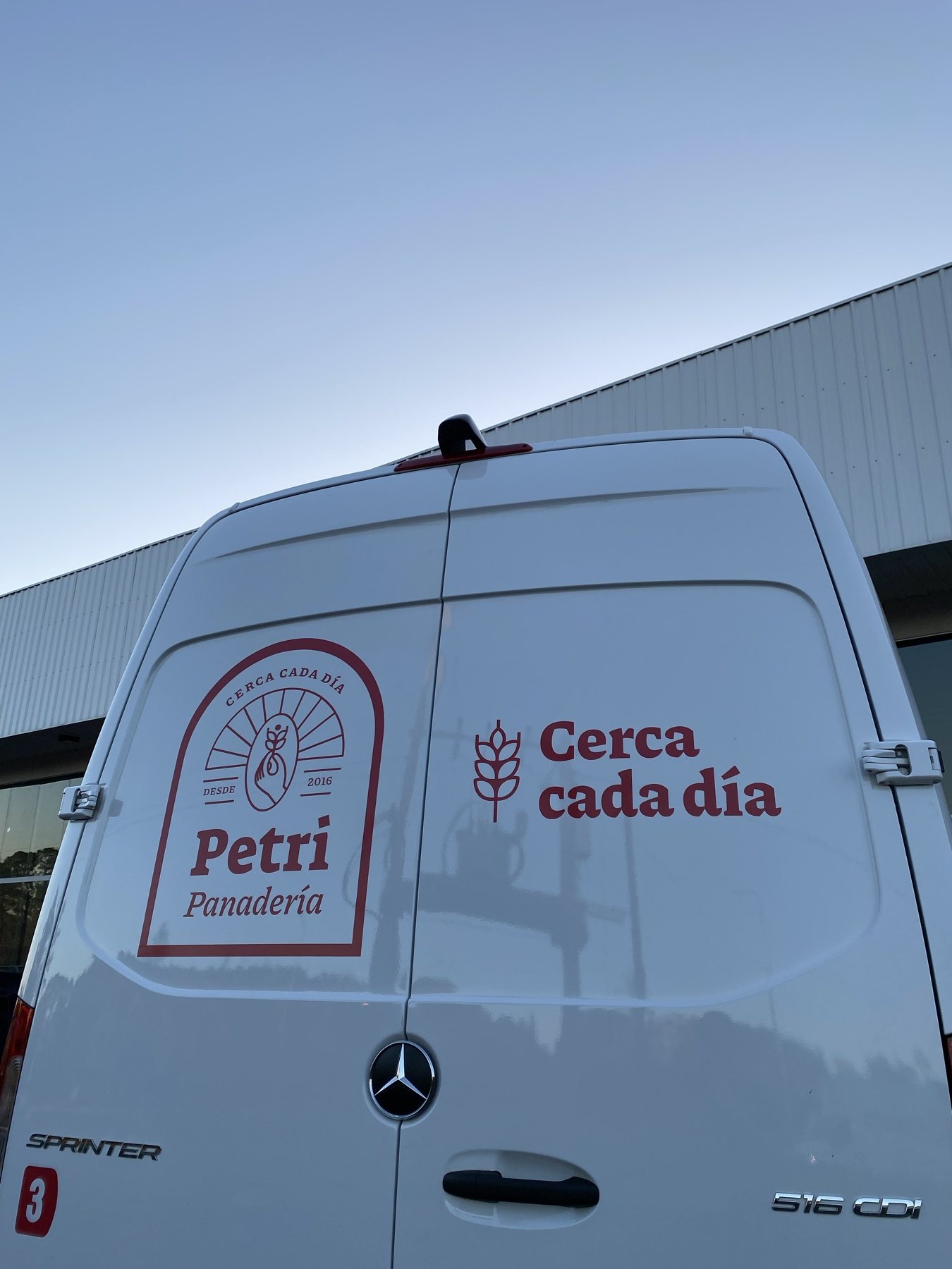
Fleet · Close every single day
Delivery fleet
Delivery fleet
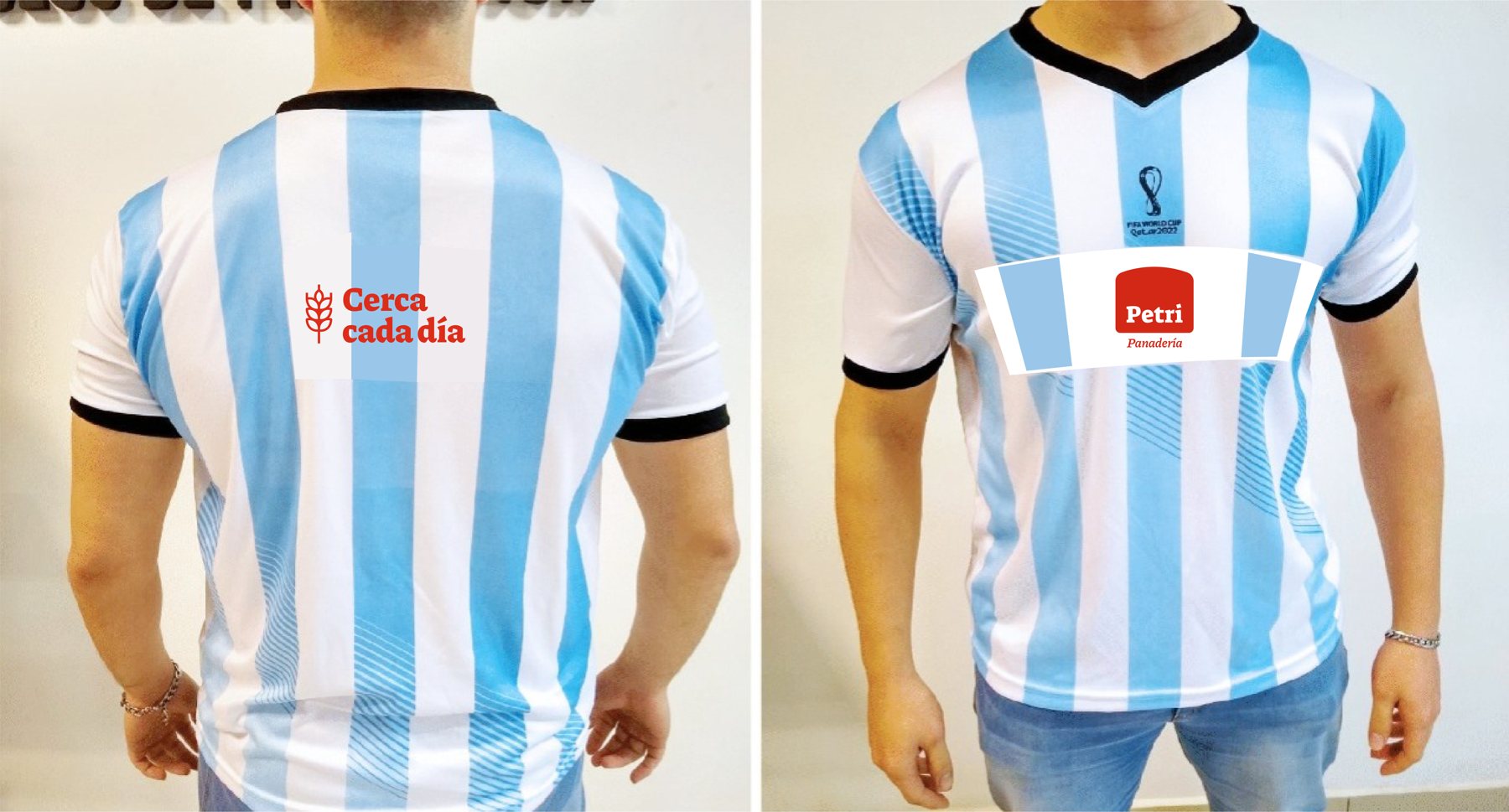
Staff uniforms
Staff uniforms
Close every single day

Social

“We’re proofing a new brand.”

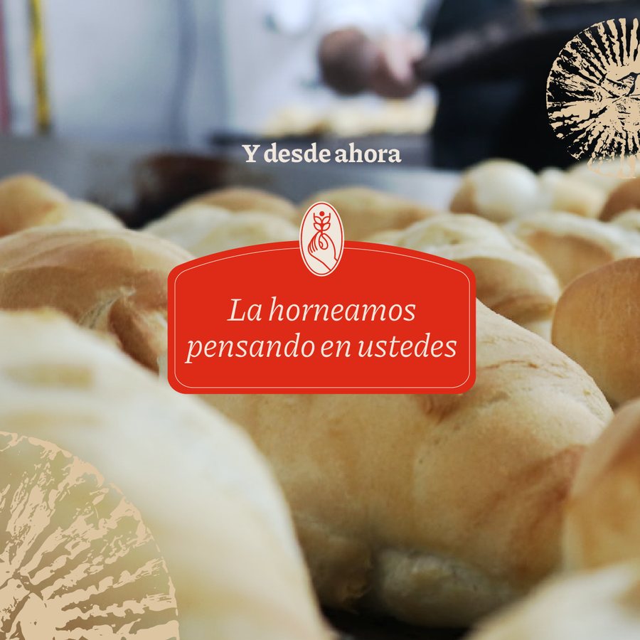
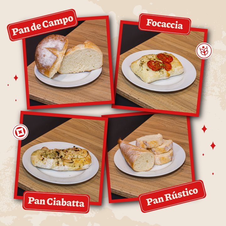
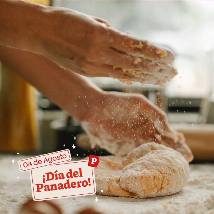
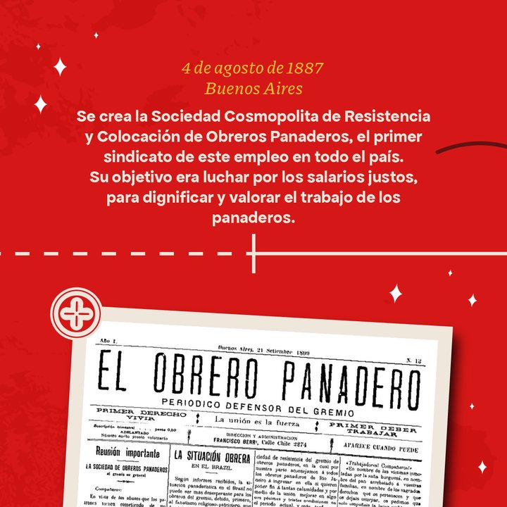
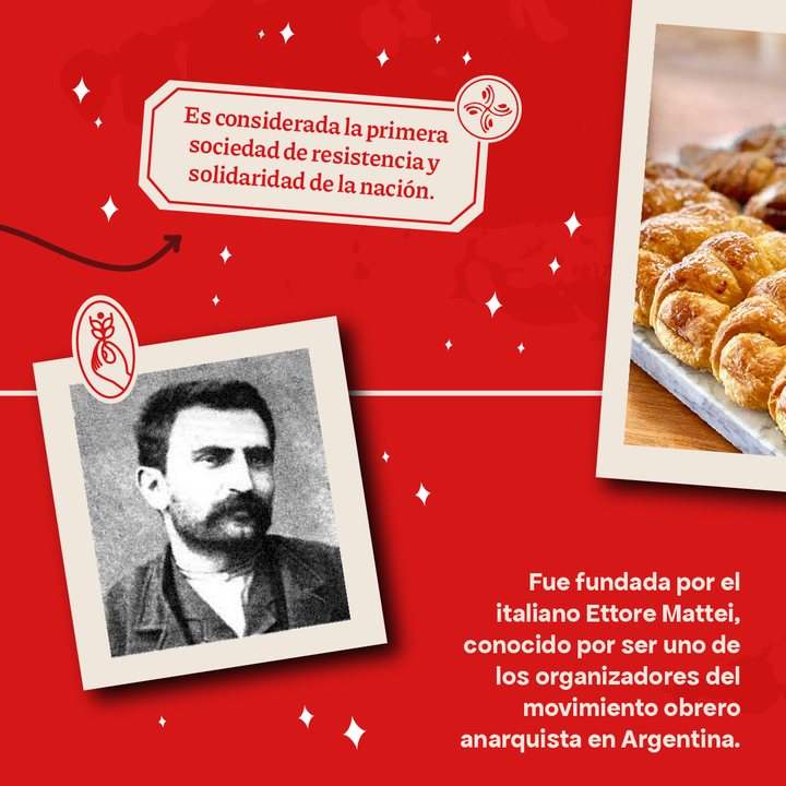
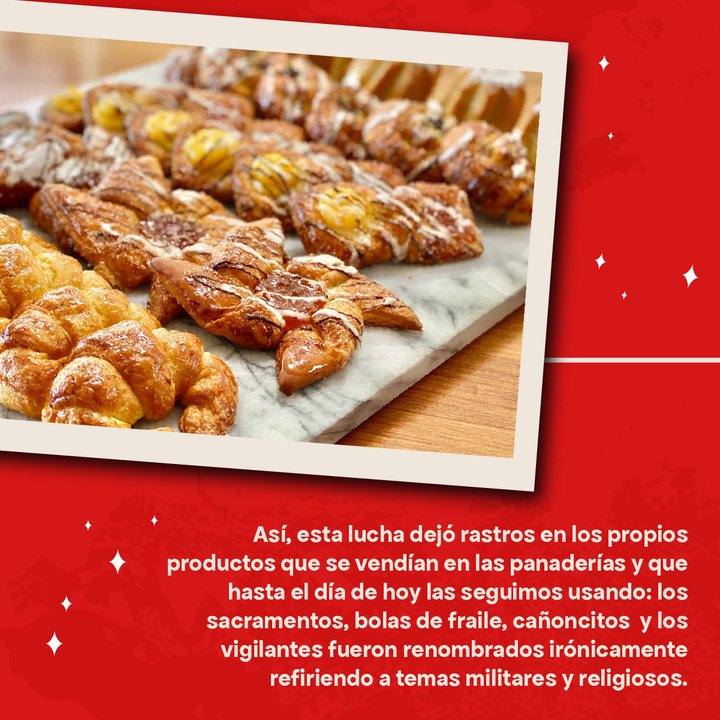
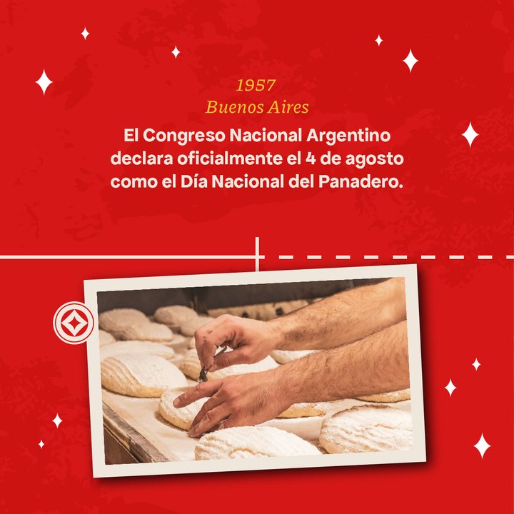
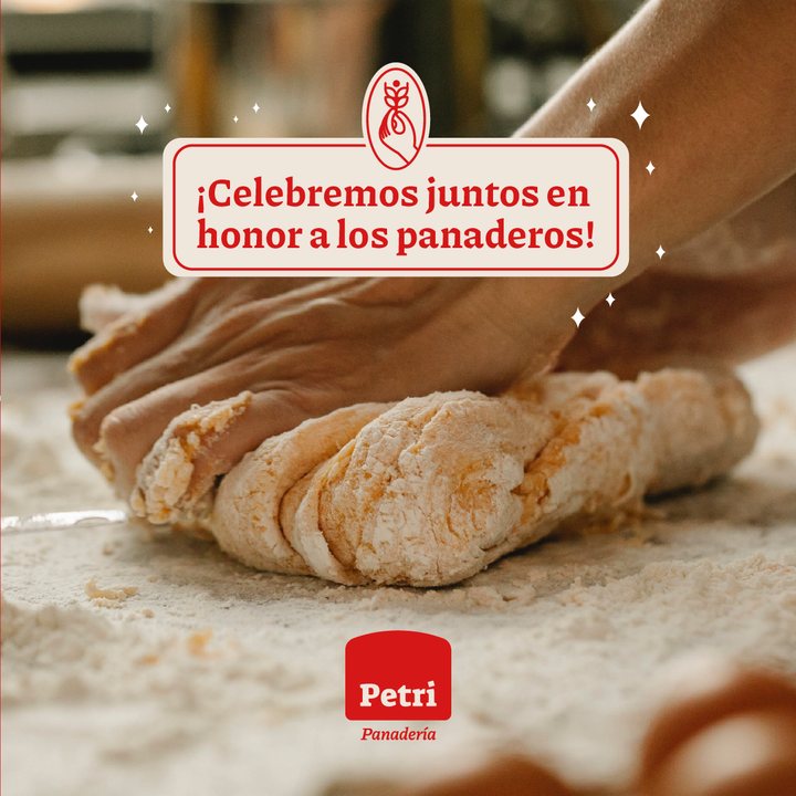
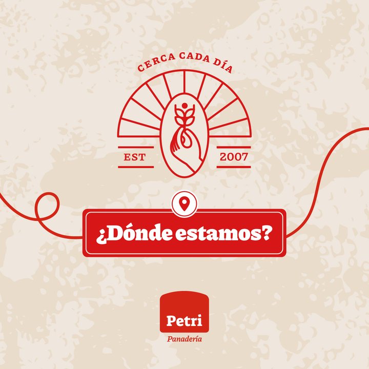
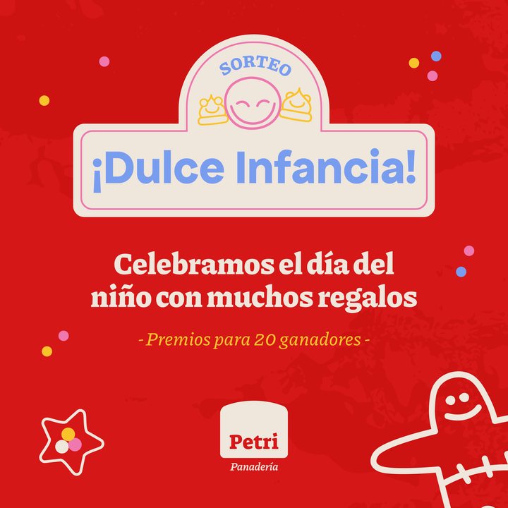
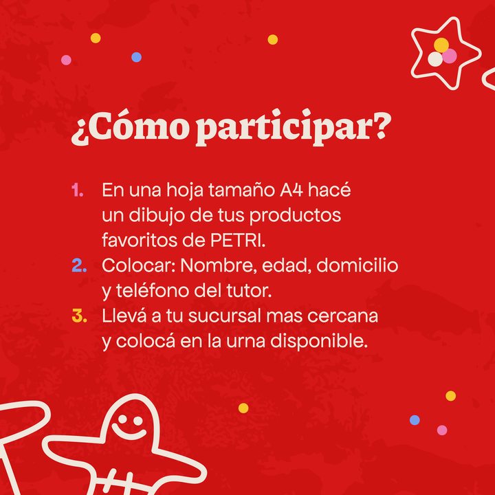
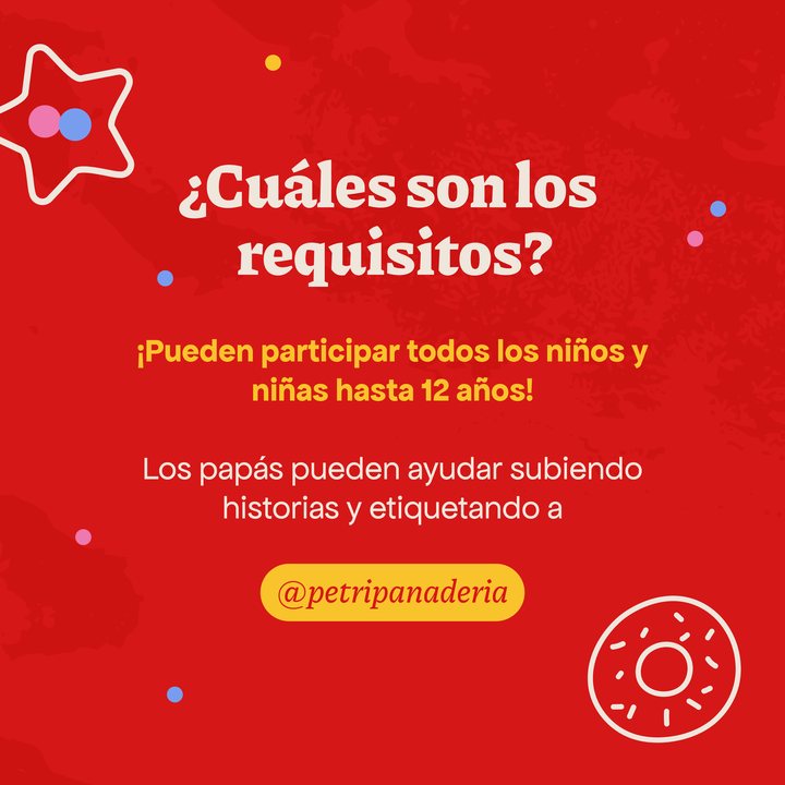
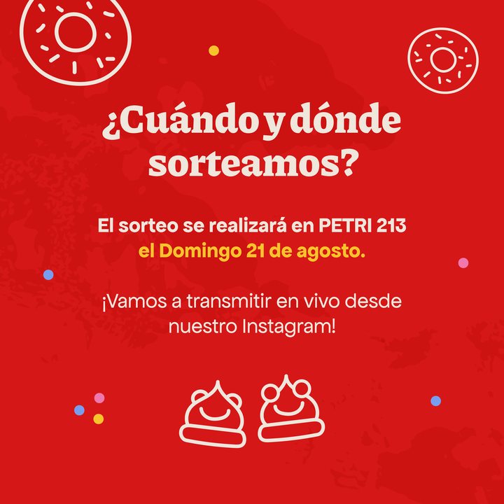
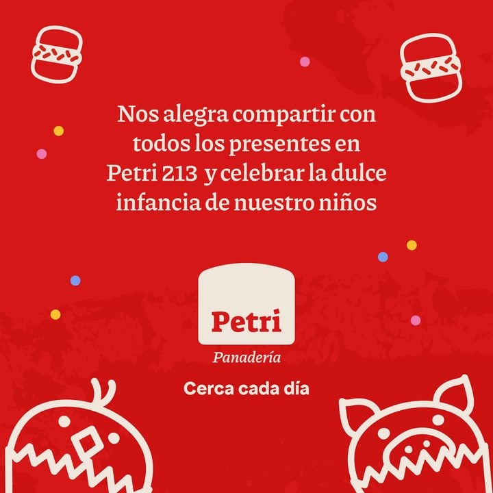
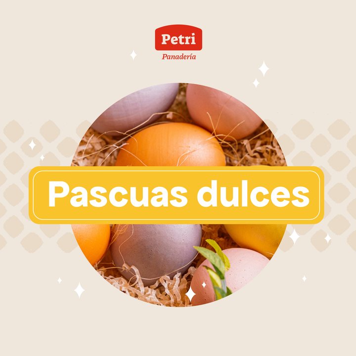
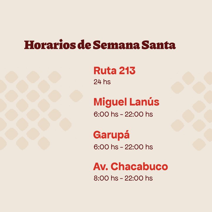
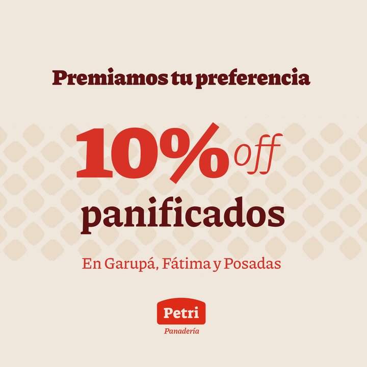
The brand launch on social media and the first months of content: promotions, special dates, giveaways and everyday bakery life.
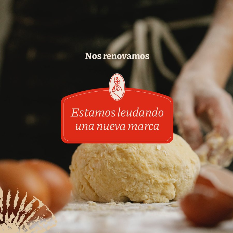
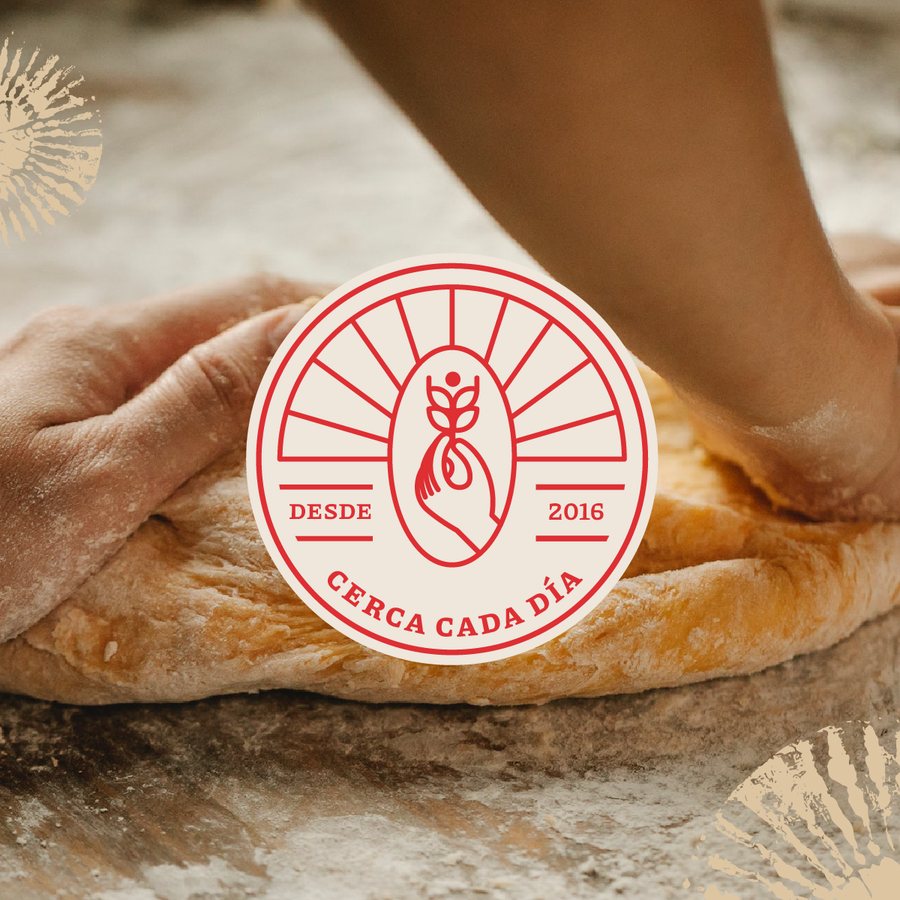
Posteo de redes de Petri
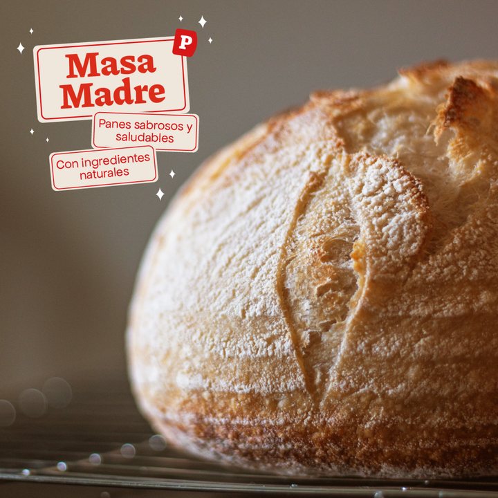
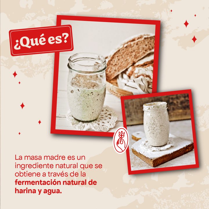
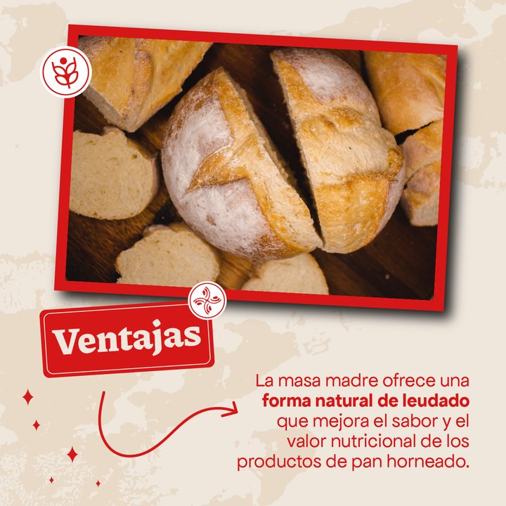
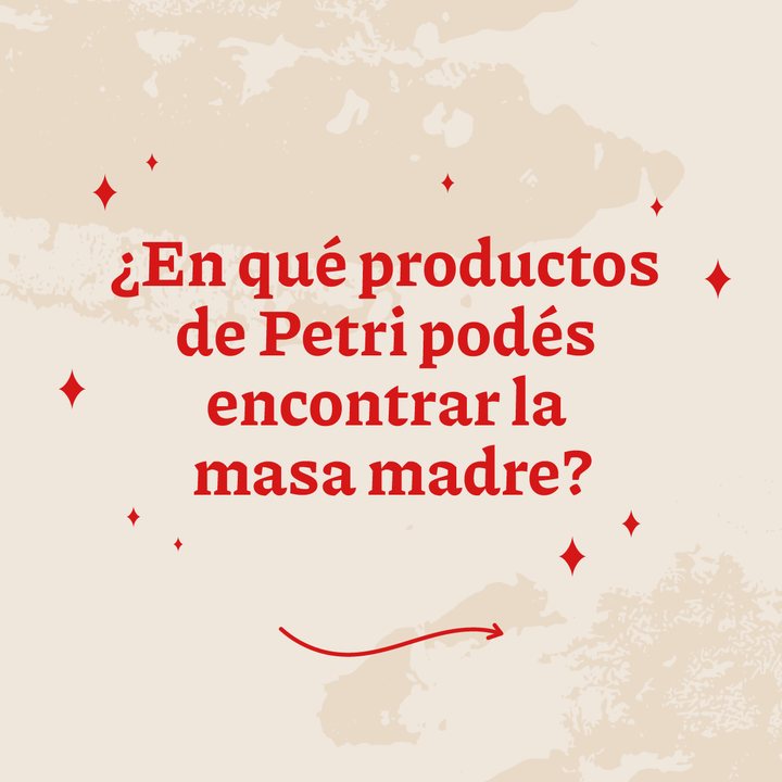
Masa madre · carrusel
Día del Panadero · carrusel
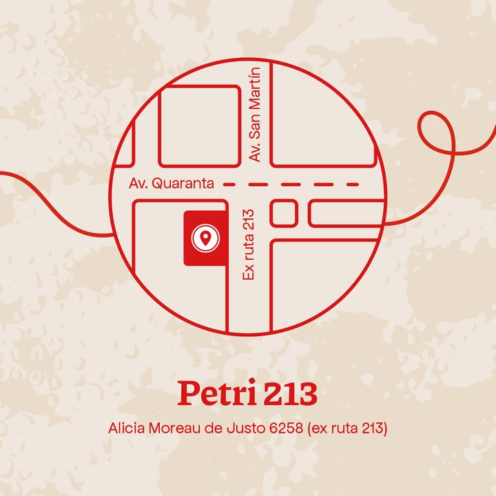
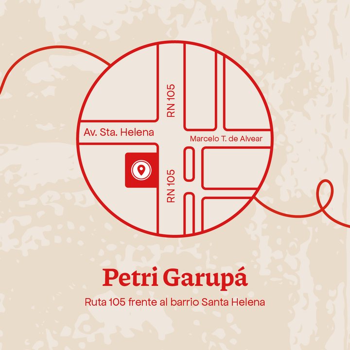
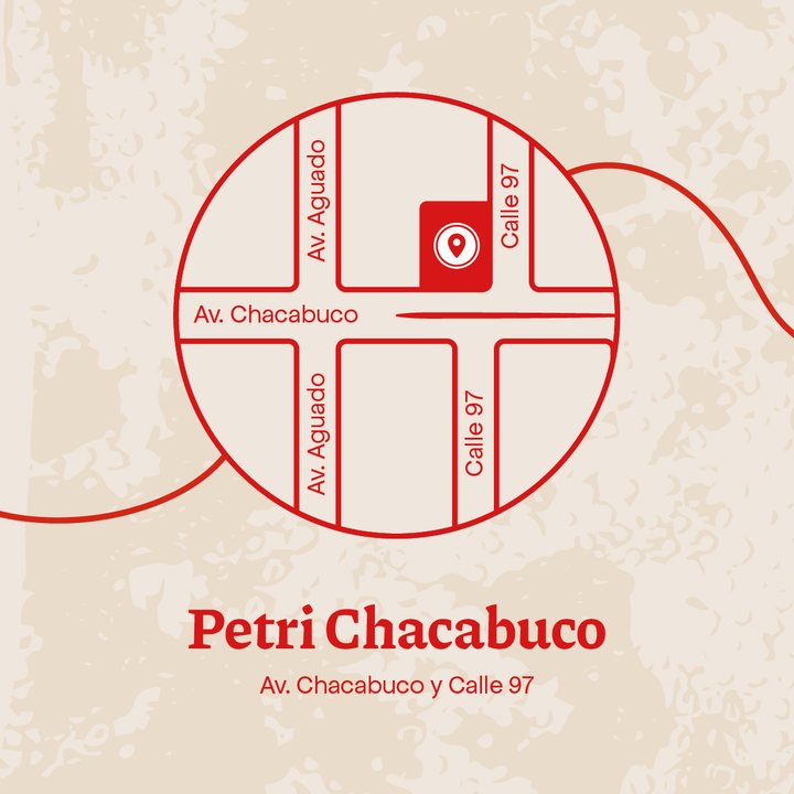
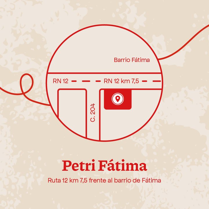
¿Dónde estamos? · carrusel
Día del Niño · sorteo Dulce Infancia
Semana Santa
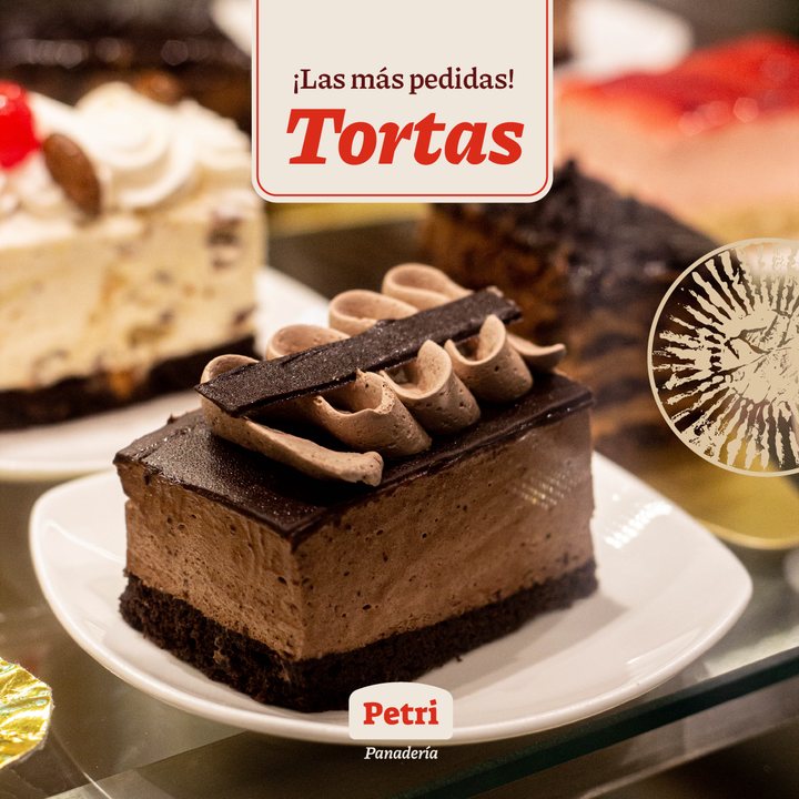
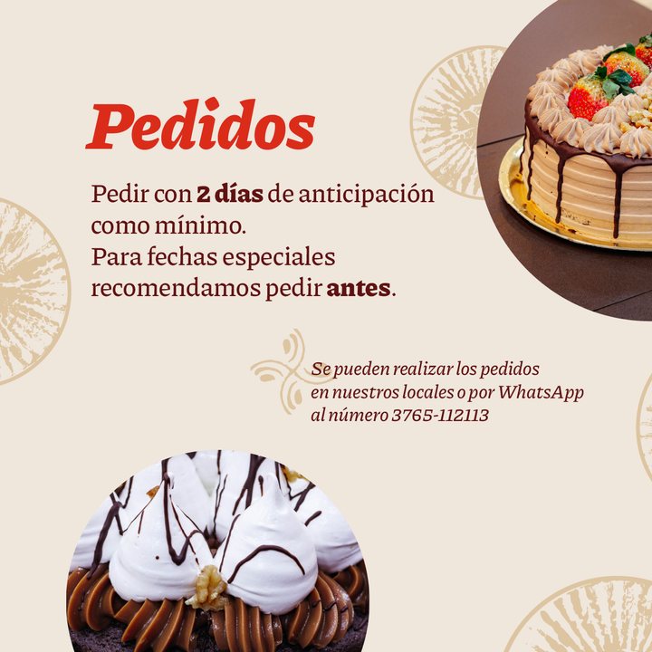
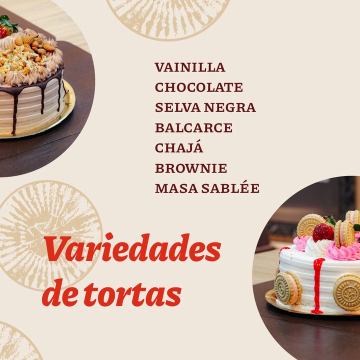
Tortas · pedidos

Brand architecture

One respected name, multiple retail formats.

Grupo Petri unifies diverse retail ventures under a trusted umbrella. Each division maintains its focused voice while sharing the hard-won goodwill built over years.
Bakery
BakeryThe origin: daily bread, homemade pasta, pastries, and take-away meals.
Market
MarketNeighborhood grocery market: everyday convenience with curated gourmet selections.
Grupo Petri
Grupo PetriThe parent corporate entity structuring and backing all business lines.

My role

From high-level strategy down to every customer touchpoint.

Following the brand repositioning, my scope spanned retail store architecture, storefront facades, packaging lines, staff apparel, and laying the groundwork for new ventures like Petri Market. The identity evolved into a comprehensive operating system guiding how Petri presents, scales, and communicates.

Disciplines

  • Brand diagnostic audit
  • Brand strategy
  • Identity redesign
  • Brand architecture
  • Packaging engineering
  • Storefront arquigraphy
  • Environmental wayfinding
  • Commercial communications

Créditos

  • DI Federico Gunther

    Estrategia de marca y comunicación · Dirección creativa · Dirección de arte · Diseño de arquigrafía y locales · Gestión del cliente

  • DG Gabriel González

    Dirección de diseño · Diseño de packaging

  • Lic. Maru Robledo

    Diseño y selección tipográfica

  • Lic. Fernanda Parchomczuk

    Diseño · Ilustraciones y tramas

  • DG Luciano Hermida

    Diseño de contenido y animación para redes sociales

Next projectPetri Market →La confianza de una panadería, trasladada a la compra diaria.