Diagnosis · Strategy · Naming & Tagline · Identity · Retail Communication
Super Kerps
Modernizing a heritage supermarket brand without starting from scratch.
The starting point
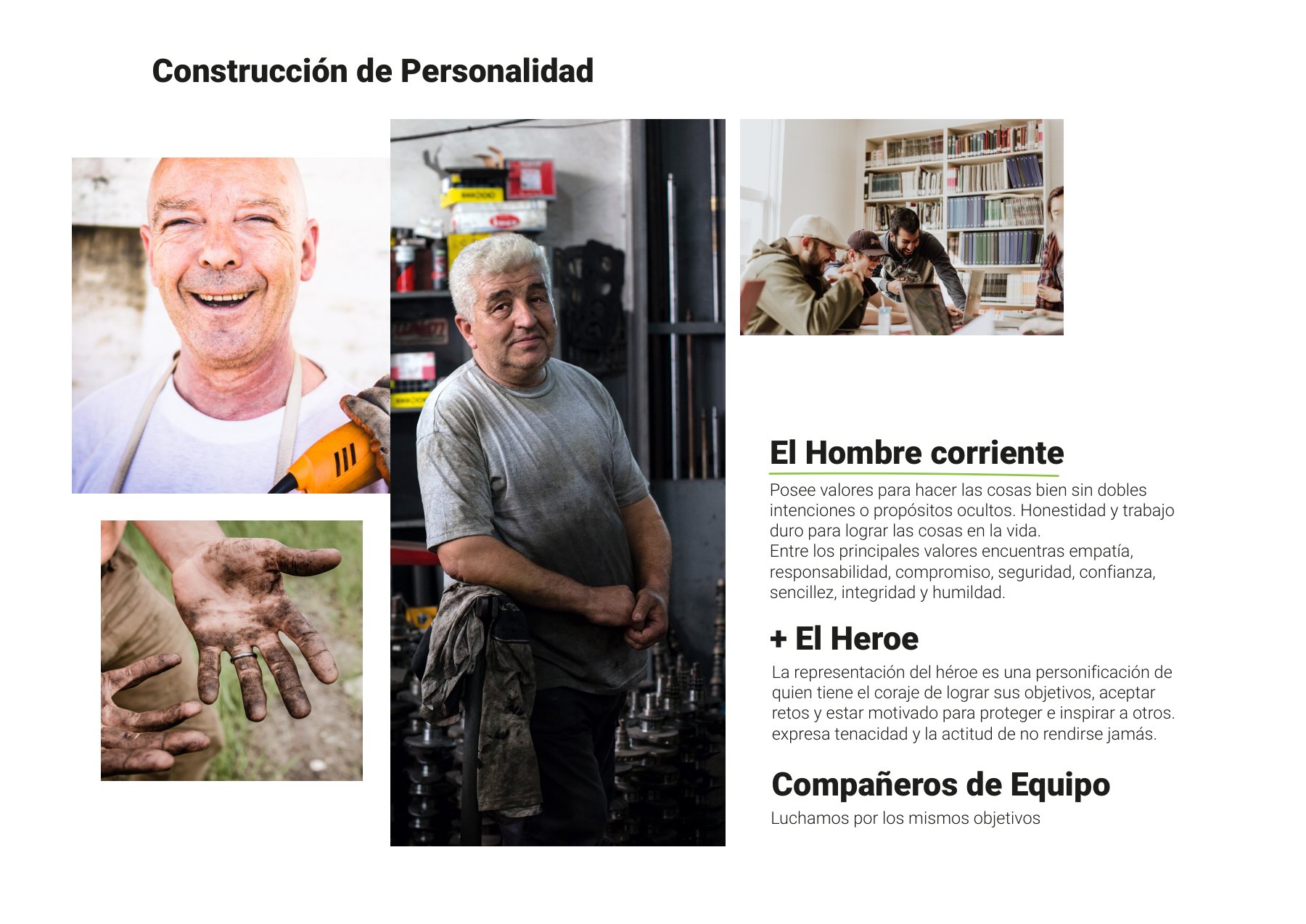
A growing supermarket chain with an identity left behind.
Kerps was an established wholesale and retail grocer with loyal neighborhood roots, undergoing rapid physical expansion: opening new store locations, hiring staff, and facing their first comprehensive brand redesign.
The initial audit revealed a supermarket category characterized by distant, purely transactional advertising. Consumers primarily prioritize rational drivers — price, assortment, and speed. The opportunity was infusing genuine warmth and personal connection into that rational core.

 BeforeAfter
Strategy
For you, more.
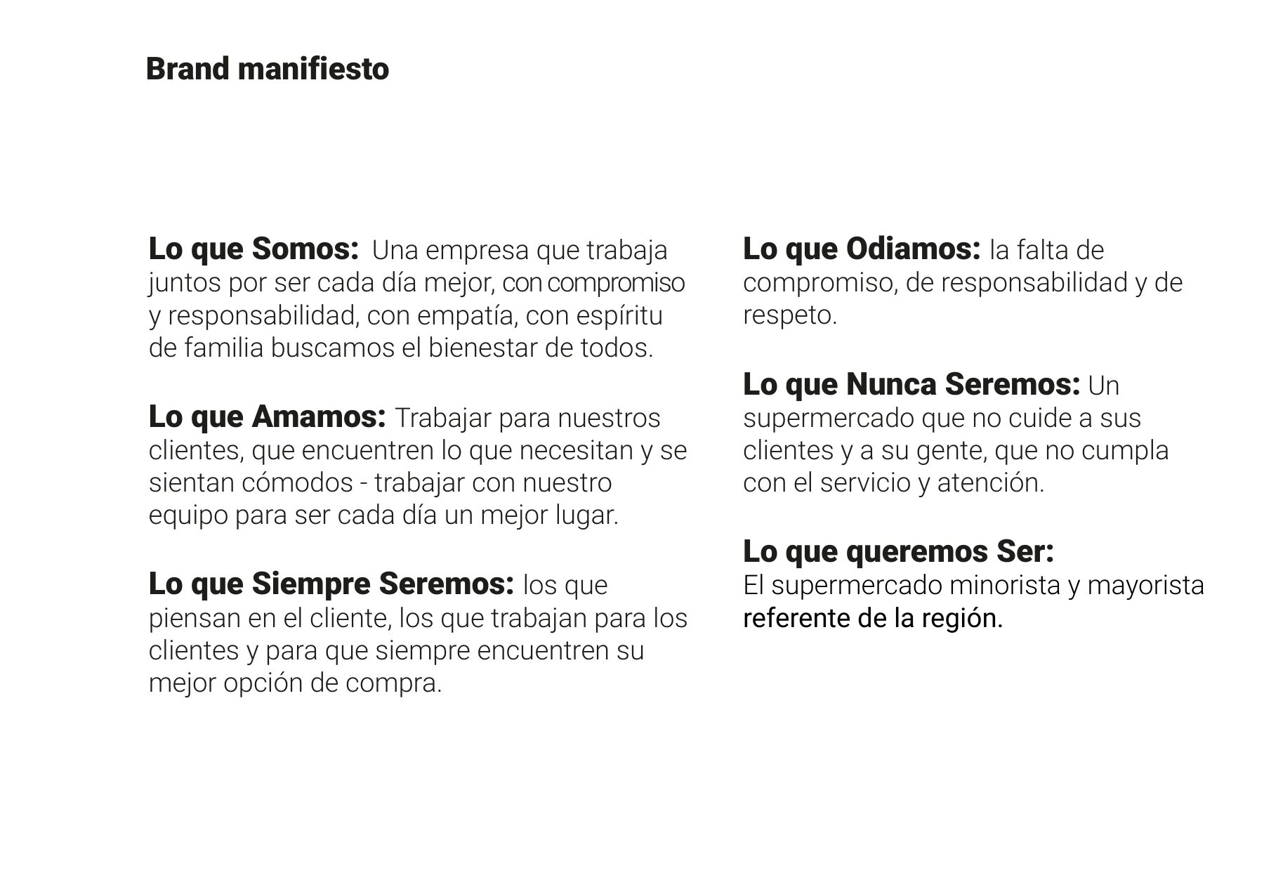
Brand platform, archetype positioning, brand manifesto, and a clear value hierarchy. This yielded the super brand prefix and a tagline merging rational benefits with personal empathy: greater variety, bigger savings, and more value for every family.
I want to be the market where you always discover and take home more.
Identity
A badge built to stand out on the shelf.
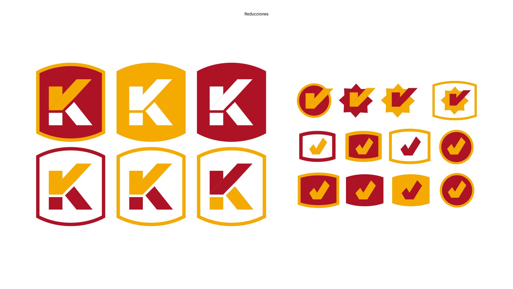
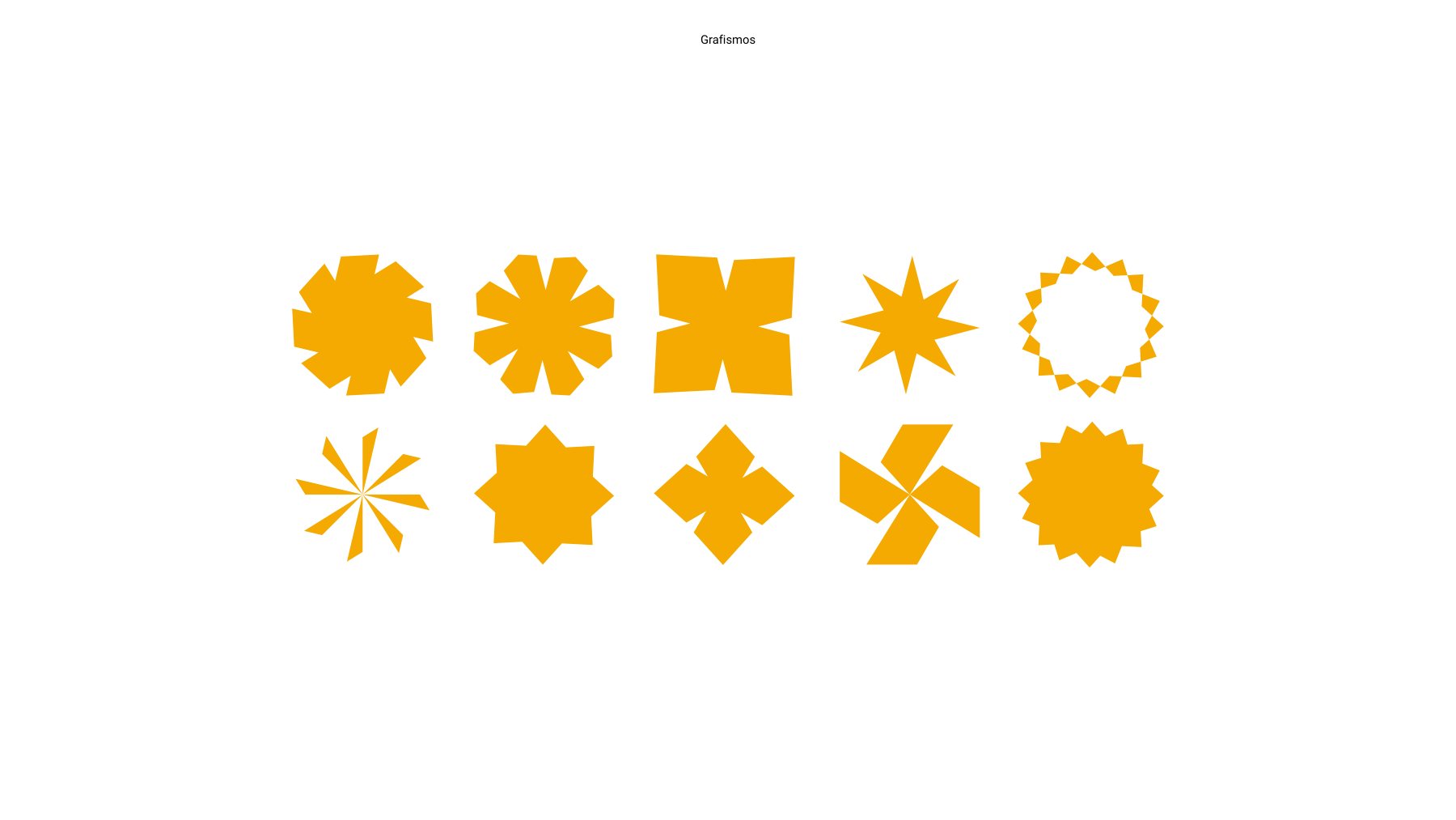
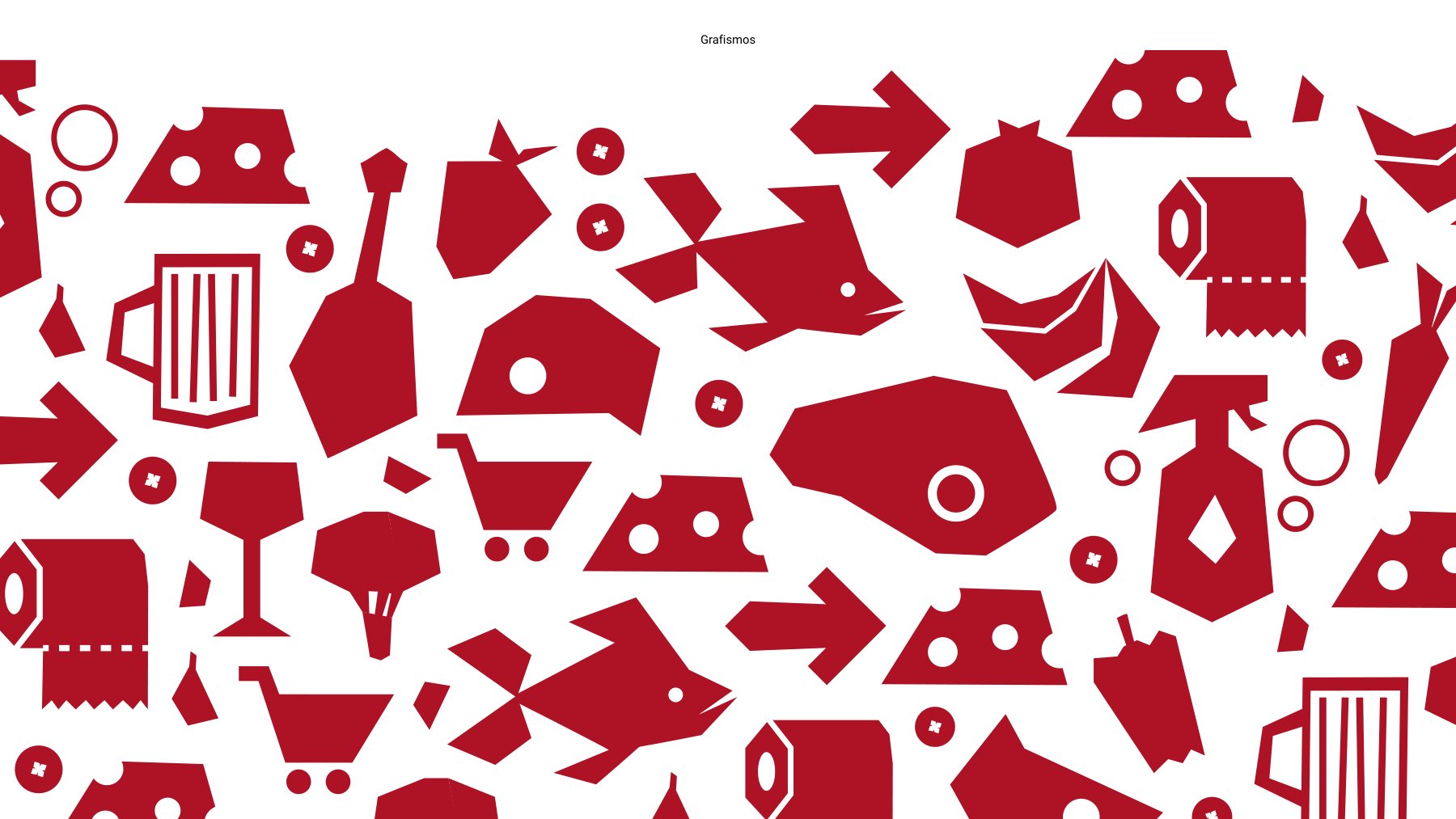
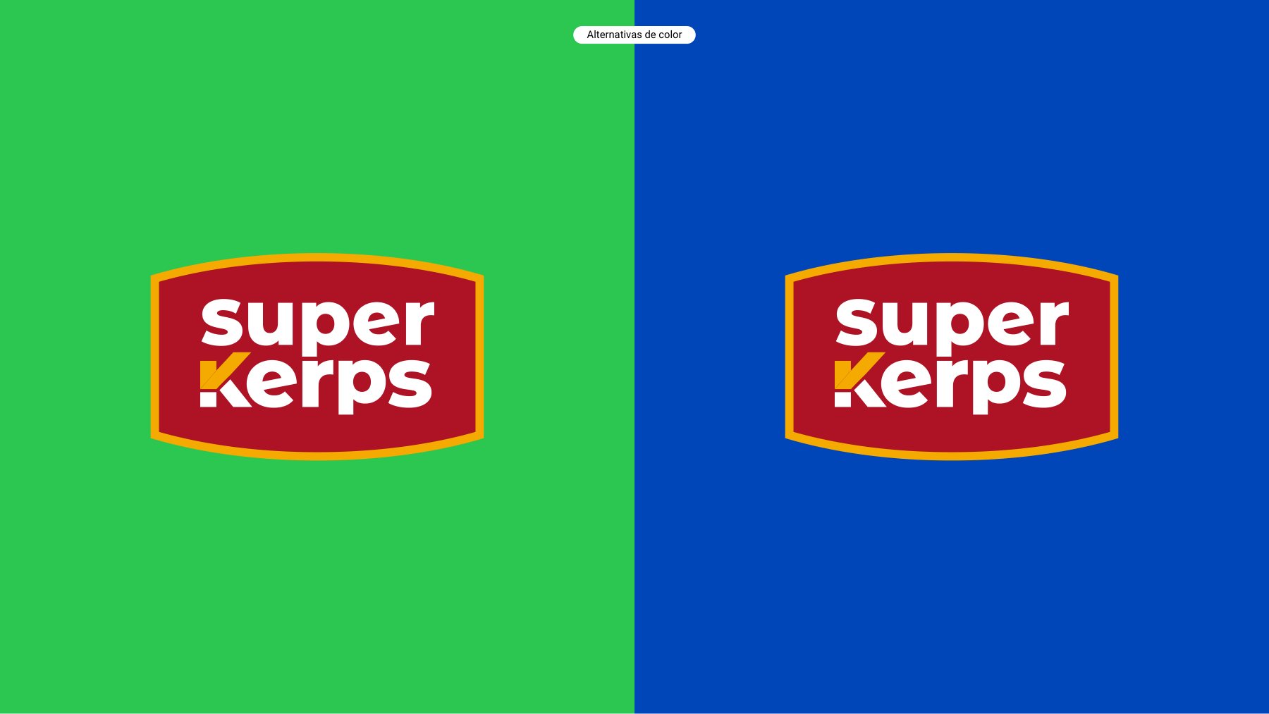
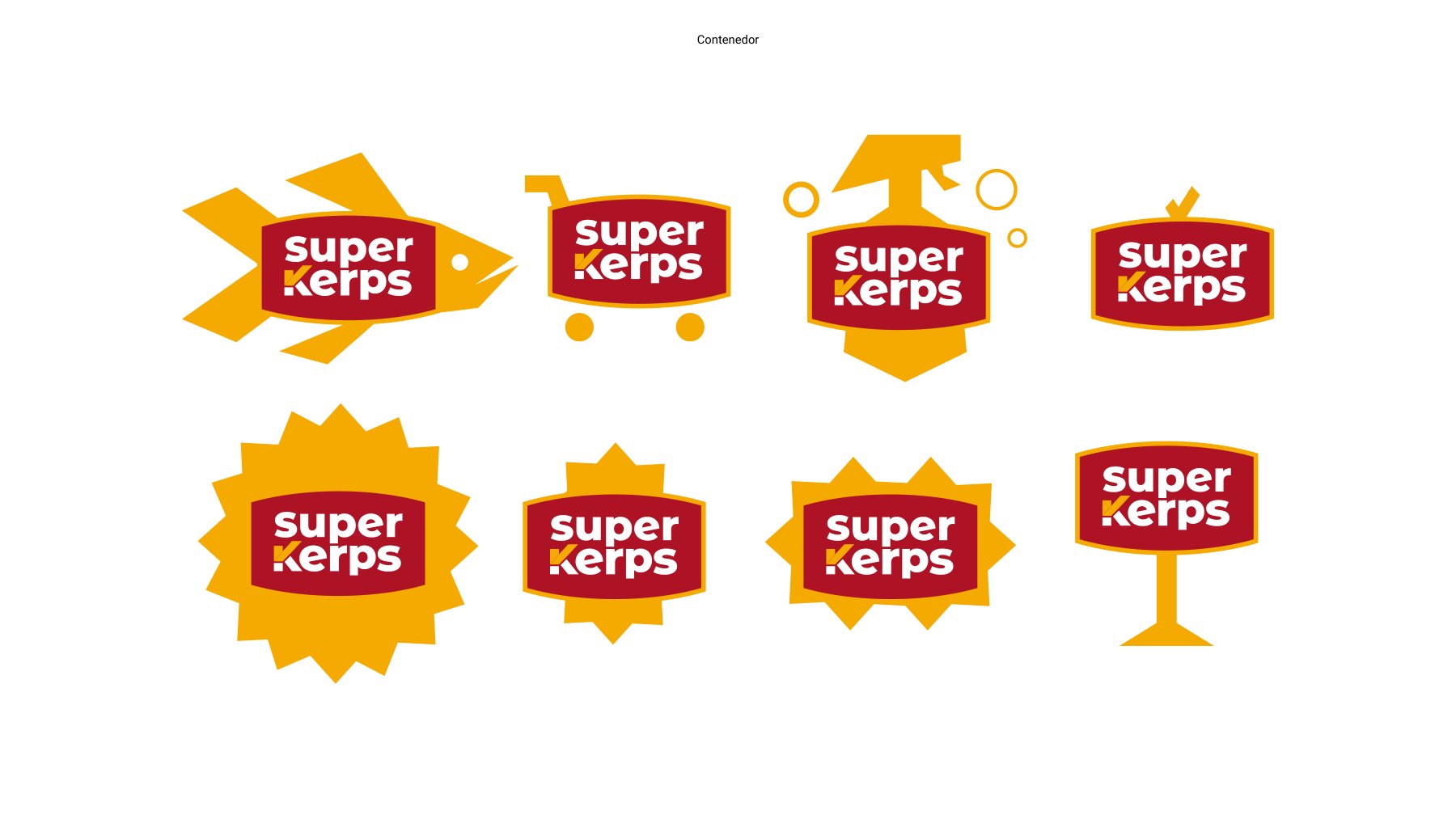
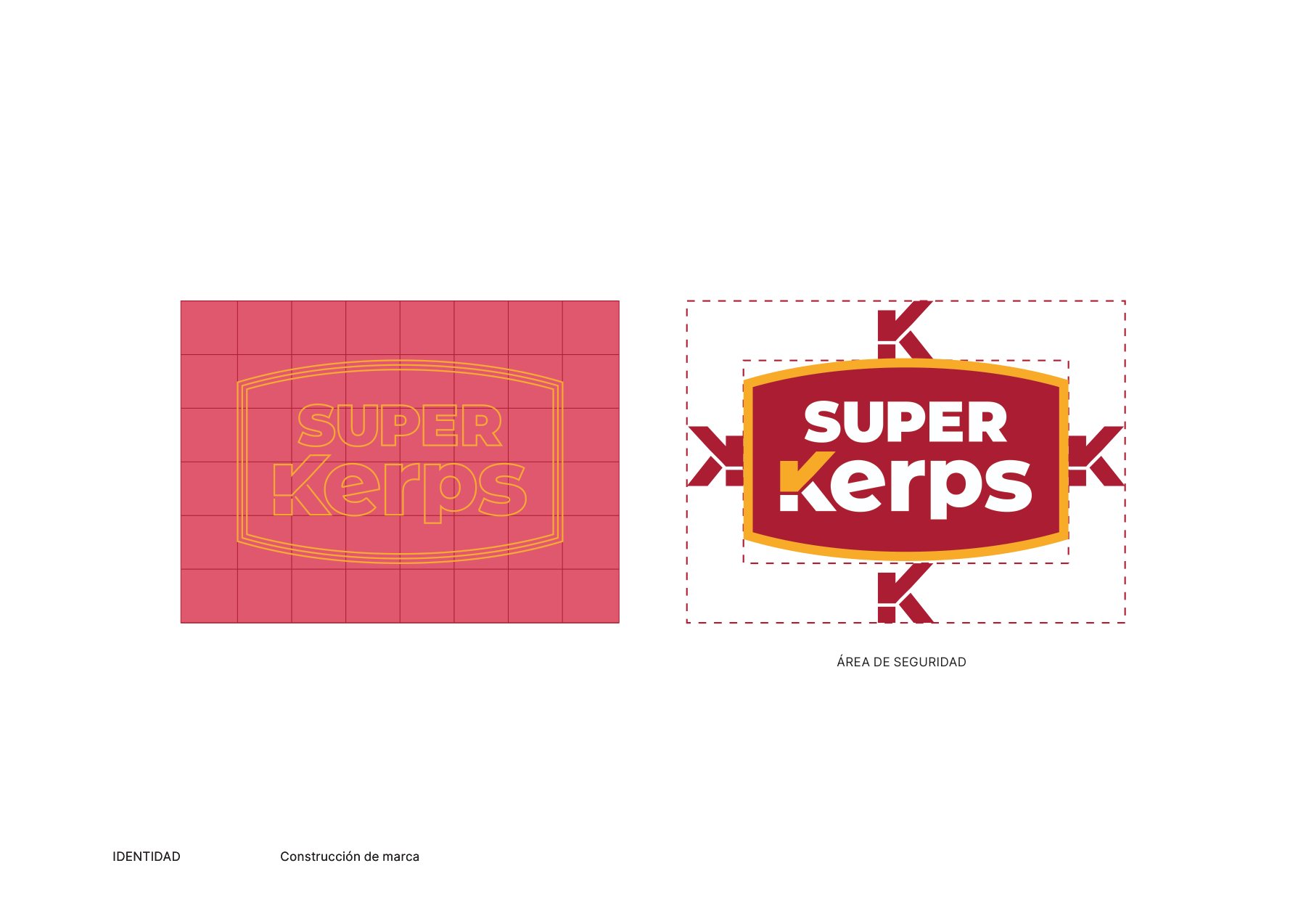
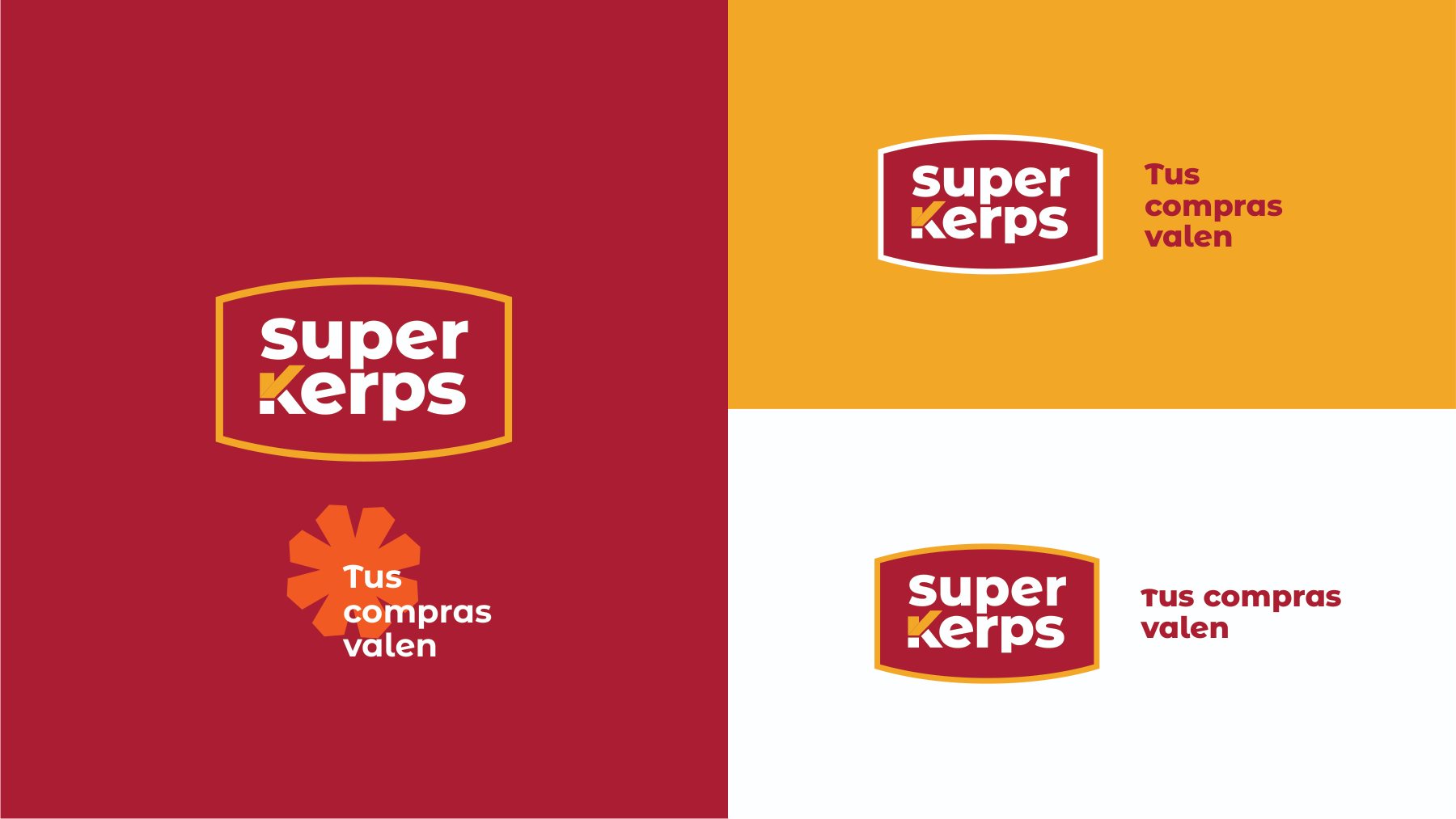
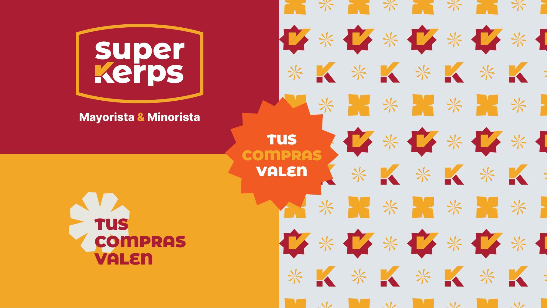
A bold red badge with heavy letterforms and a distinctive K symbol, surrounded by starburst seals channeling the high-energy language of classic grocery merchandising. Bold red and warm yellow serve as the brand core, supported by aisle-specific accent hues.
#B11E2EAmarillo
#F6A800Blanco
#FFFFFFVerde
#2E9E44Azul
#1F4FB5
Communication
Every purchase delivers real value.
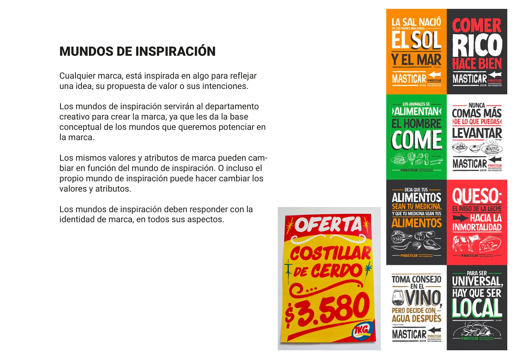
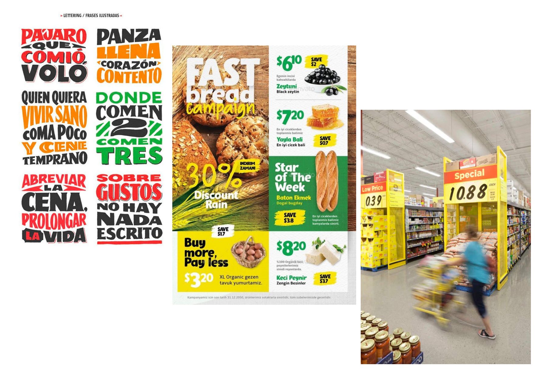
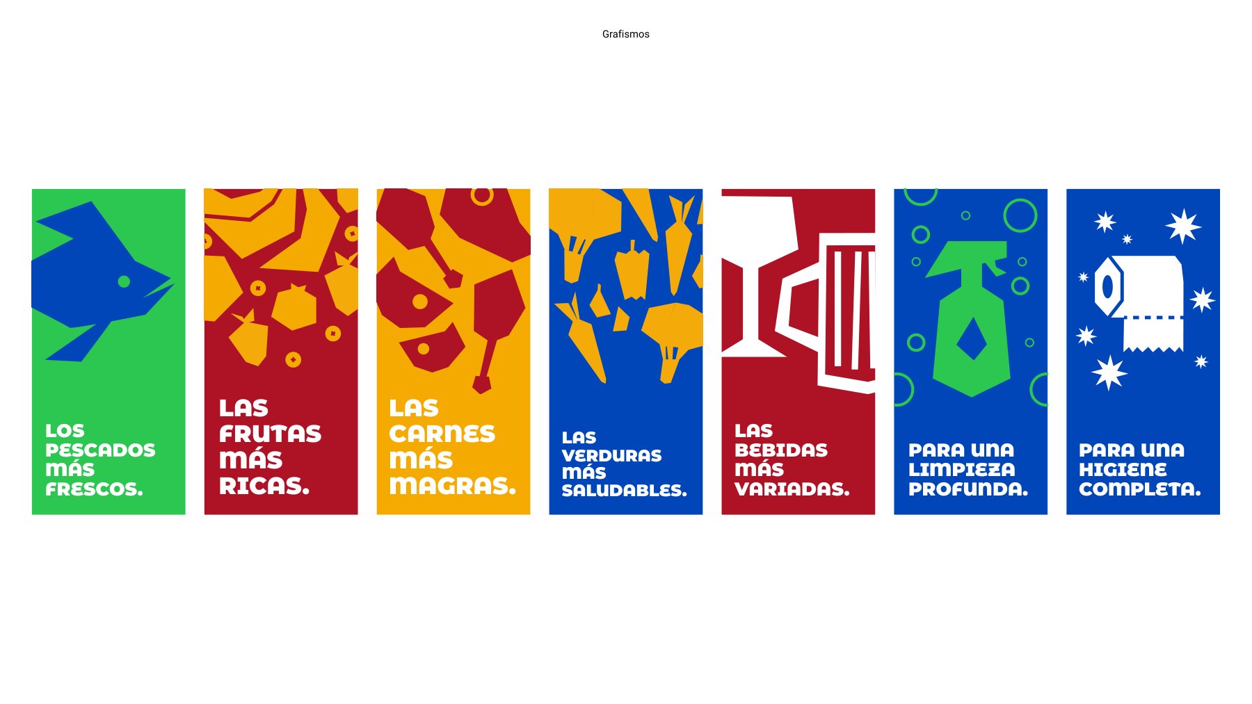
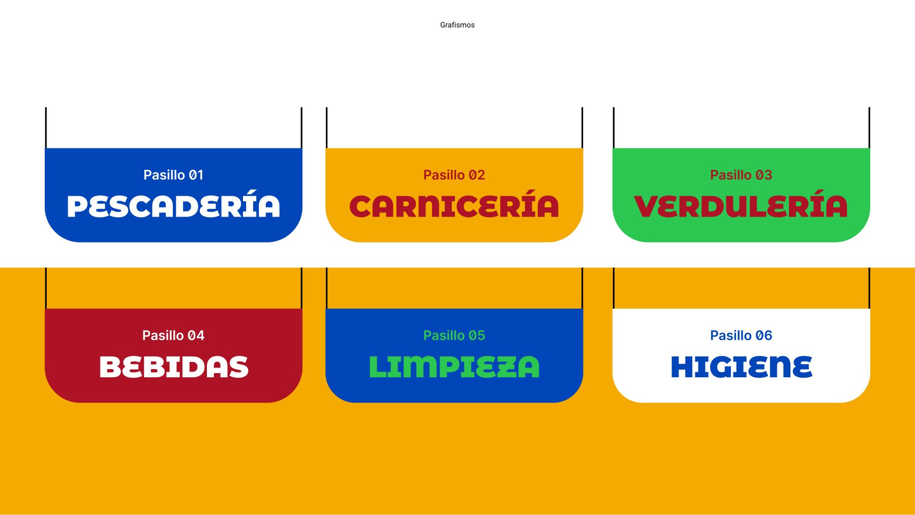
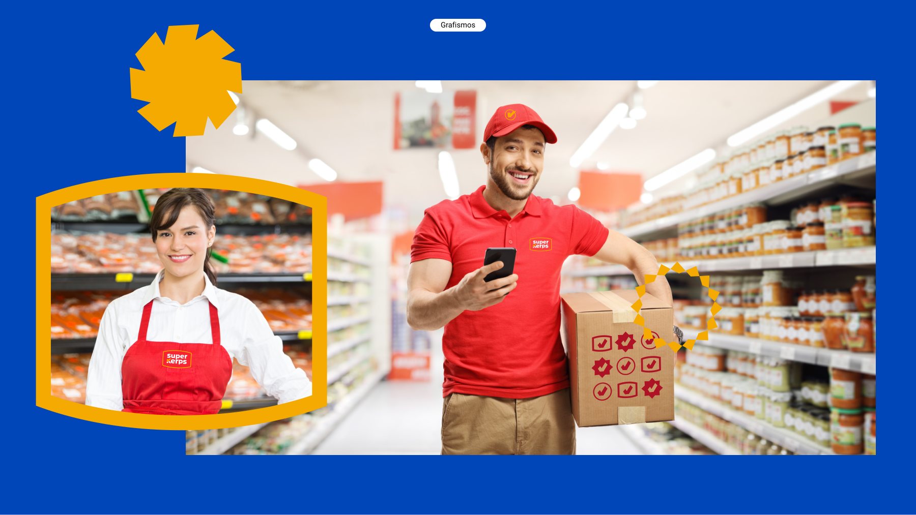
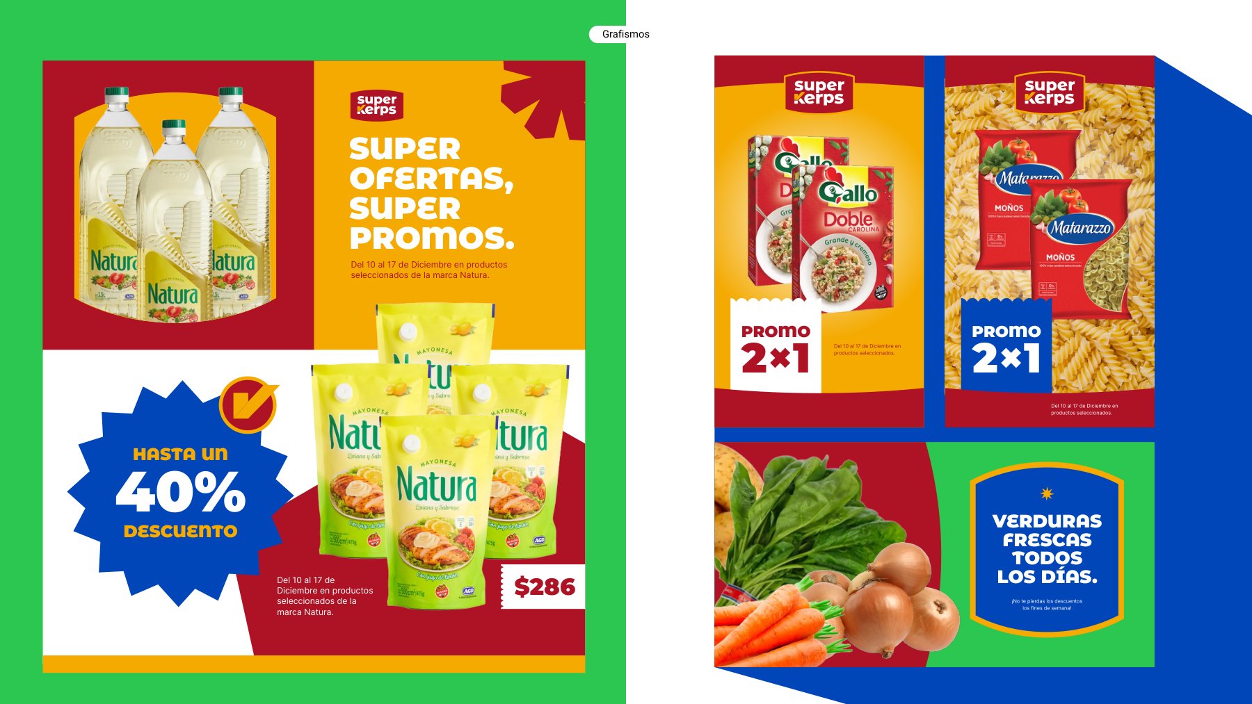
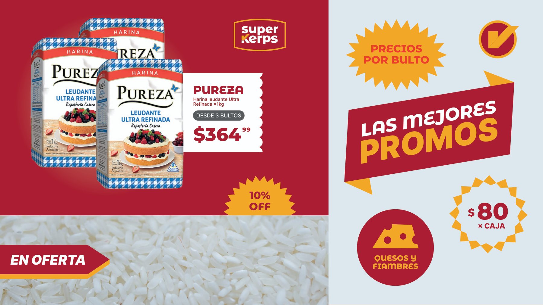
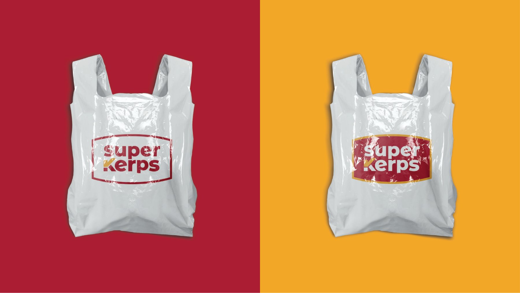
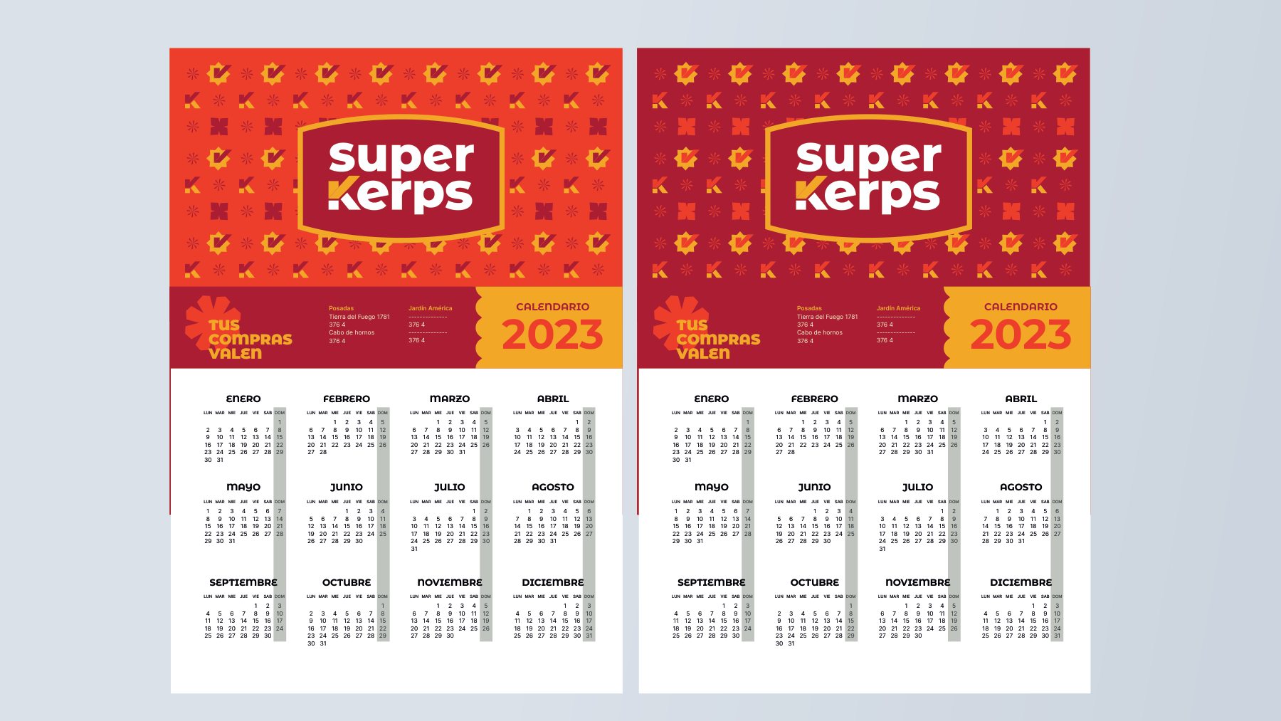
A retail communication framework for weekly discounts, department signage, and point-of-sale engagement: grocery product patterns, price tags, overhead category signage, and promotional collateral.

My role
From business insights to real-world execution.
Brand diagnostic, strategic positioning, naming extension and tagline, visual identity, brand guidelines, and comprehensive retail communication system.
- Diagnosis
- Strategy
- Naming
- Tagline
- Identity
- Brand Guidelines
- Communication